XYZ Type
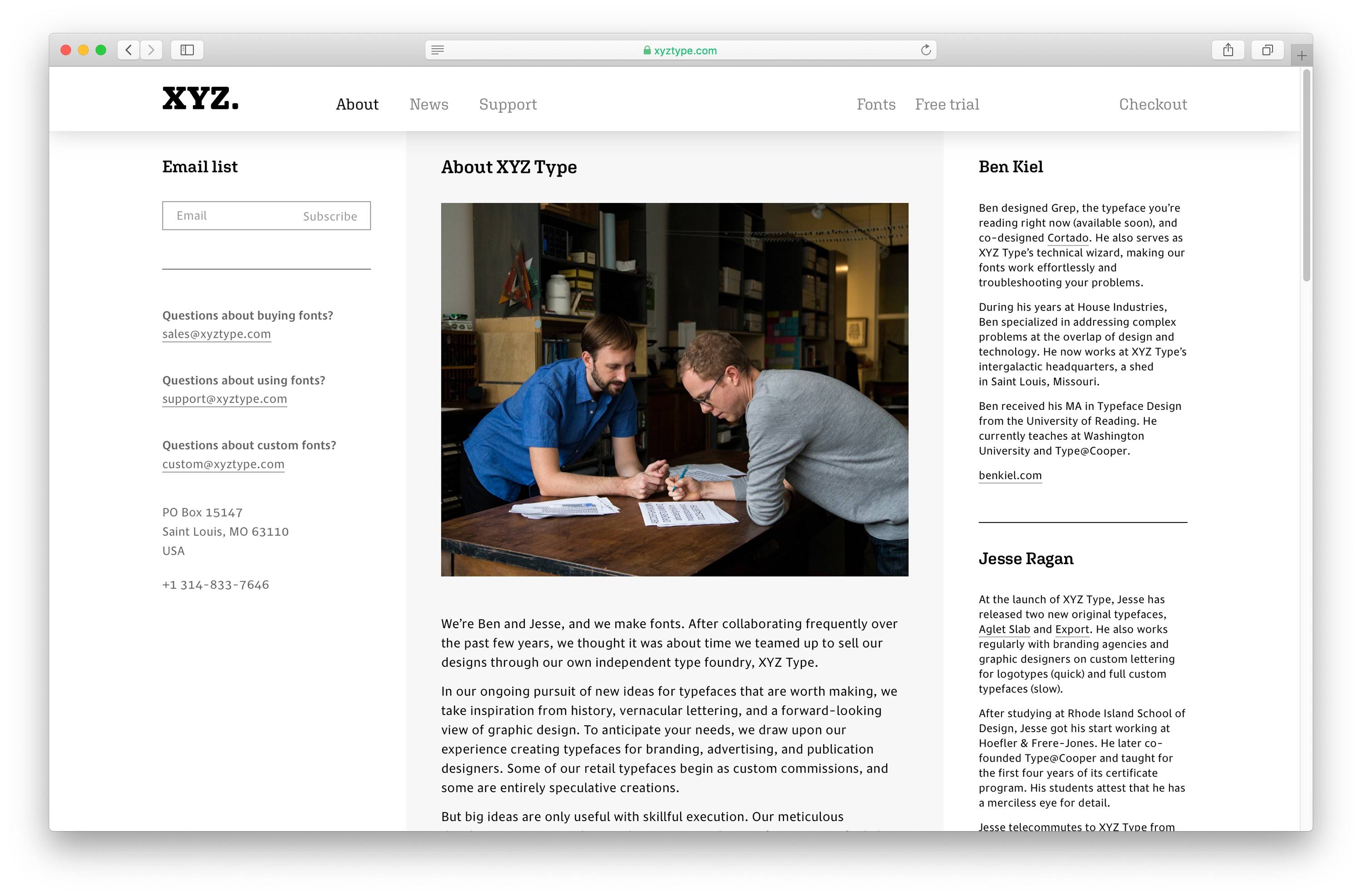
XYZ Type is an independent type foundry offering fonts by Ben Kiel and Jesse Ragan. They draw original typefaces from scratch, customize versions of their retail typefaces to tailor them to a client’s specific needs, and fine-tune client logotype sketches.

Name
XYZ Type's name derives from the end of the Latin alphabet. We worked with the team to chose this name as a representation of their work. In the most basic sense, the fonts they sell are iterations of that alphabet; their value lies in the visual differences of line, shape, and formality.
Brand
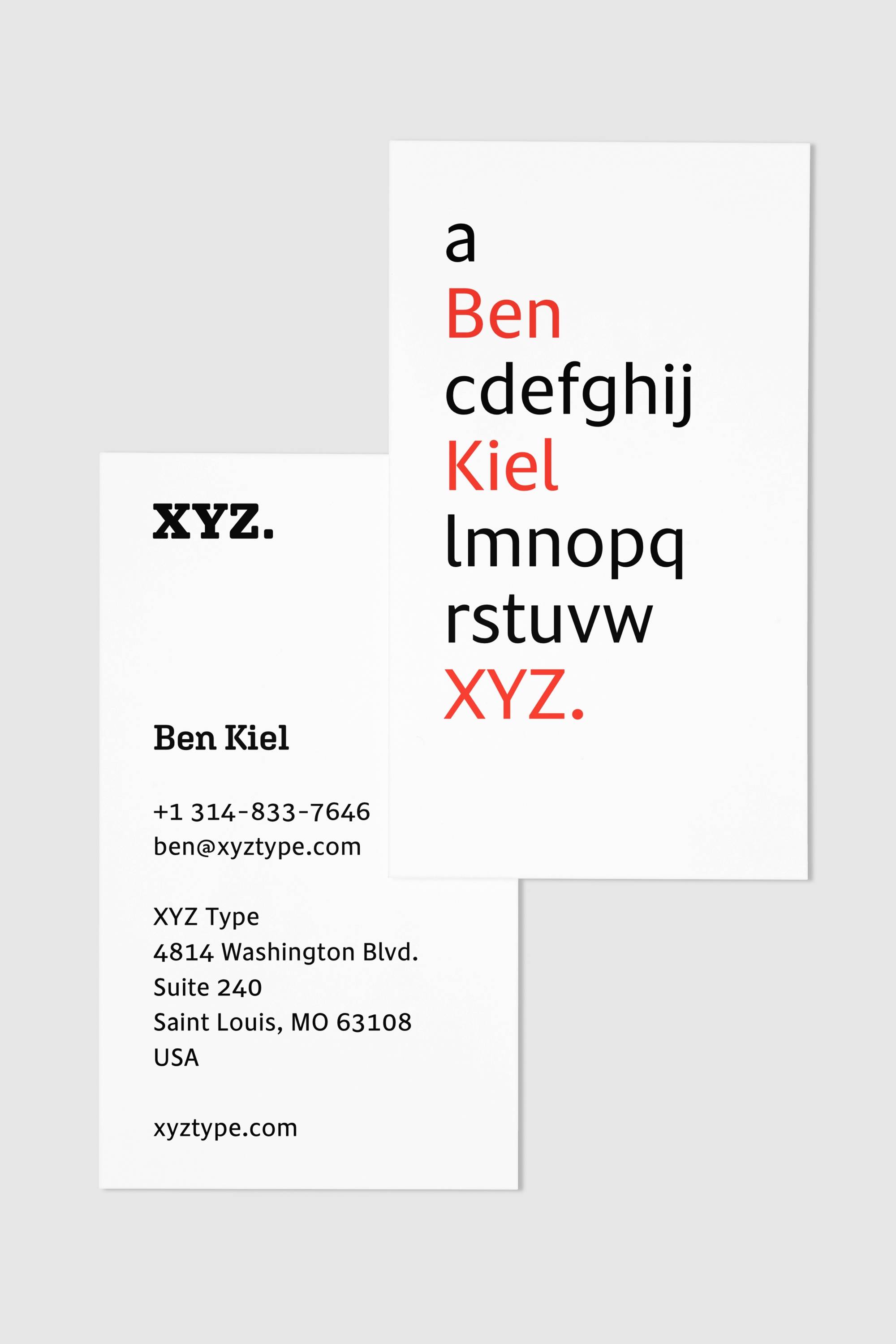
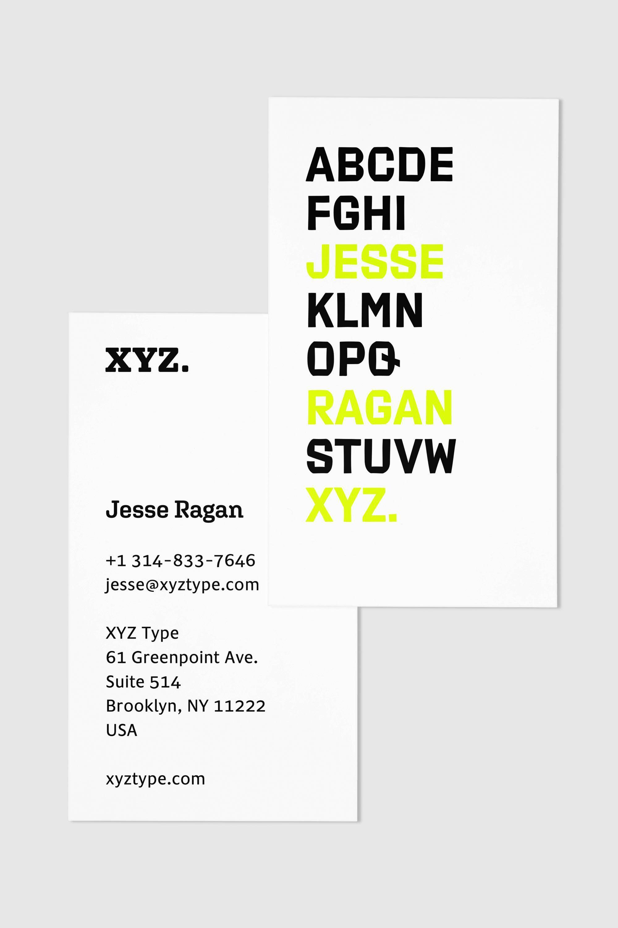
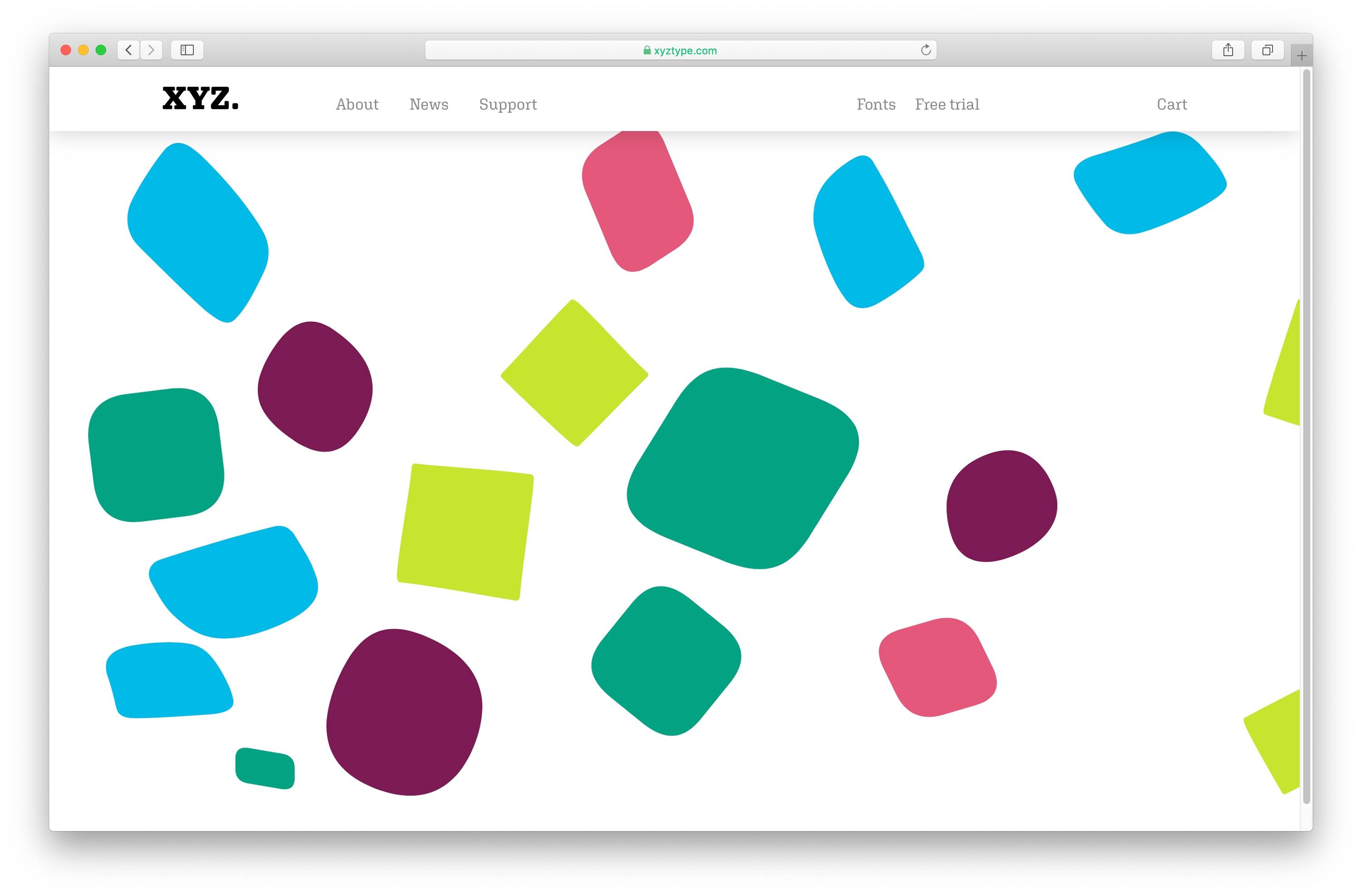
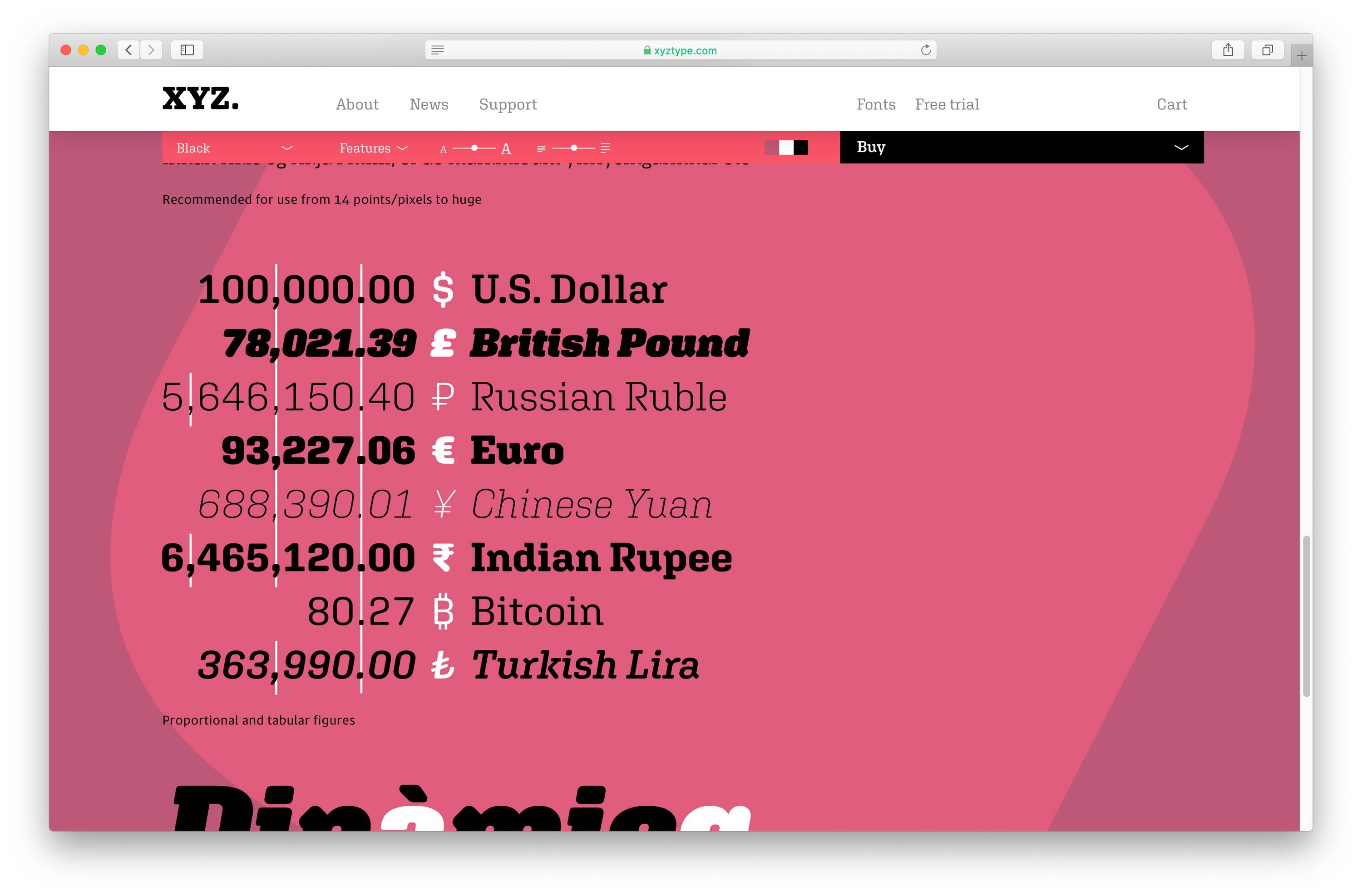
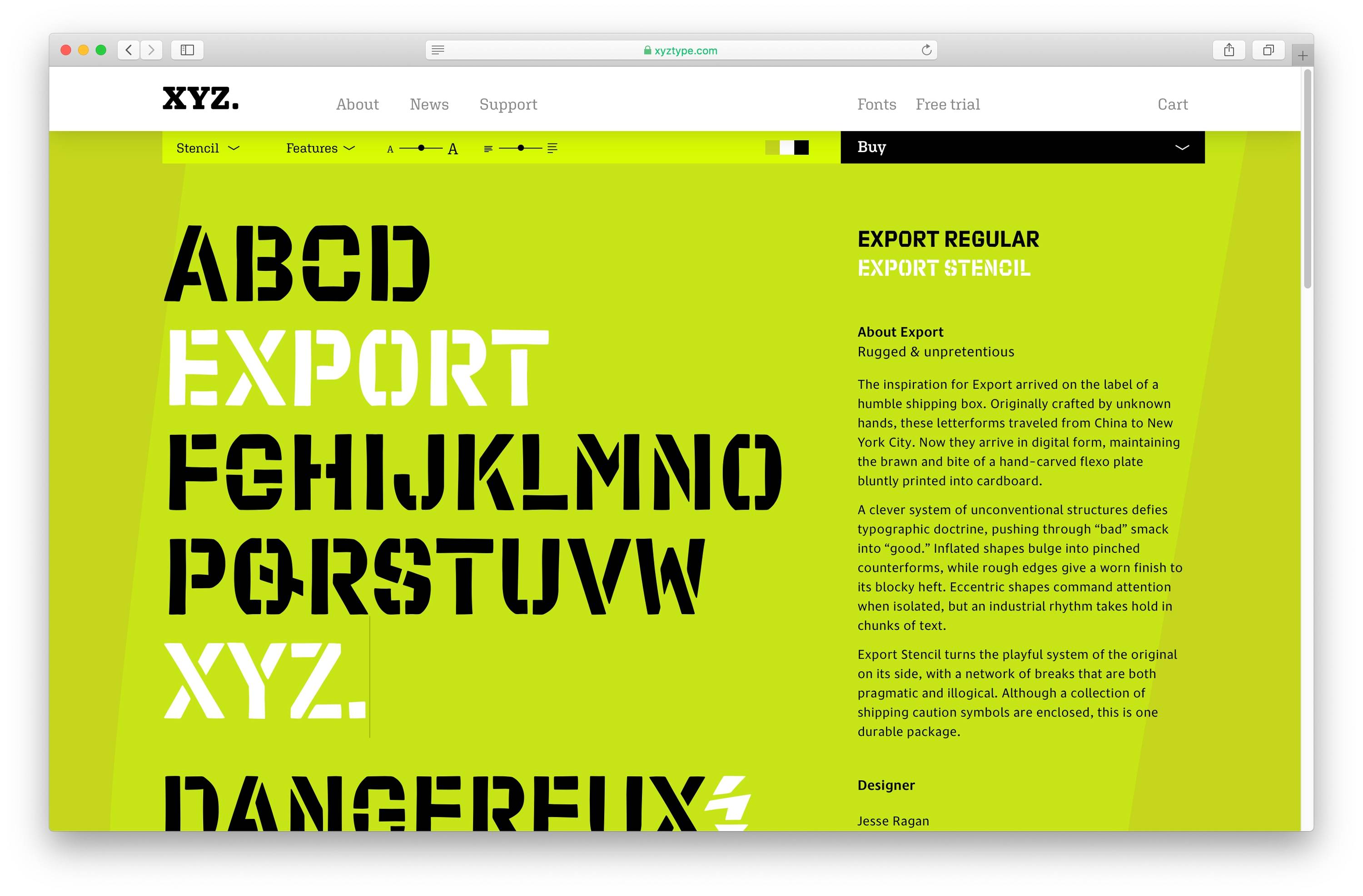
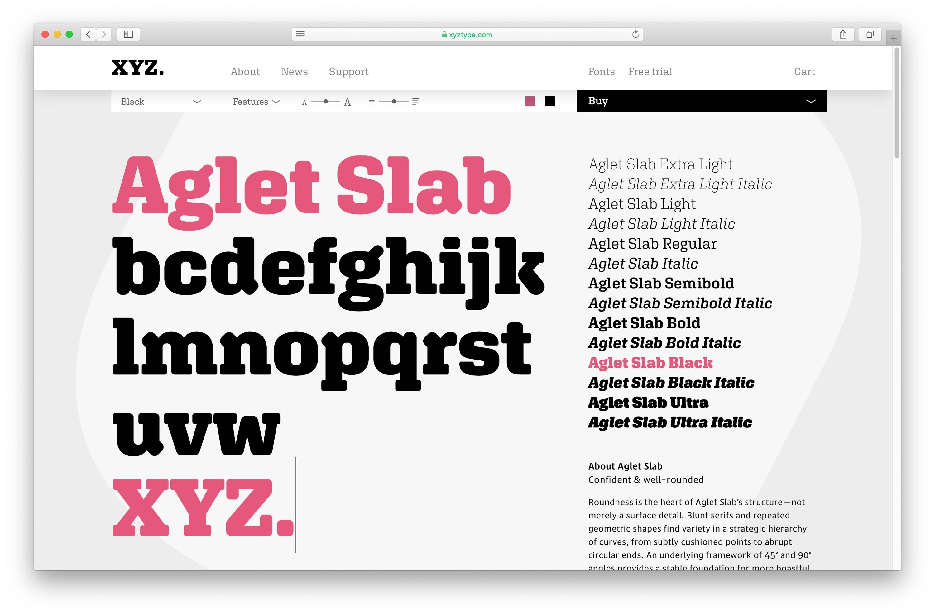
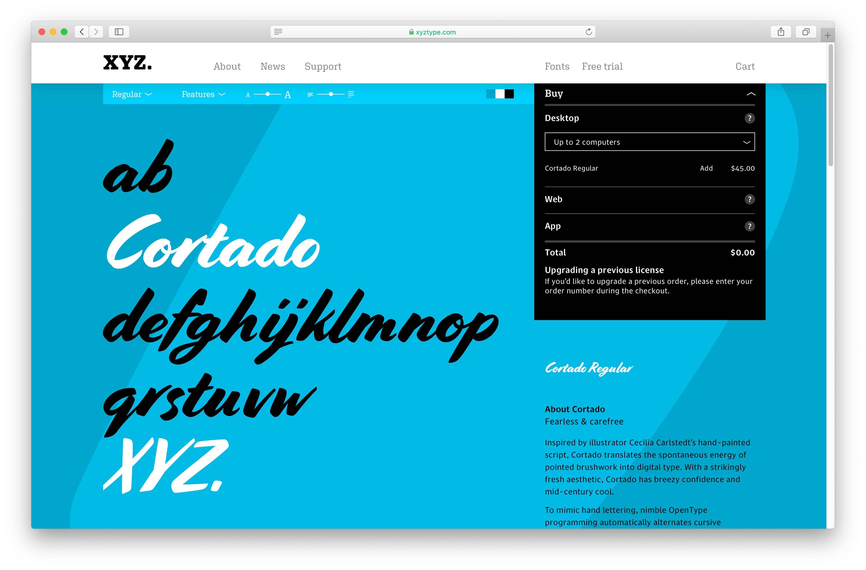
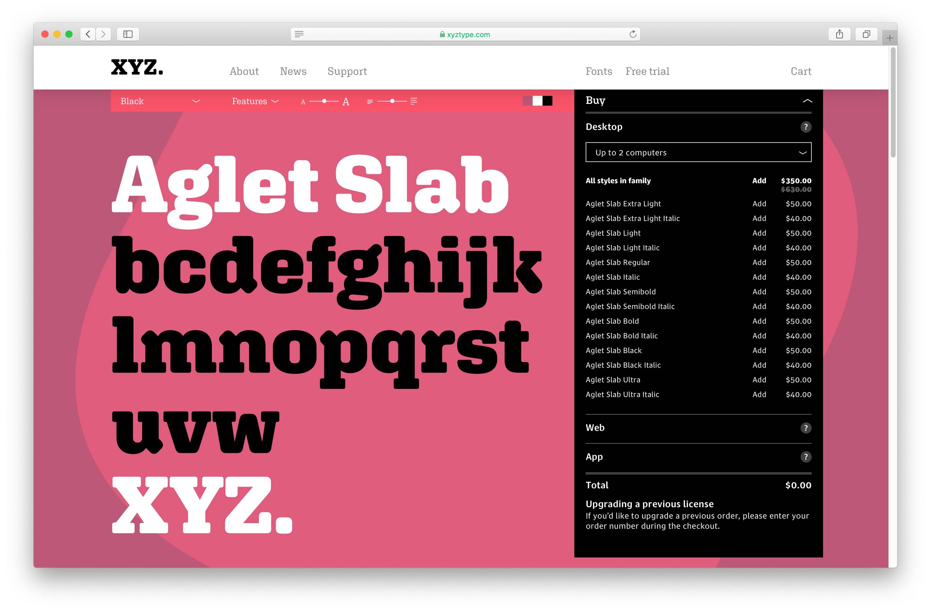
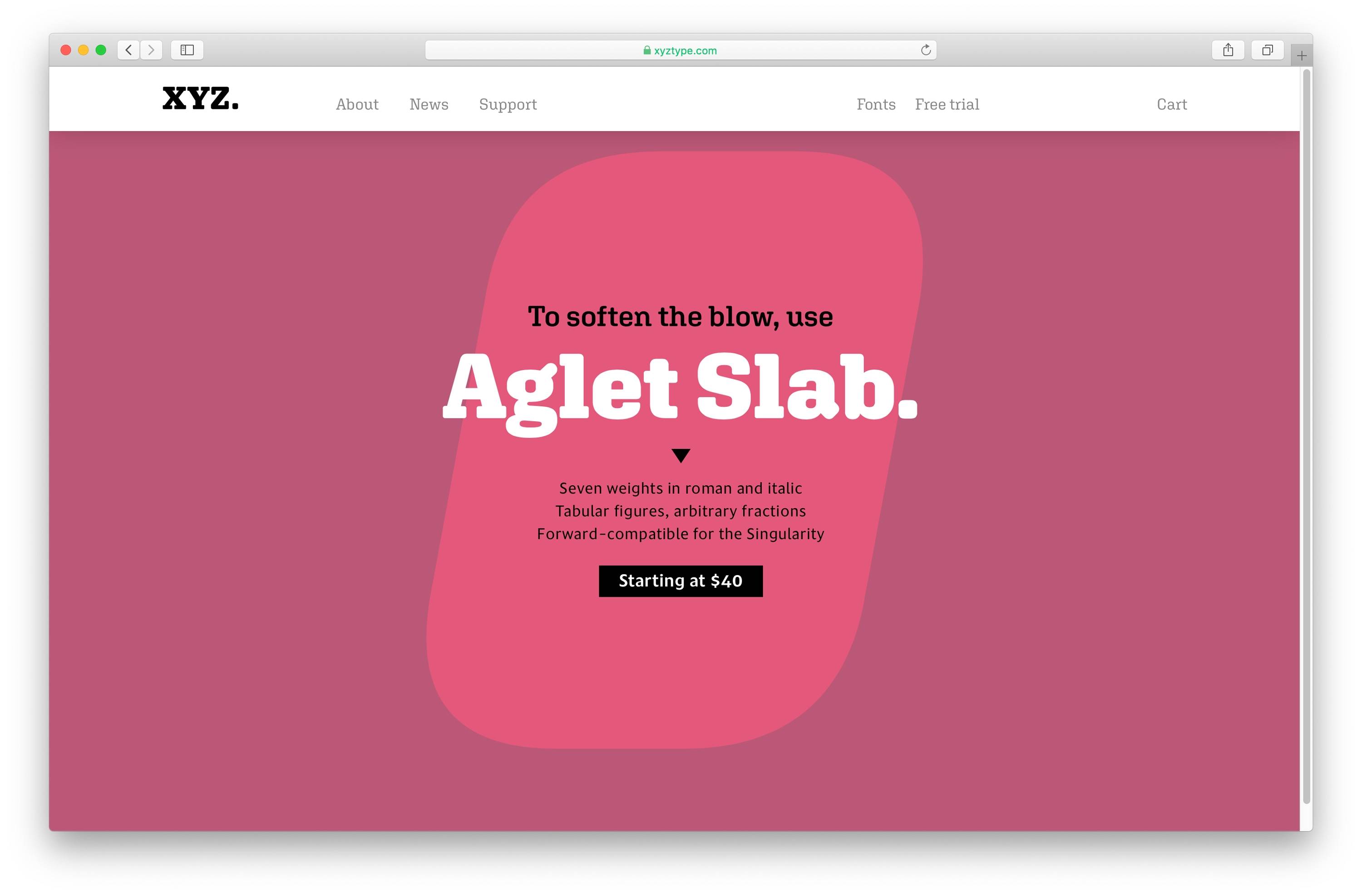
To illustrate the character of XYZ Type’s work graphically, we focused on a tiny typographic symbol as a recurring motif of the brand identity and the design system: the period. The structural simplicity of a single period can highlight the fundamental design details that distinguish one typeface from another and stand in perfectly as a representative of the intentionality and detail of the company's artistic product.
Website development by GrayBits
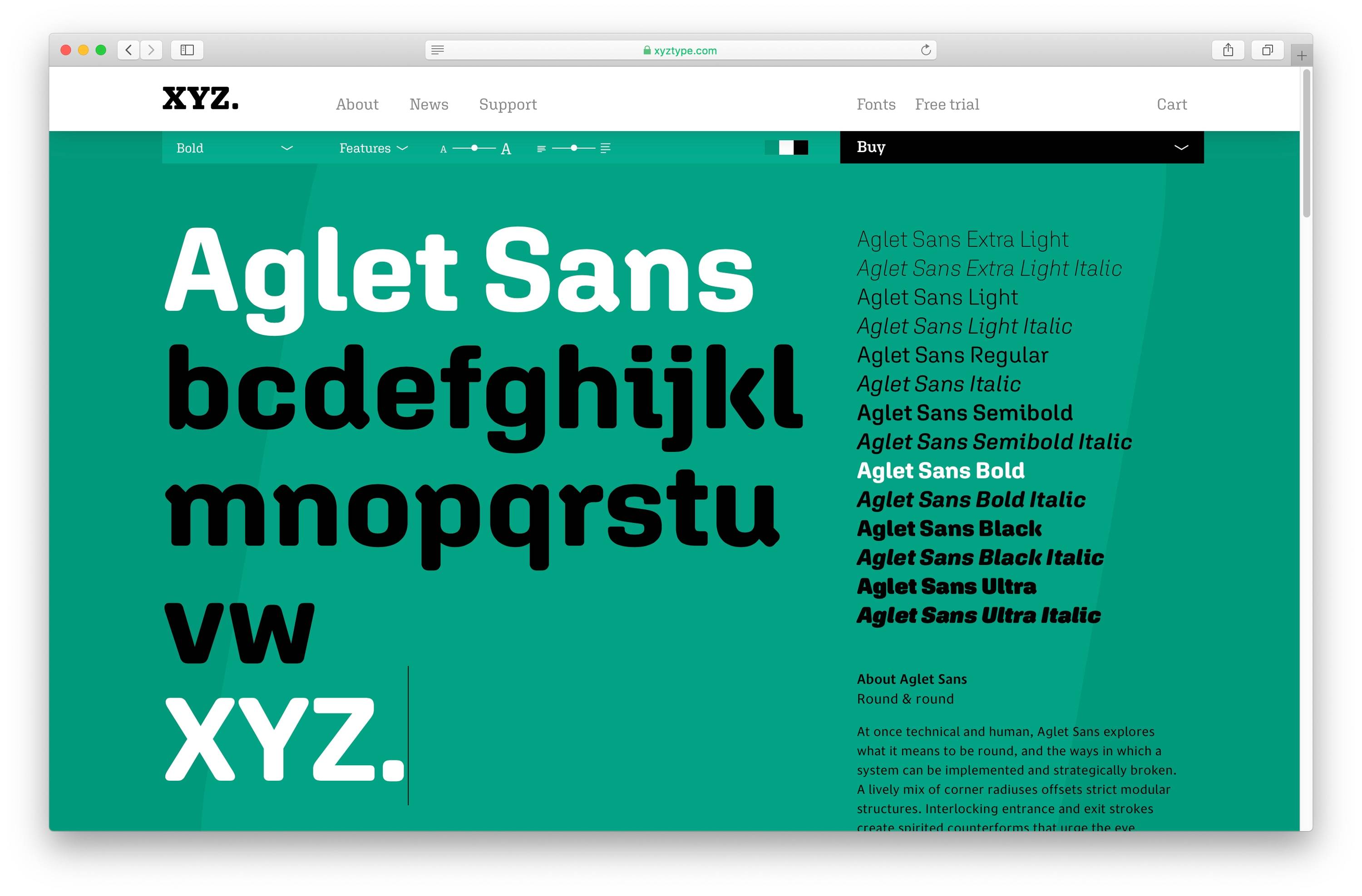
In our design, a randomized field of diverse periods from XYZ’s typefaces greets you when you arrive at the website's landing page, forming a playful interface to explore the products. In addition, an enormous period appears subtly in the background of each product page, adding a layer of texture and visual interest.
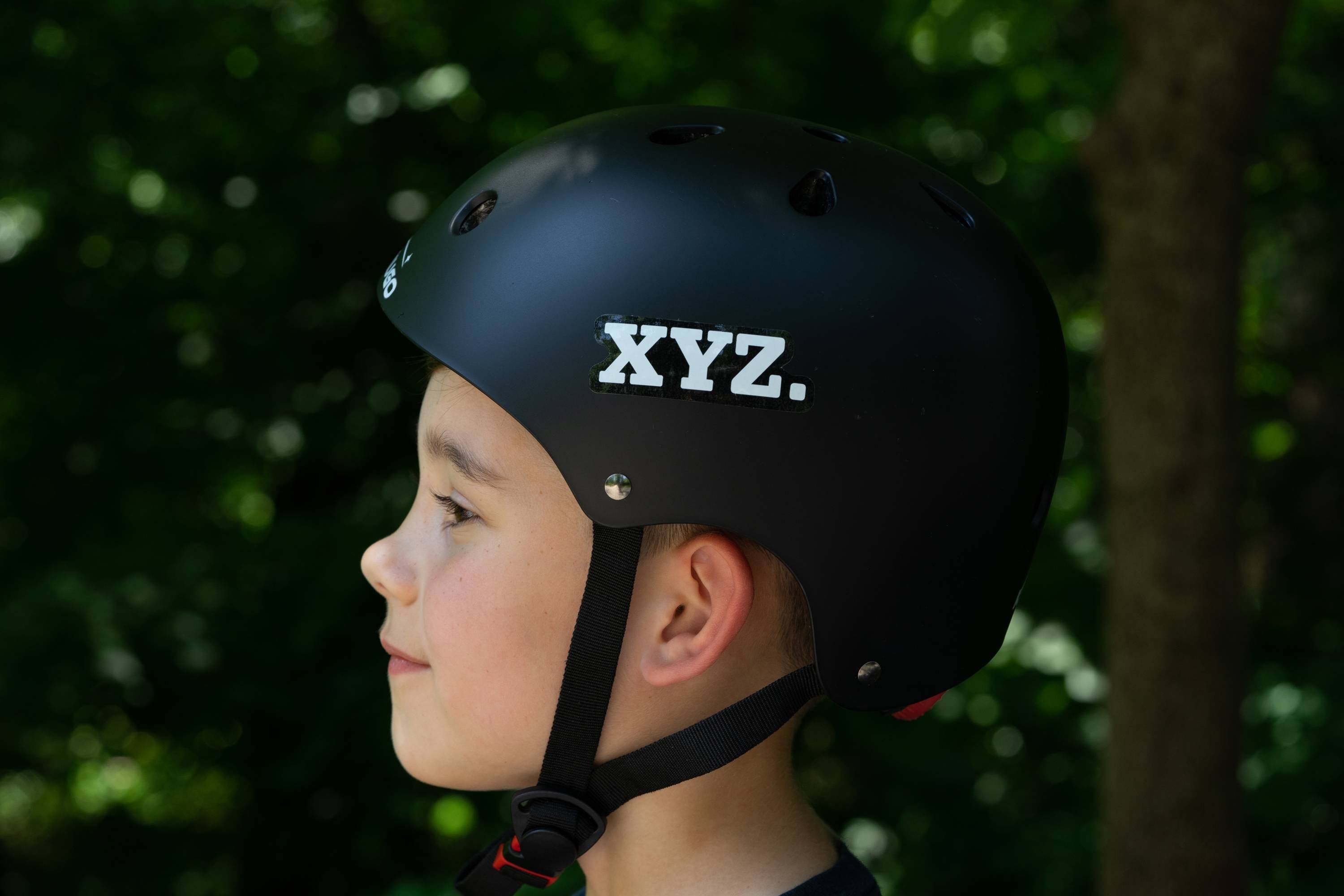
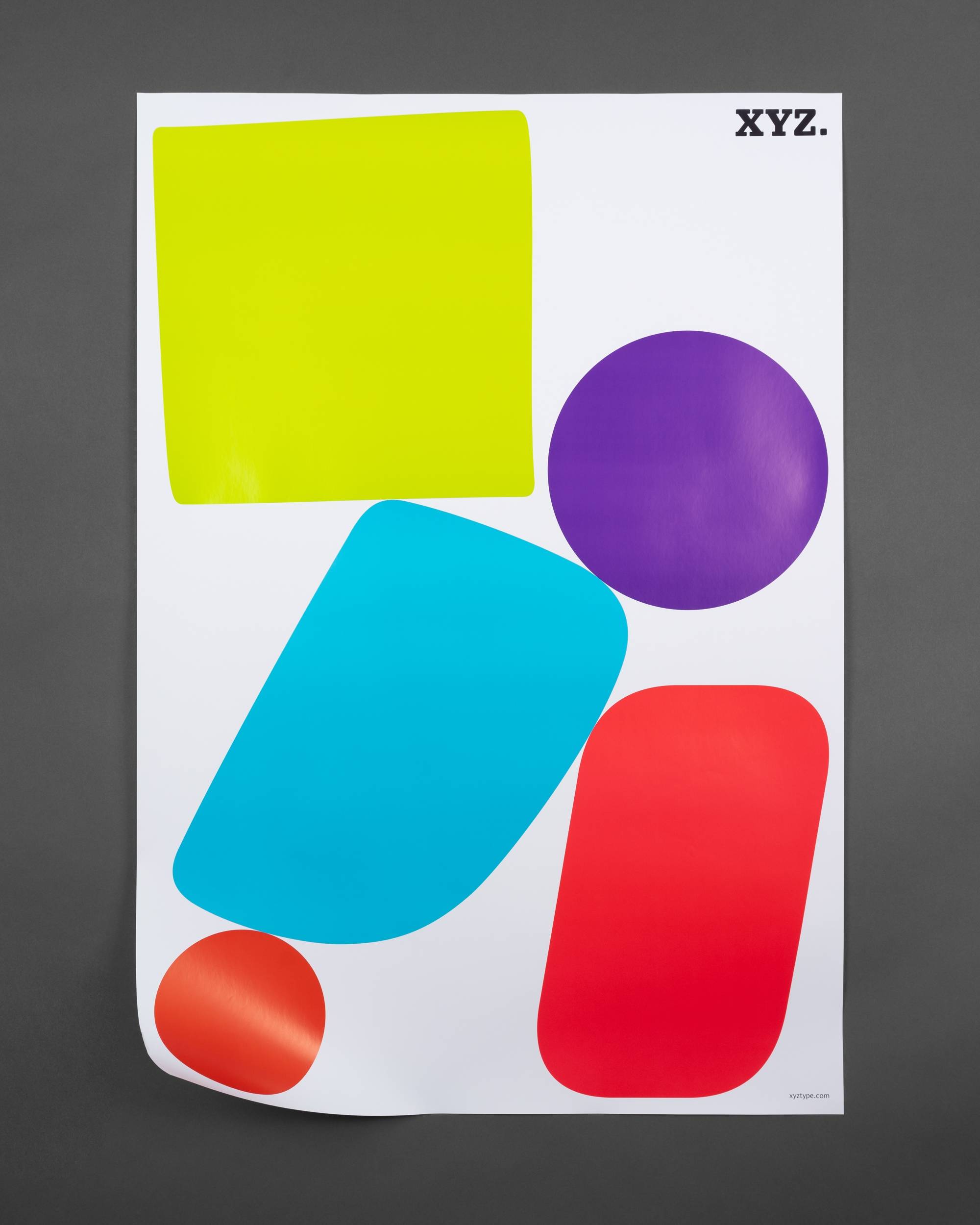
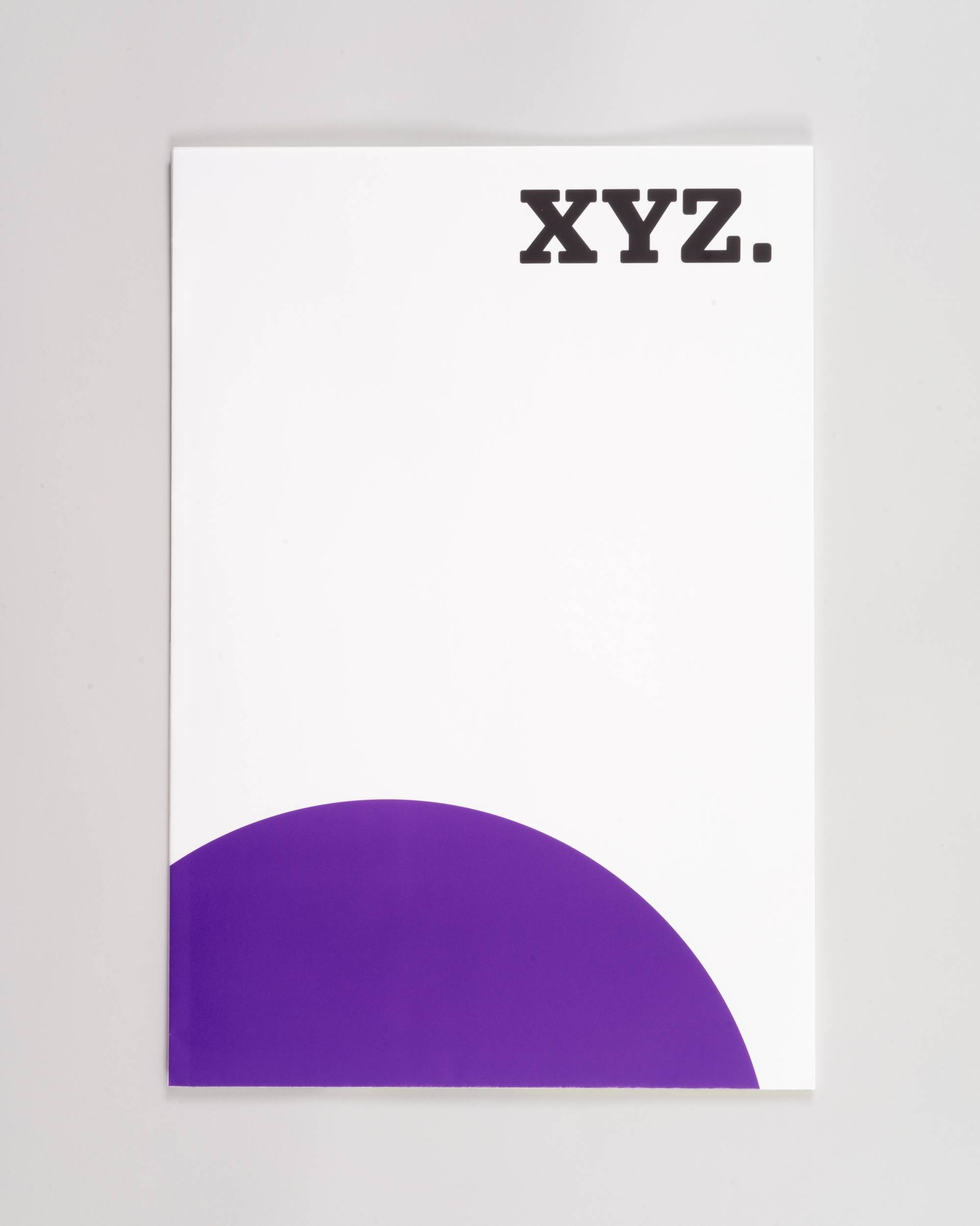
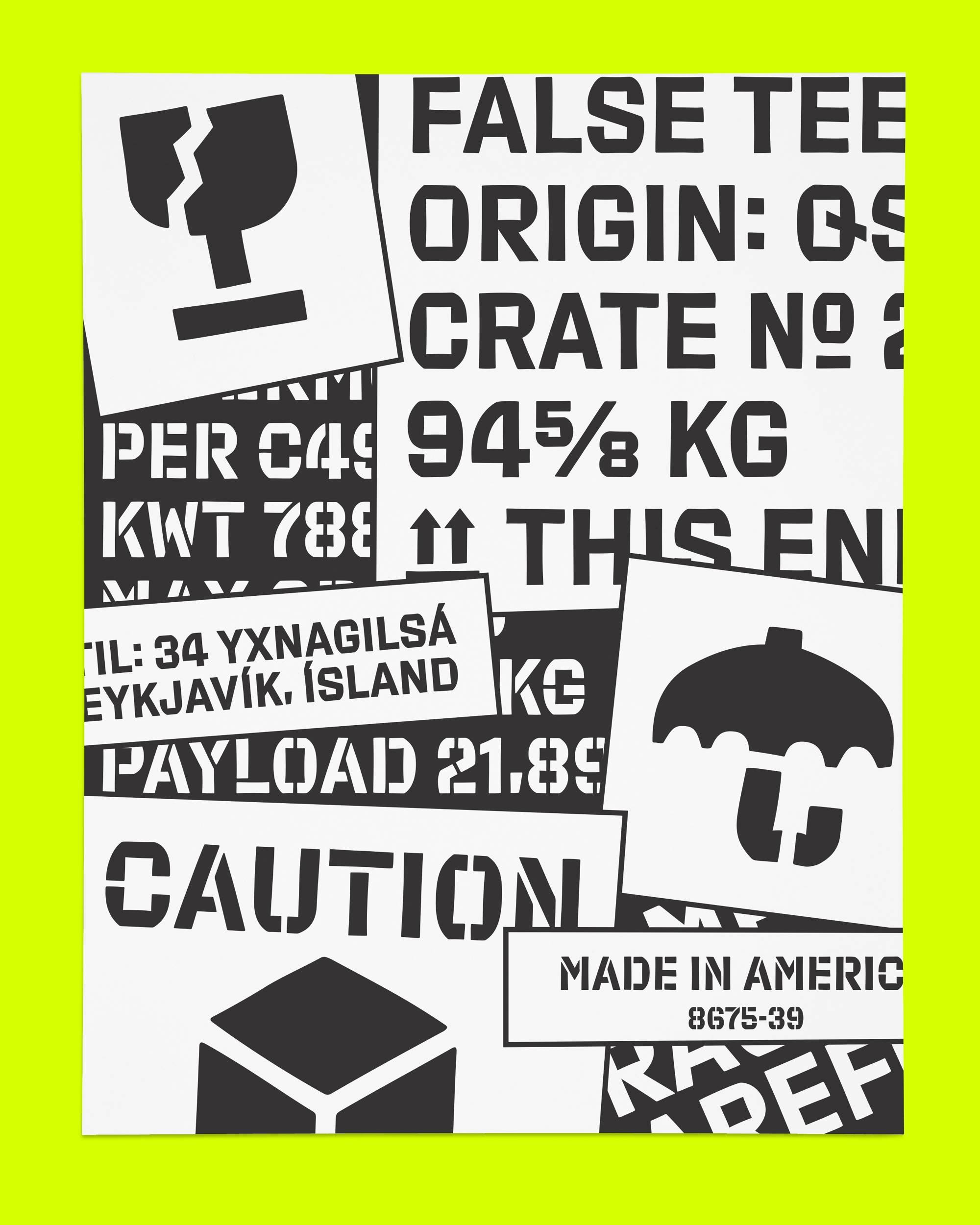
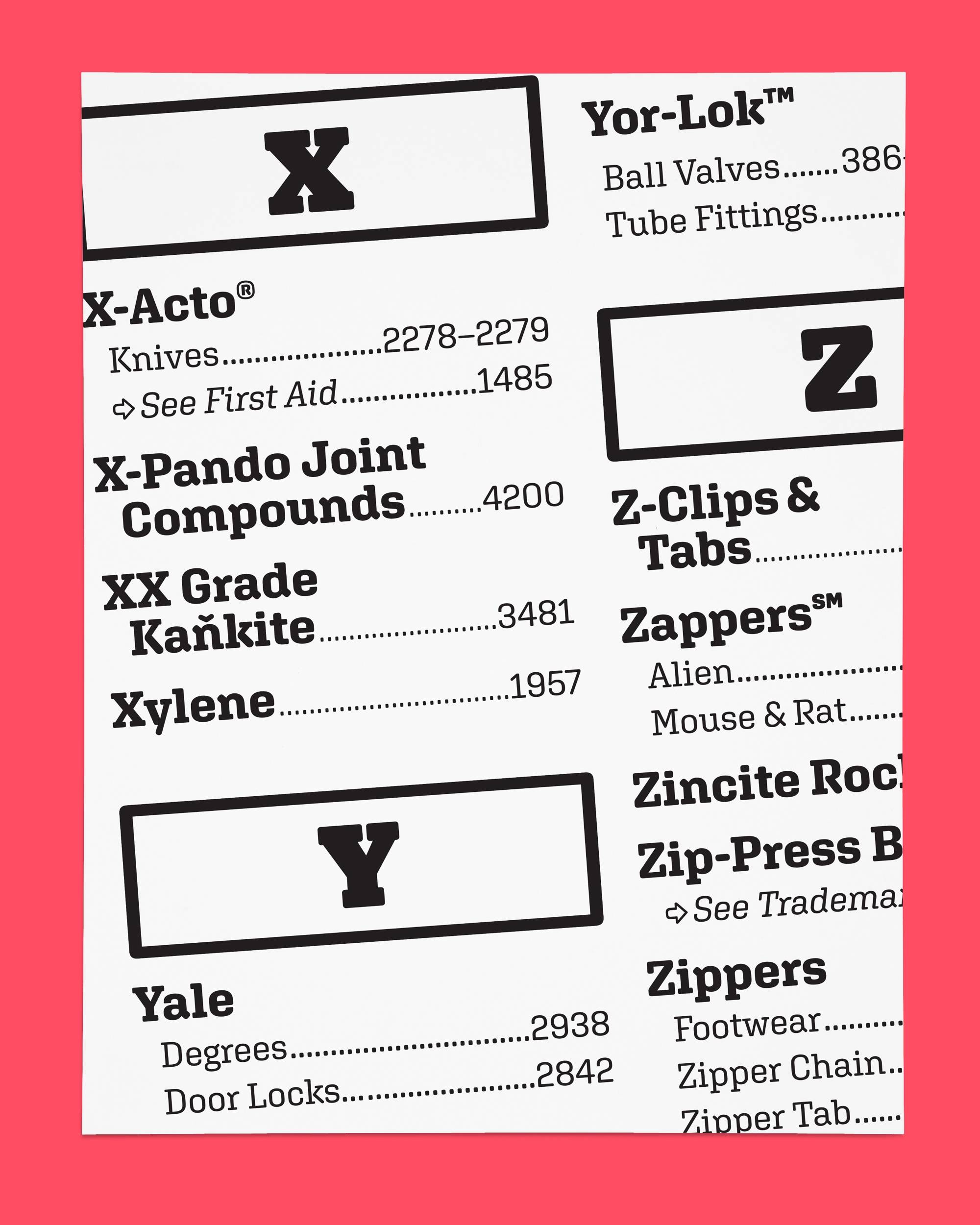
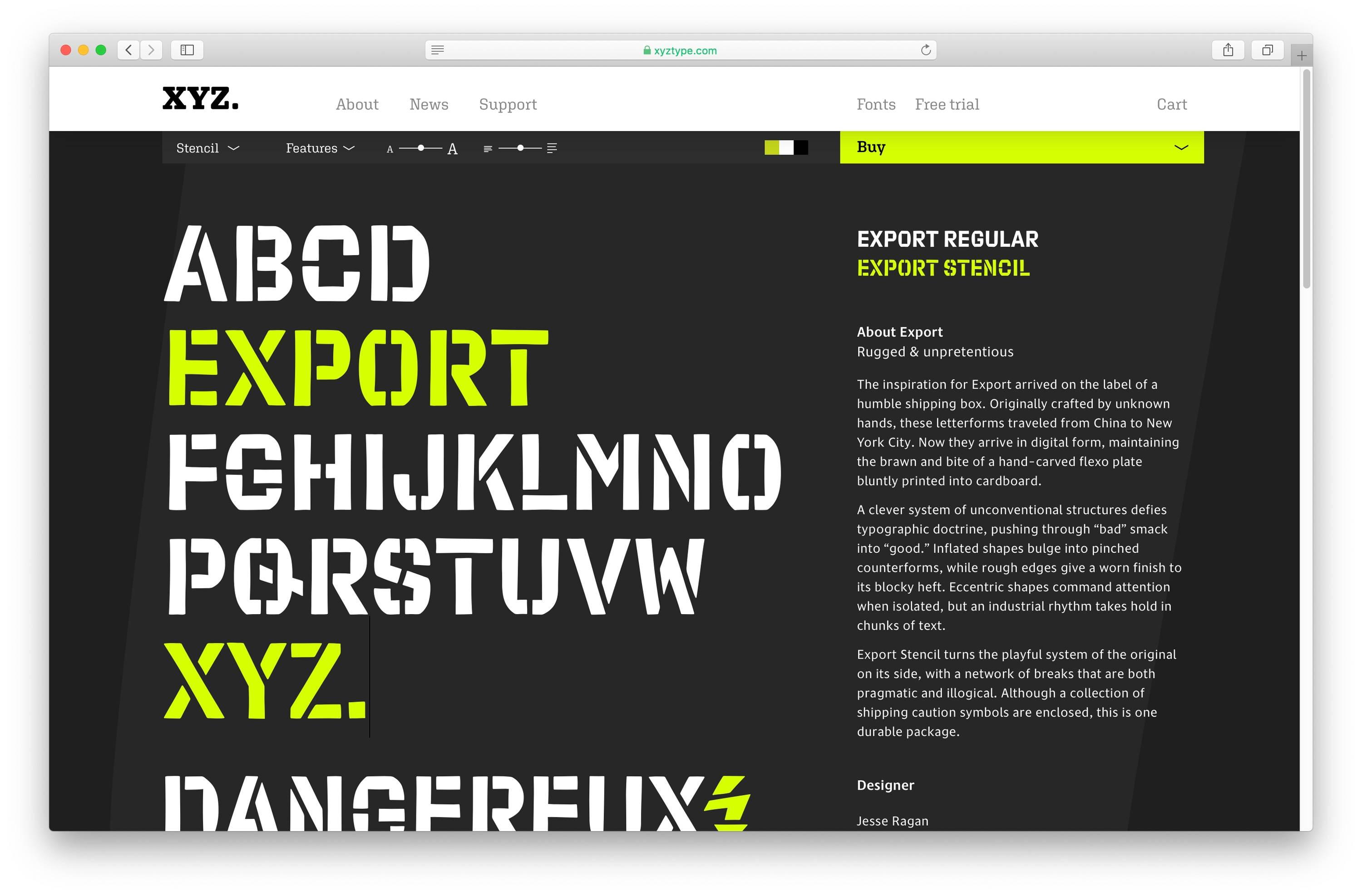
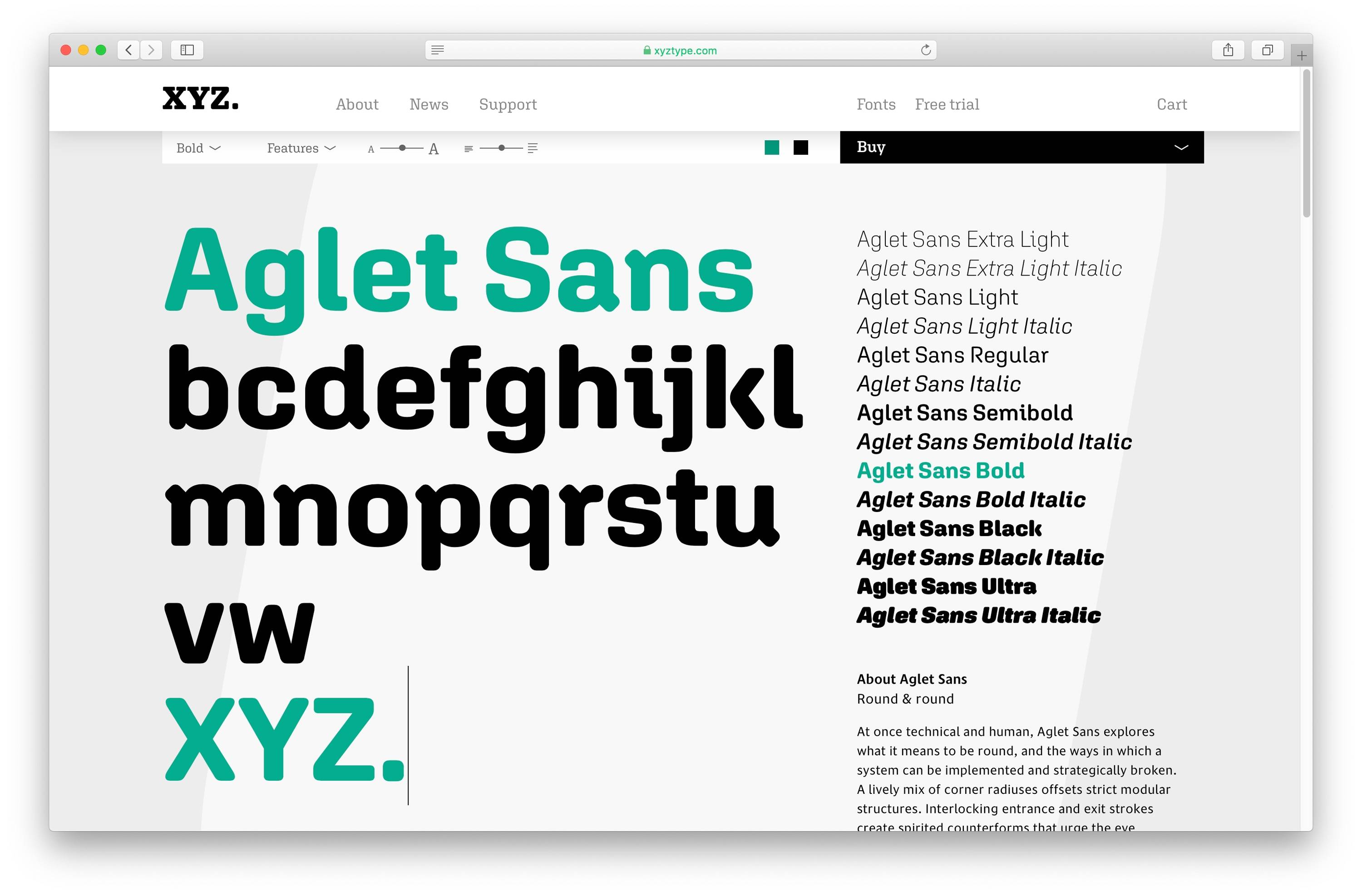
In Use