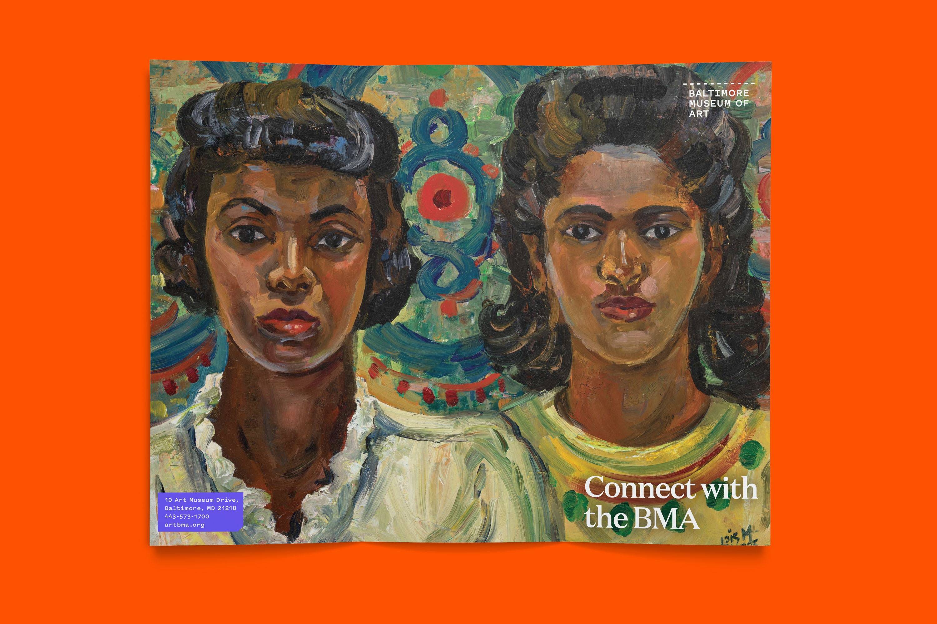
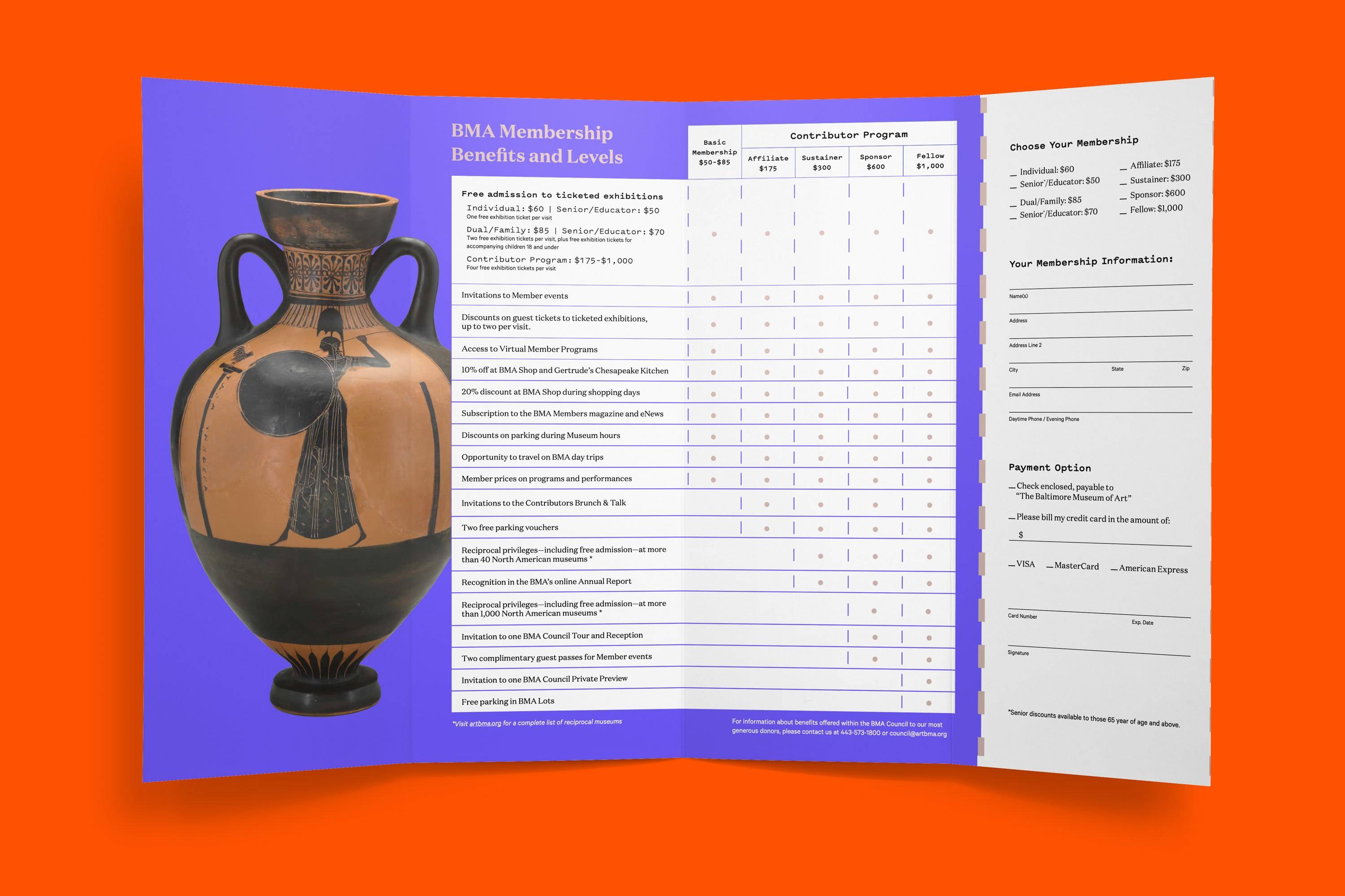
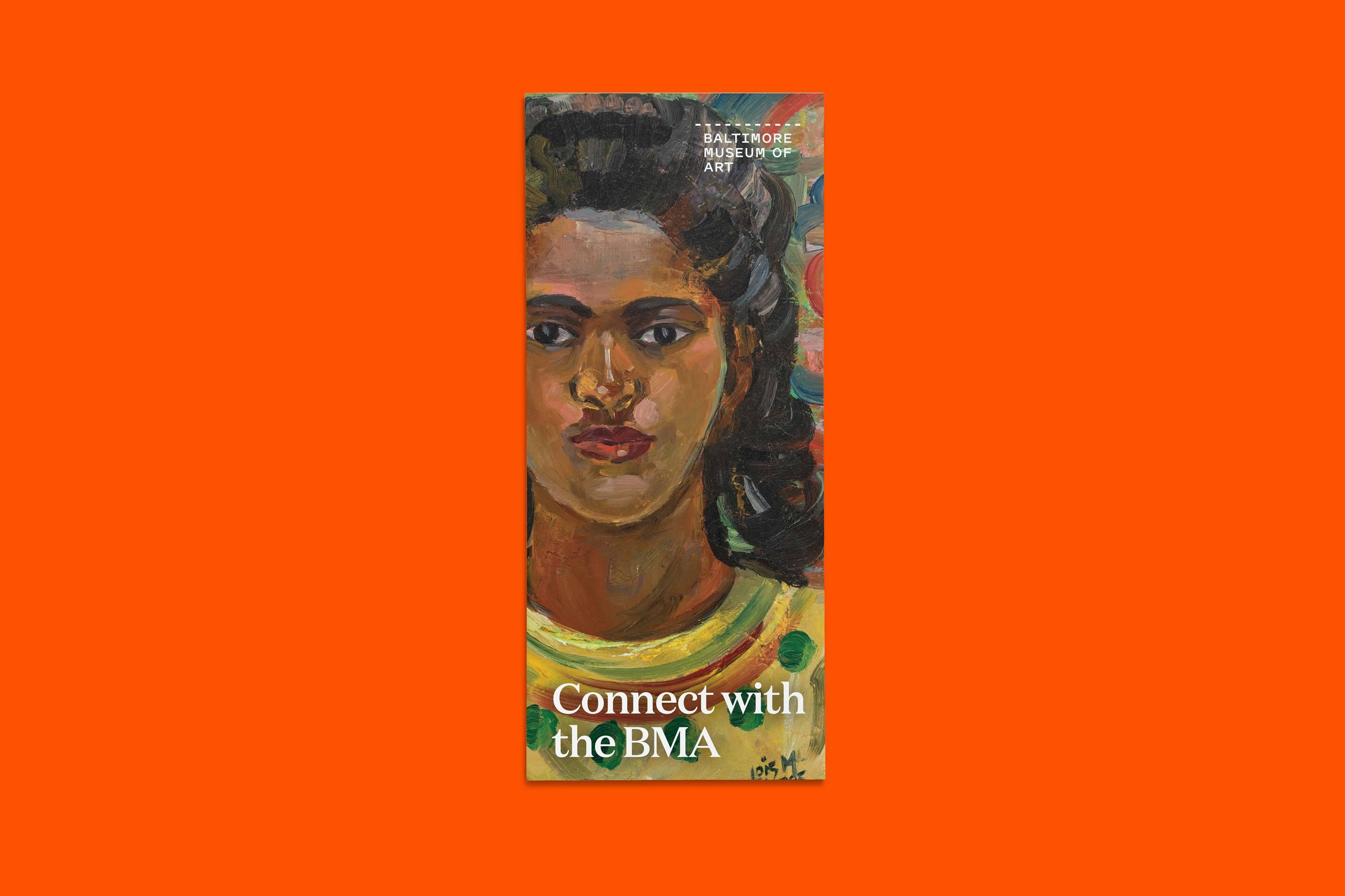
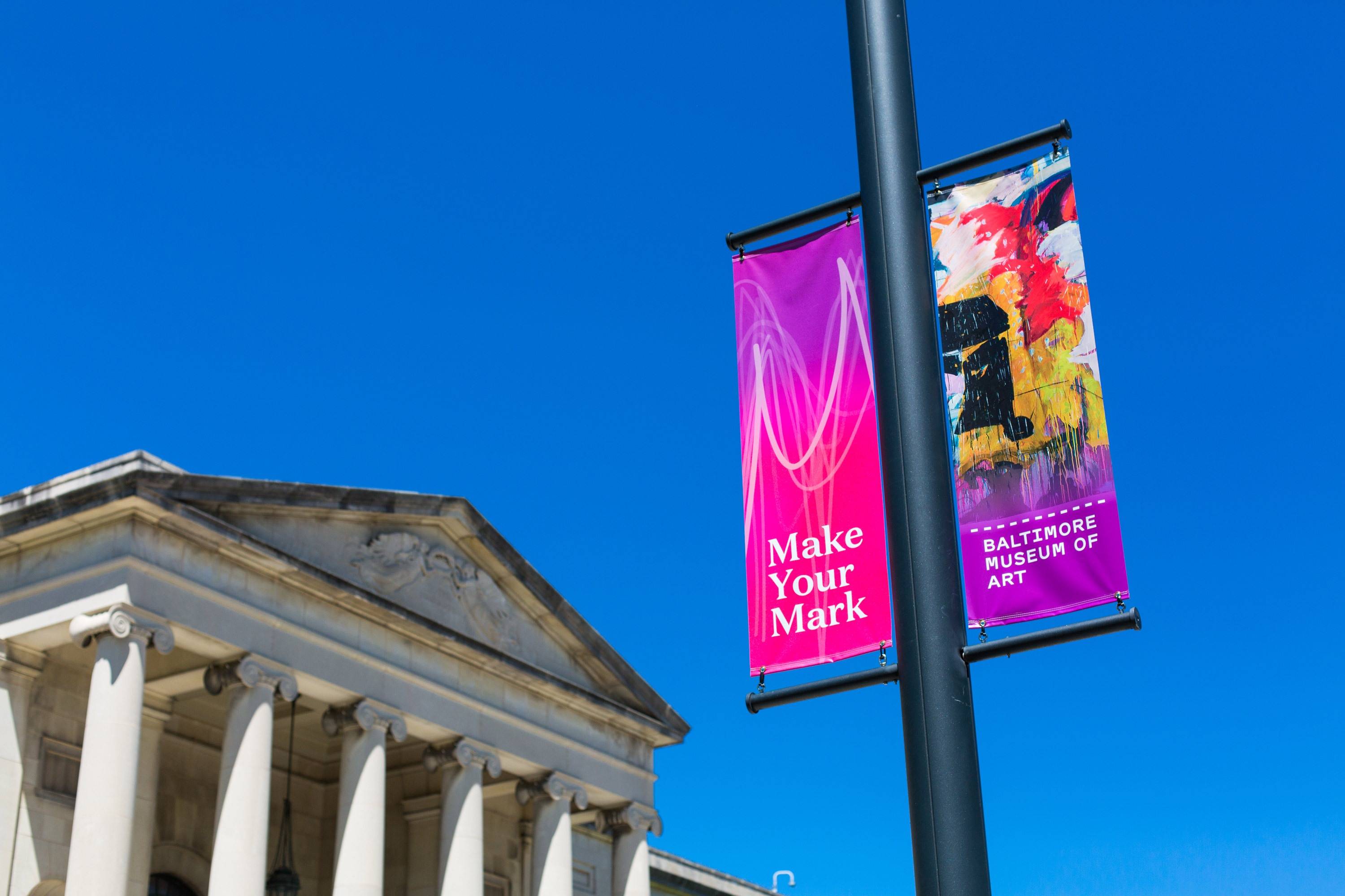
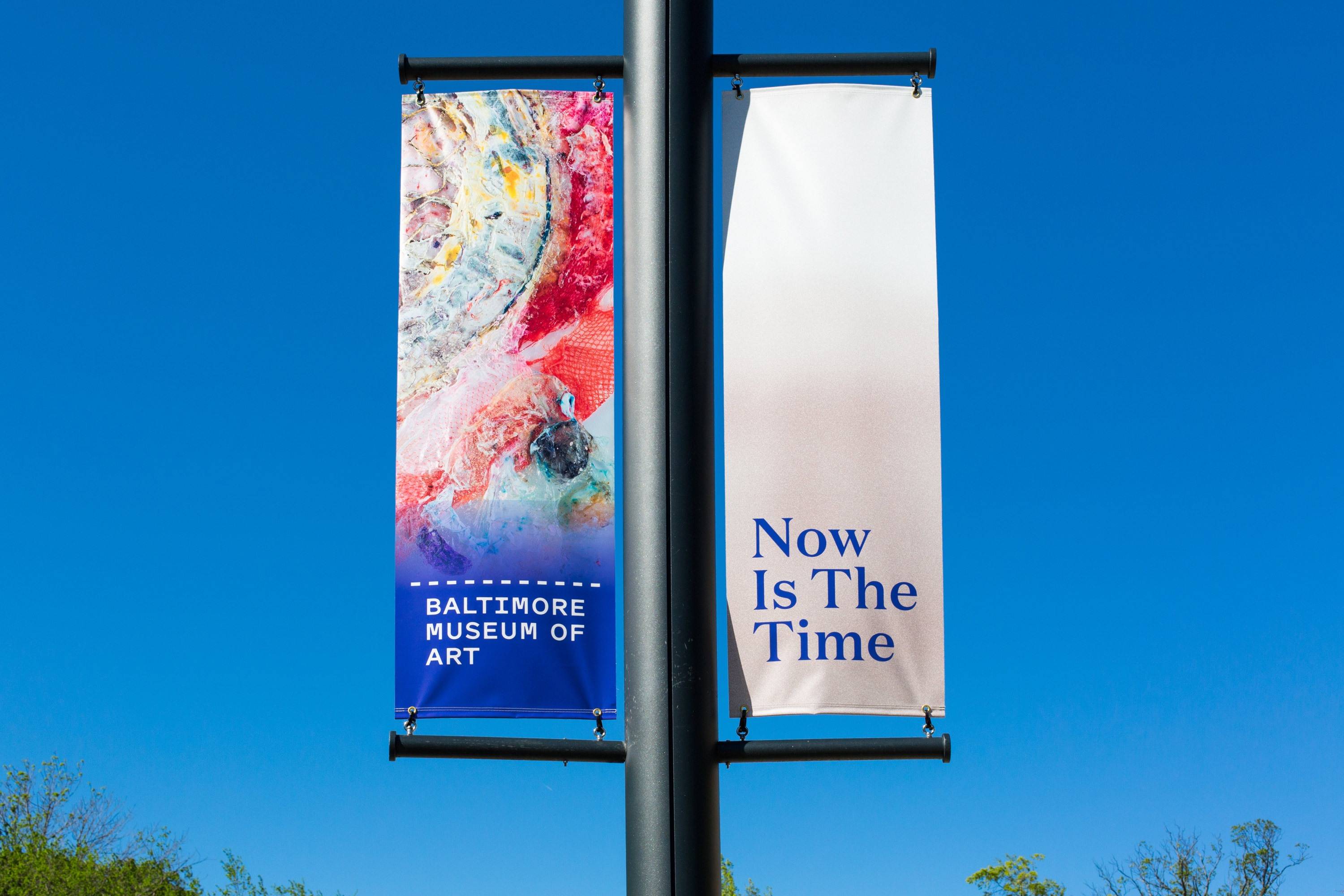
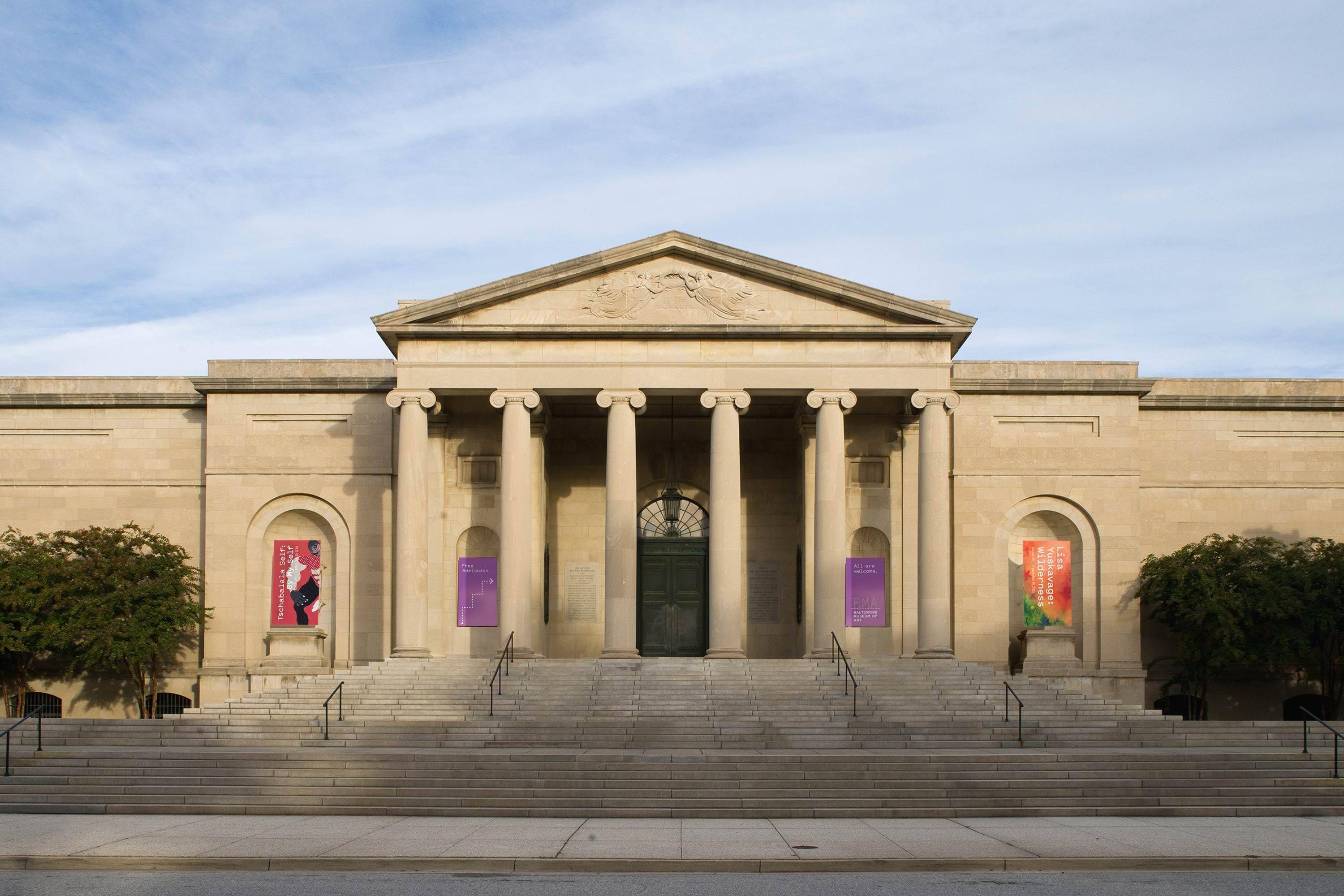
Baltimore Museum of Art
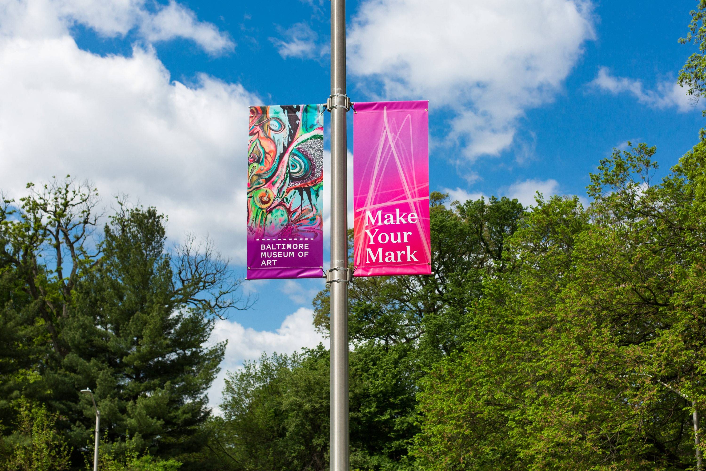
Make your mark.
The Baltimore Museum of Art (BMA) inspires people of all ages and backgrounds through exhibitions, programs, and collections that tell an expansive story of art—challenging long-held narratives and embracing new voices. Their collection includes more than 95,000 objects, the world’s largest public holding of works by Henri Matisse, one of the nation’s finest collections of prints, drawings, and photographs, and a rapidly growing number of works by contemporary artists of diverse backgrounds.

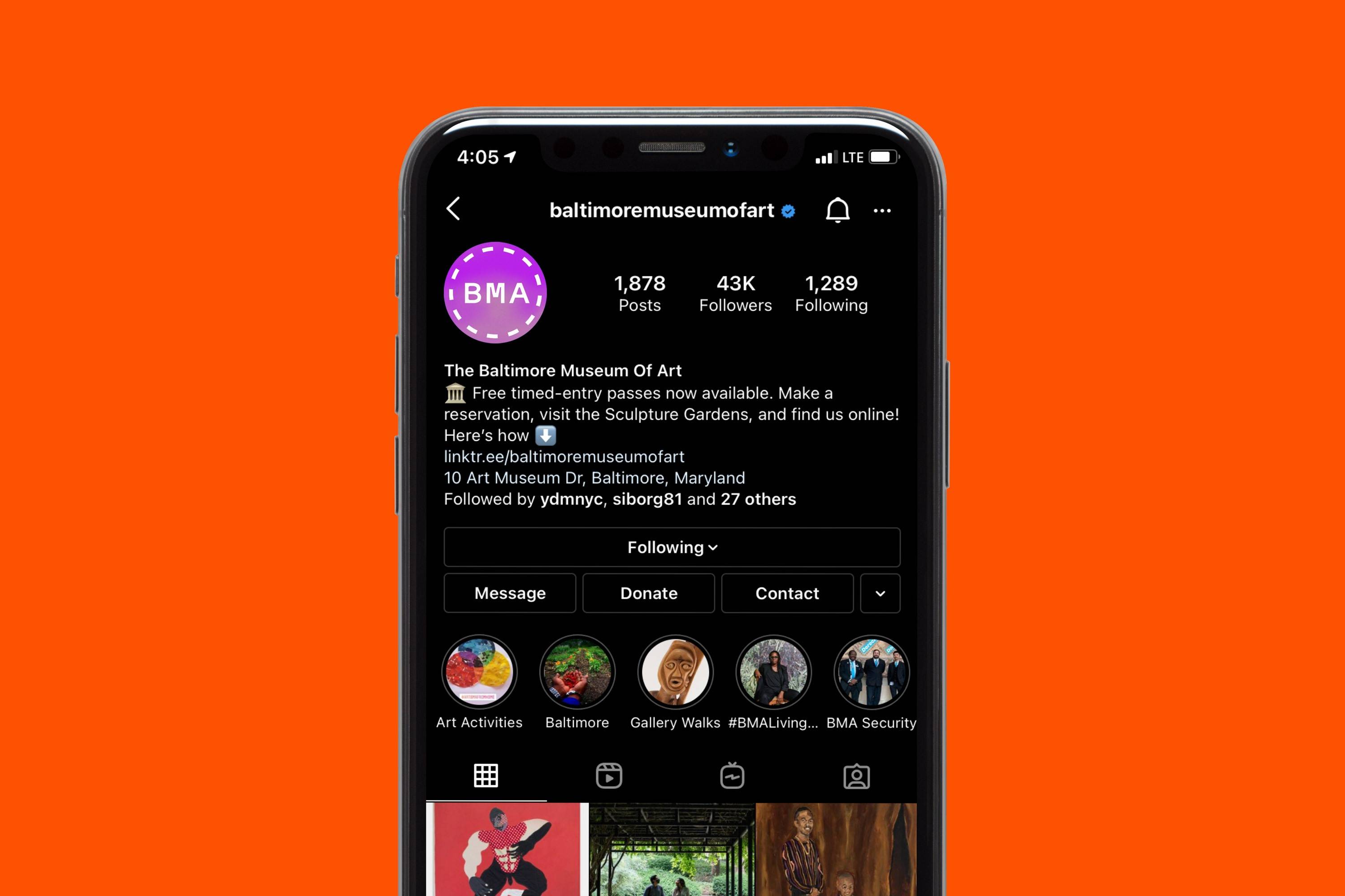
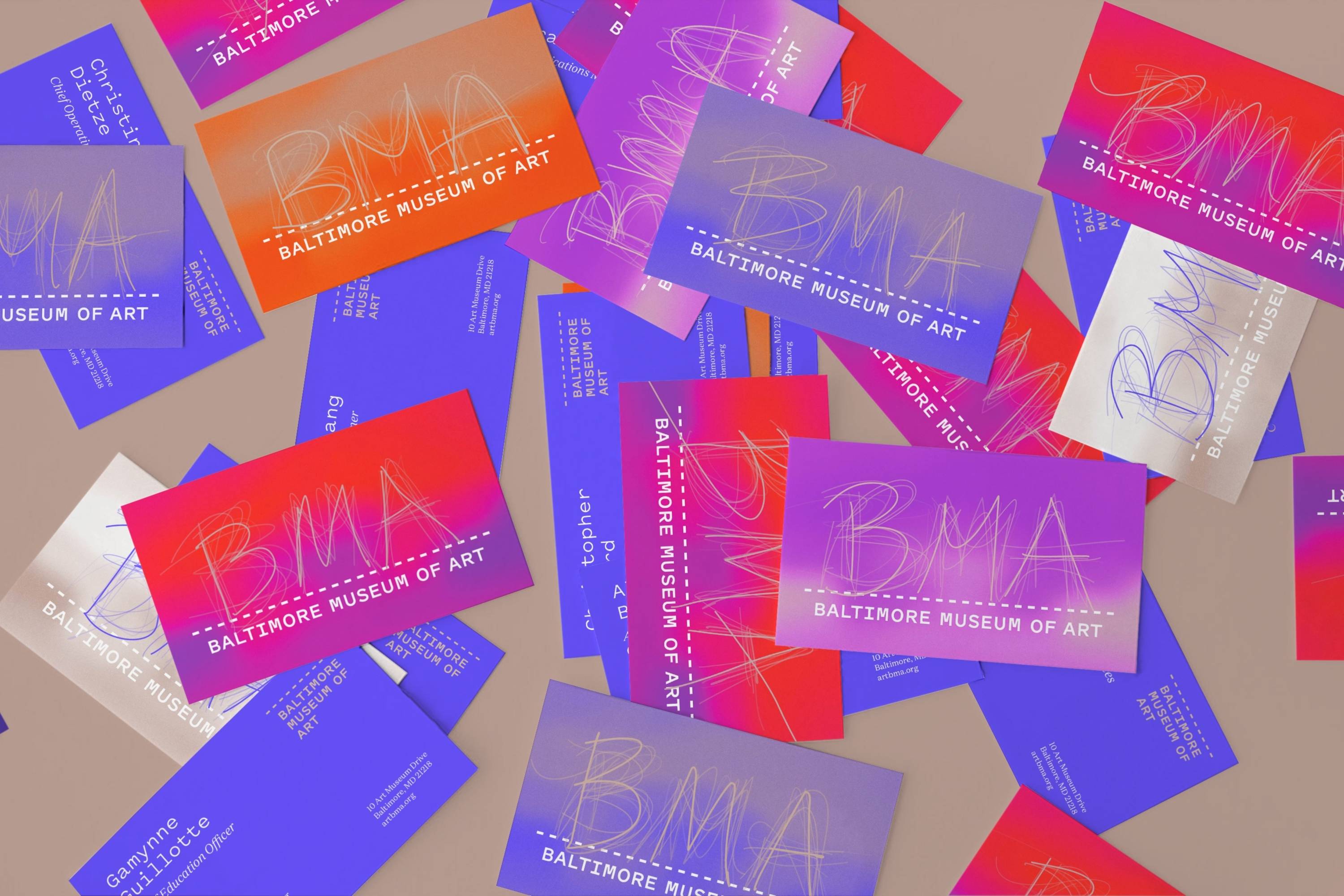
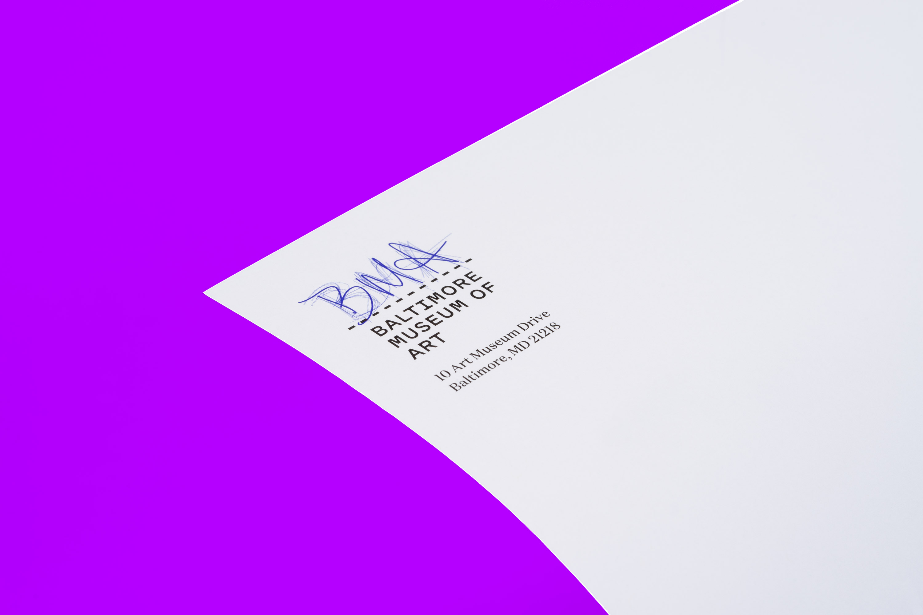
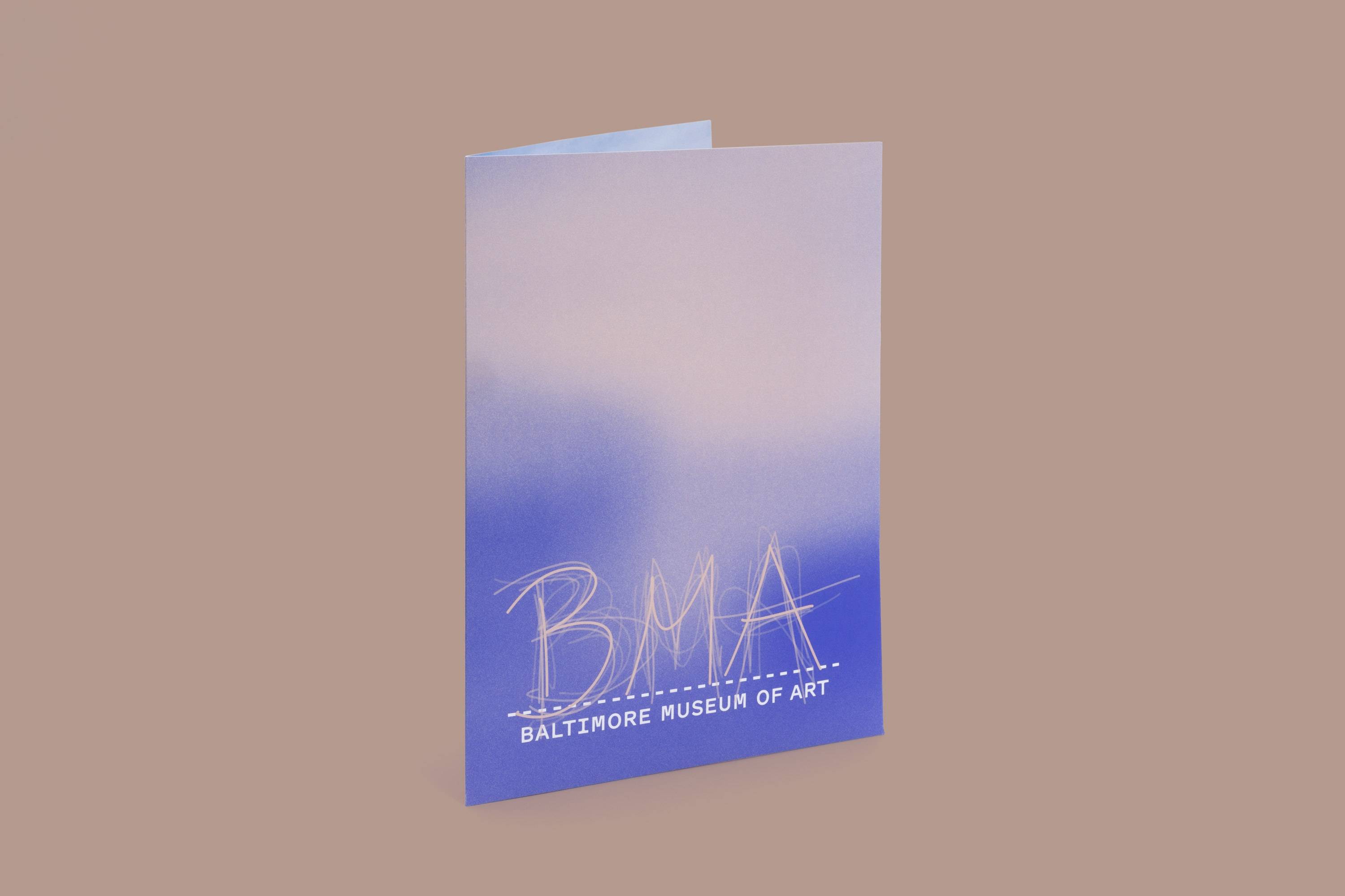
The Baltimore Museum of Art’s logo is comprised of marks made by the public. The logo’s two-part structure first positions the museum’s name, Baltimore Museum of Art, beneath a dashed line, communicating that the museum serves as a platform for creativity. The second portion, which is situated above the line, captures the museum’s acronym, BMA, as created by staff, visitors, and collaborators. The overlapping, handwritten marks come to represent a shared experience, open for all.
We won the bid to rebrand the museum after over a year of collaborative work with the BMA’s leadership, staff, and Baltimore-based designer Bruce Willen of Post Typography / Public Mechanics.
The process began in 2019 and the BMA’s new brand identity launched in May 2021.
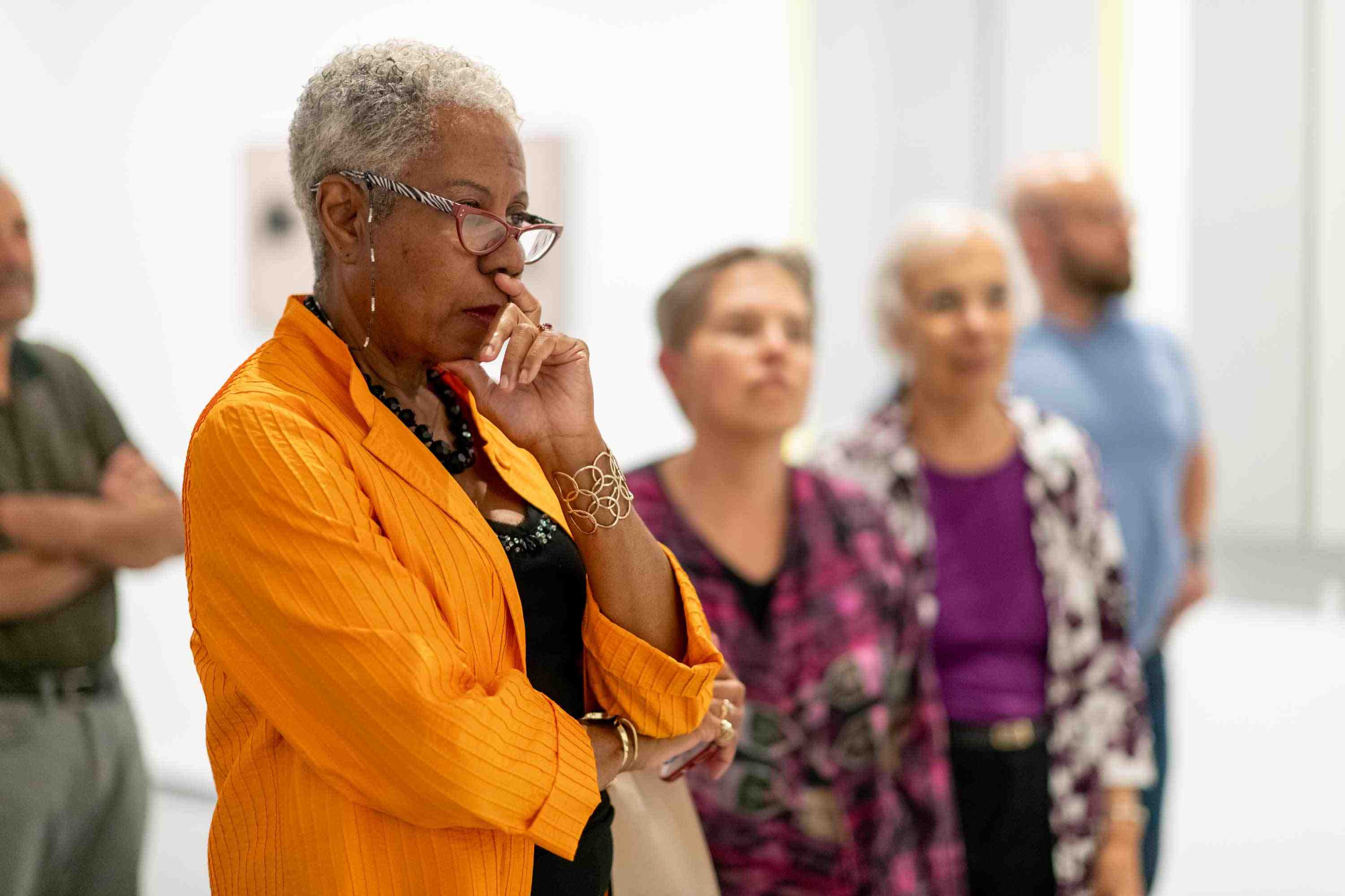
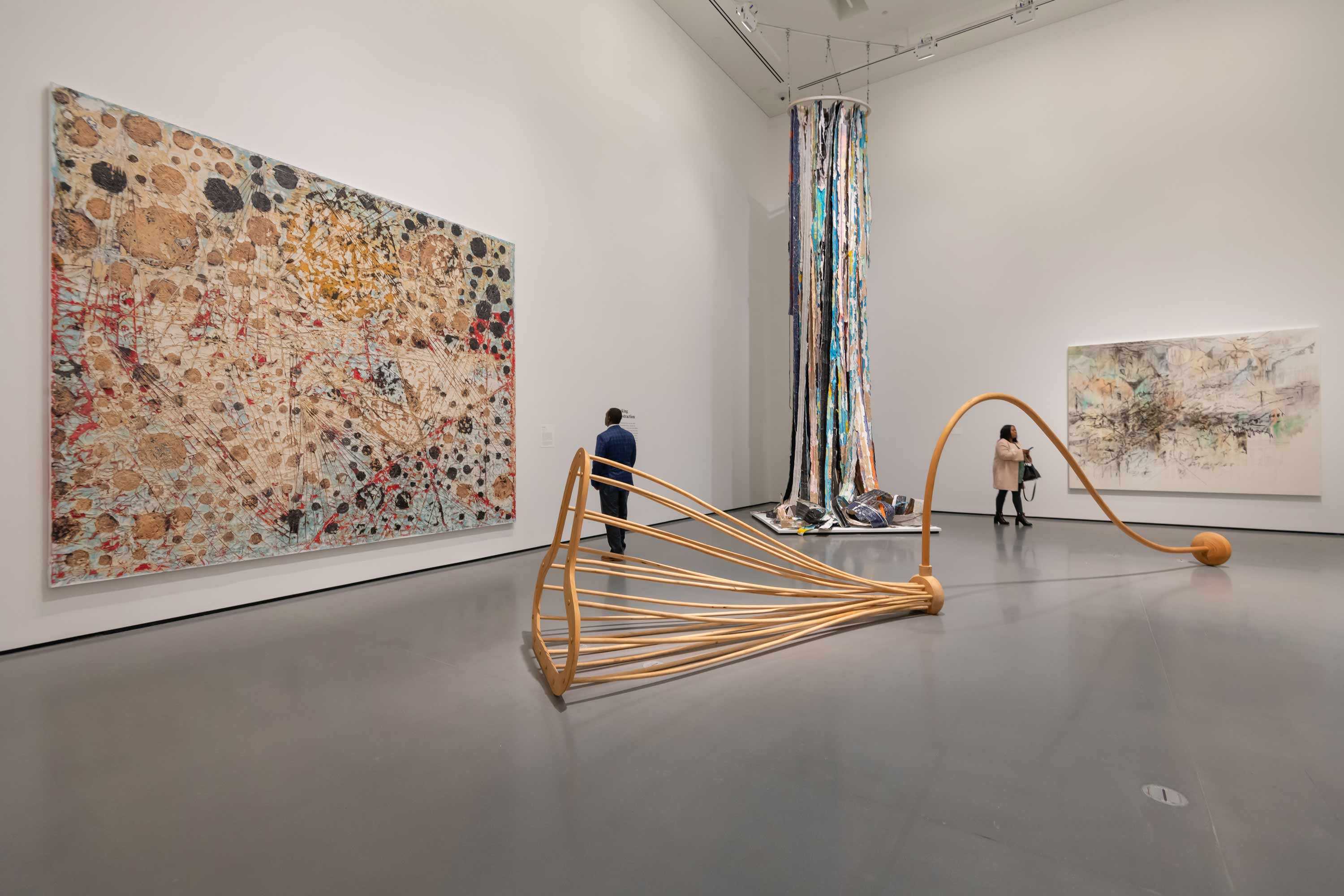
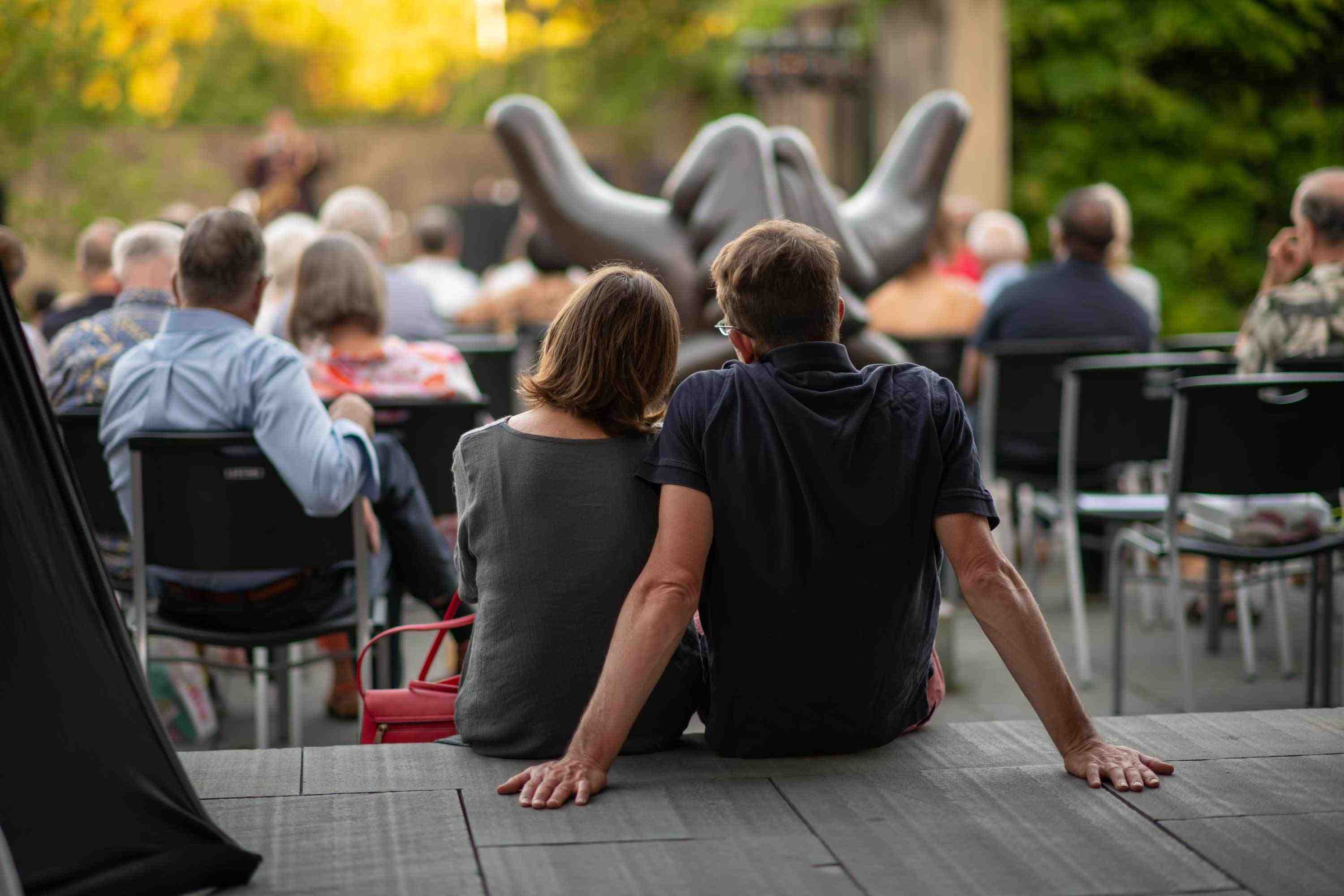
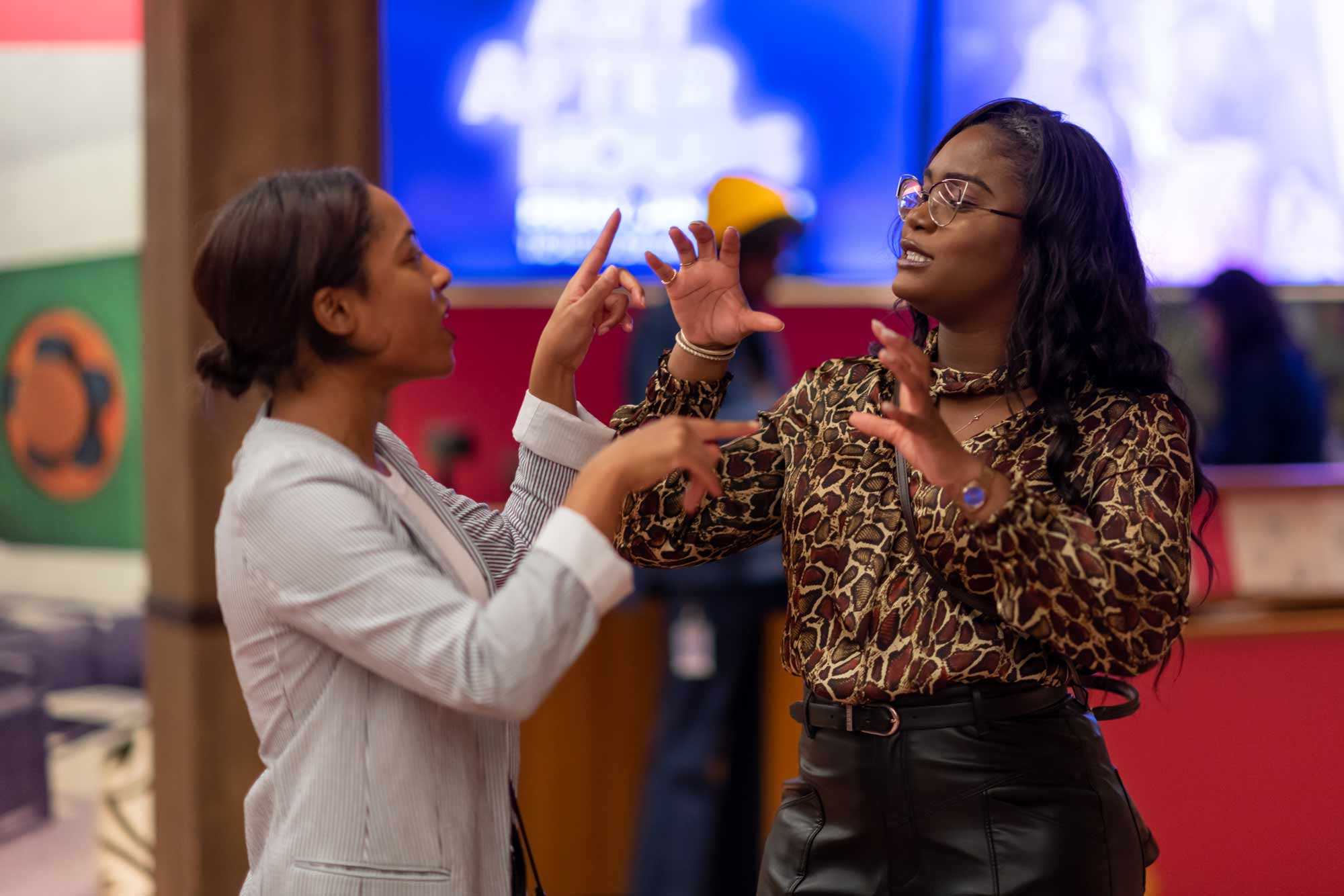

Photographs by Max Franz
Context
The BMA spent four months interviewing their known community and Baltimoreans at large to better understand how the museum is perceived. This led them to determine that its work and branding should be guided by four essential traits: Honesty, Vibrancy, Empathy, and Fearlessness.
From there, we established three central questions to guide the design. What logo can connect the BMA and Baltimore? What logo is a manifestation of a truly shared experience? What graphic system reflects aspects of the brand personality?
Brand Identity Elements
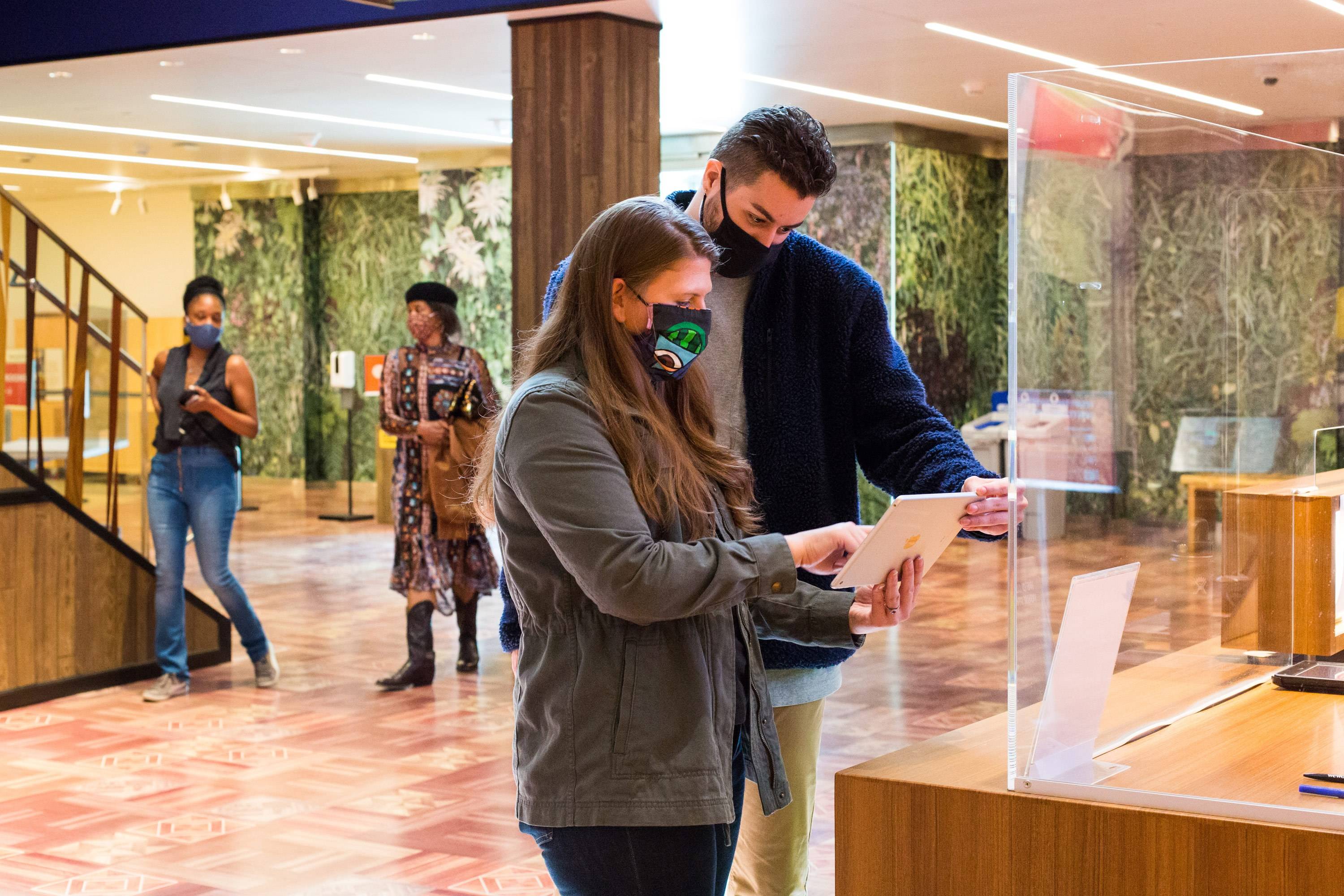
To visually articulate the BMA’s commitment to inclusivity, particularly in the way it signifies how the museum’s identity comes from its community, we developed a digital system that allows the public to contribute their own unique marks to the new logo. This makes the logo an ever-changing manifestation of its audiences and their engagement with the institution.

We started by identifying a relational color system that reflects the BMA’s personality and honors the museum’s process-driven sensibility.
To connote Honesty, we looked at where the BMA began, with the gift of a work called “Mischief” by William Sergeant Kendall. We calculated the average color value of the work, and the resultant tan hue became the starting point for our institutional color system.
From there, we developed a color value for Vibrant by fully saturating the honest hue, arriving at an orange-red.
For Empathetic, a warm purple is color-analogous to vibrant.
Finally, for Fearless, we chose a color that defies description, a hue somewhere between purple and blue.
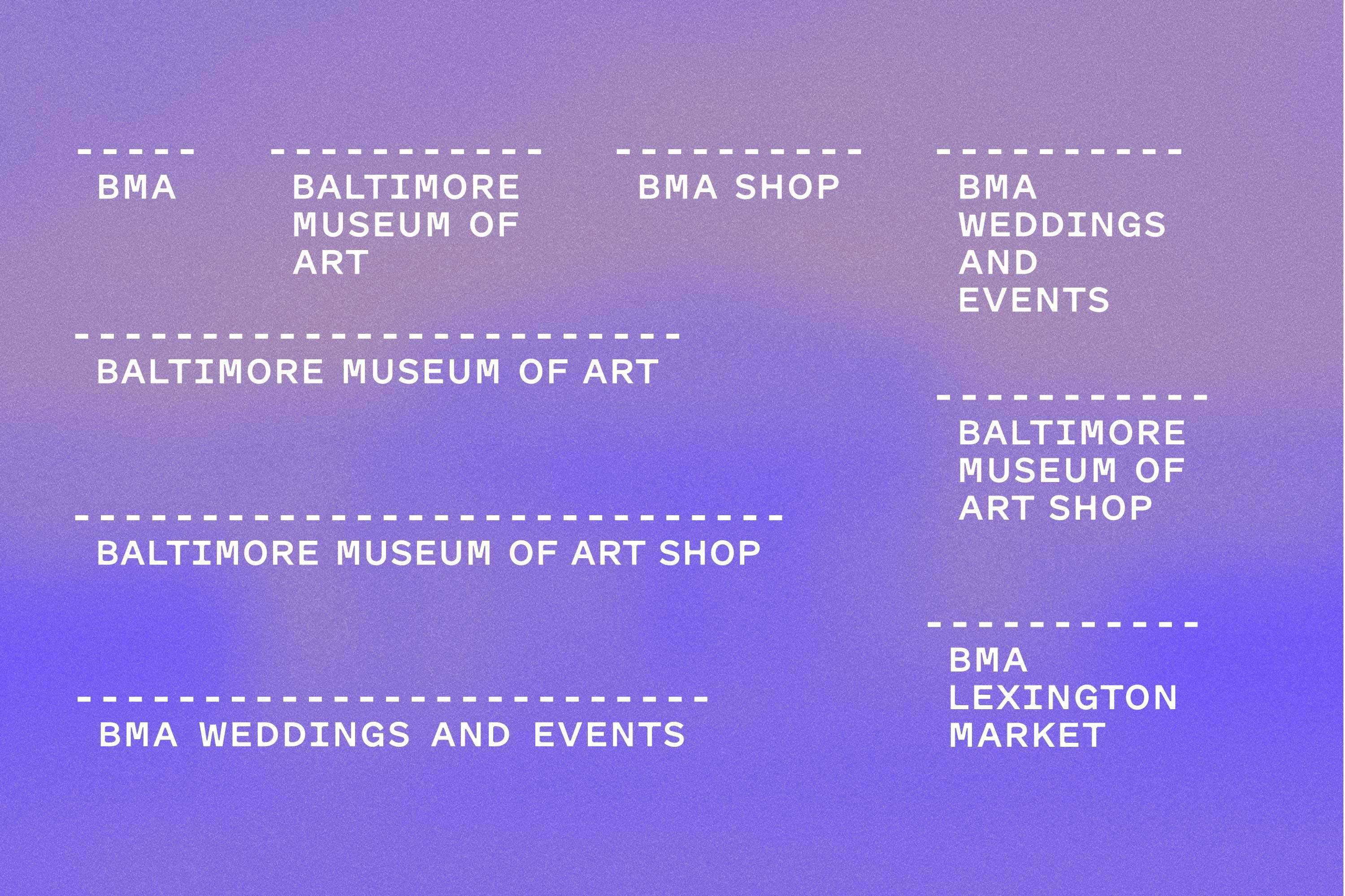
Variations on the dashed line logotype platform, designed for brand extensions like the museum’s BMA Lexington Market outpost, the BMA Shop, and BMA Weddings and Events.
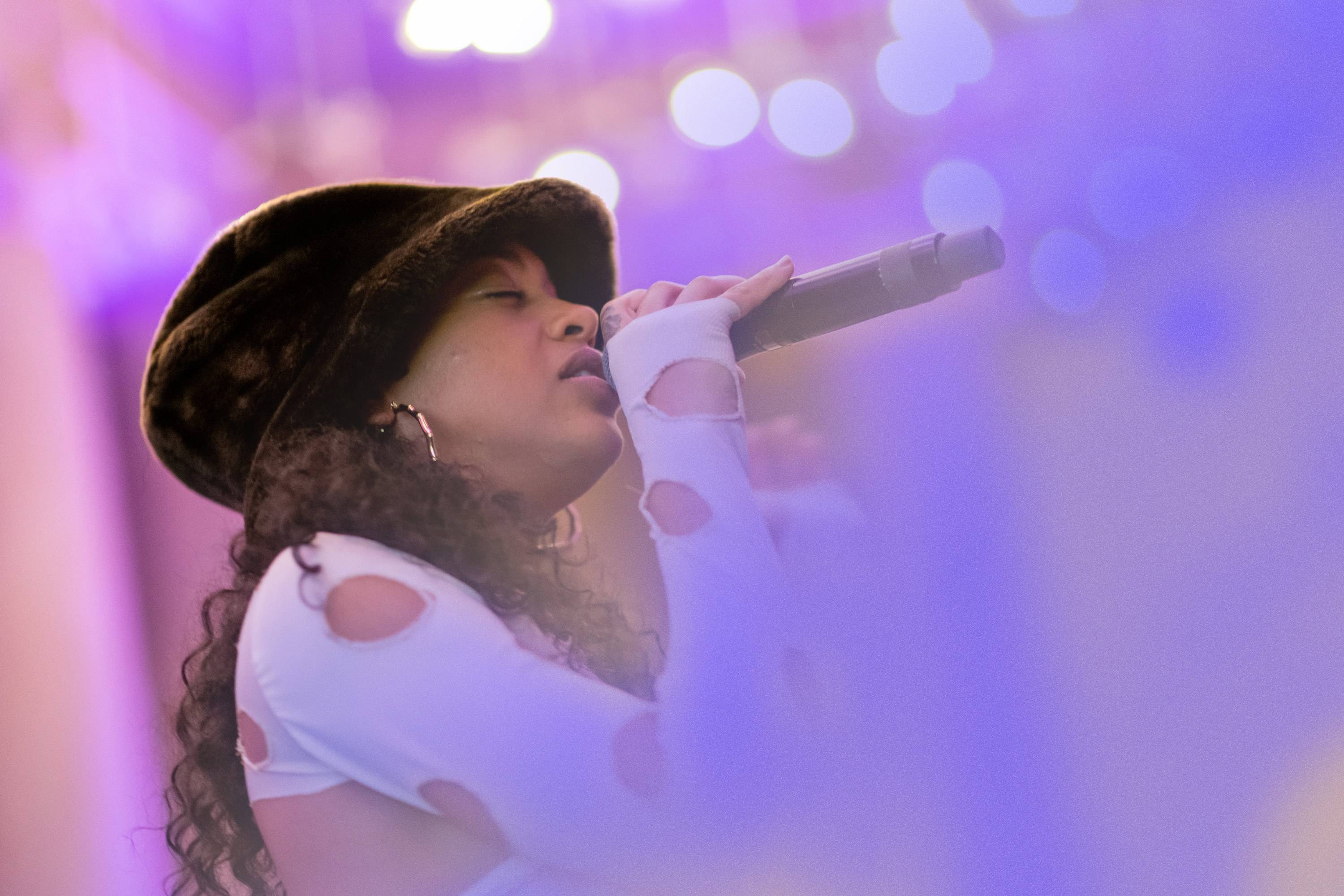
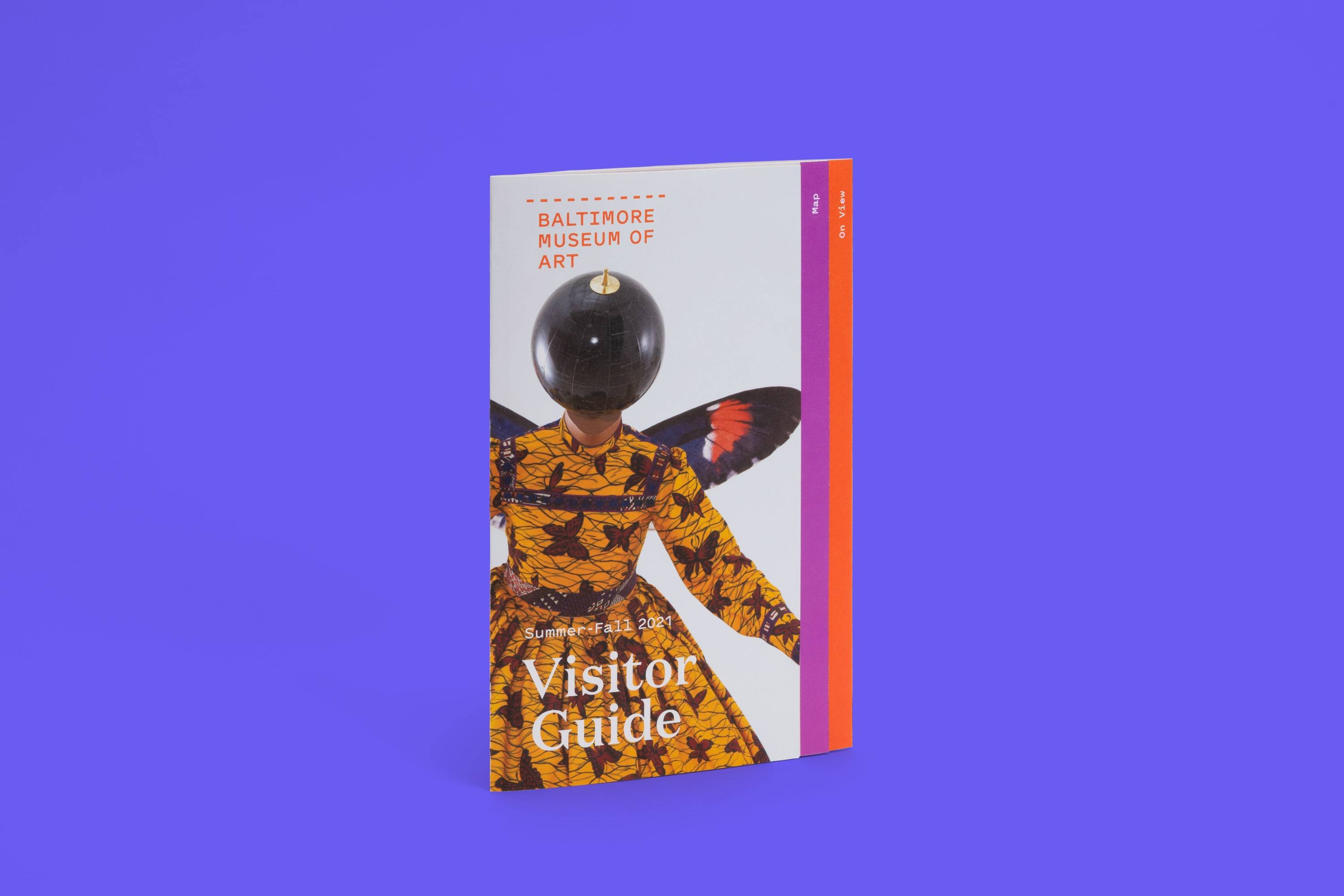
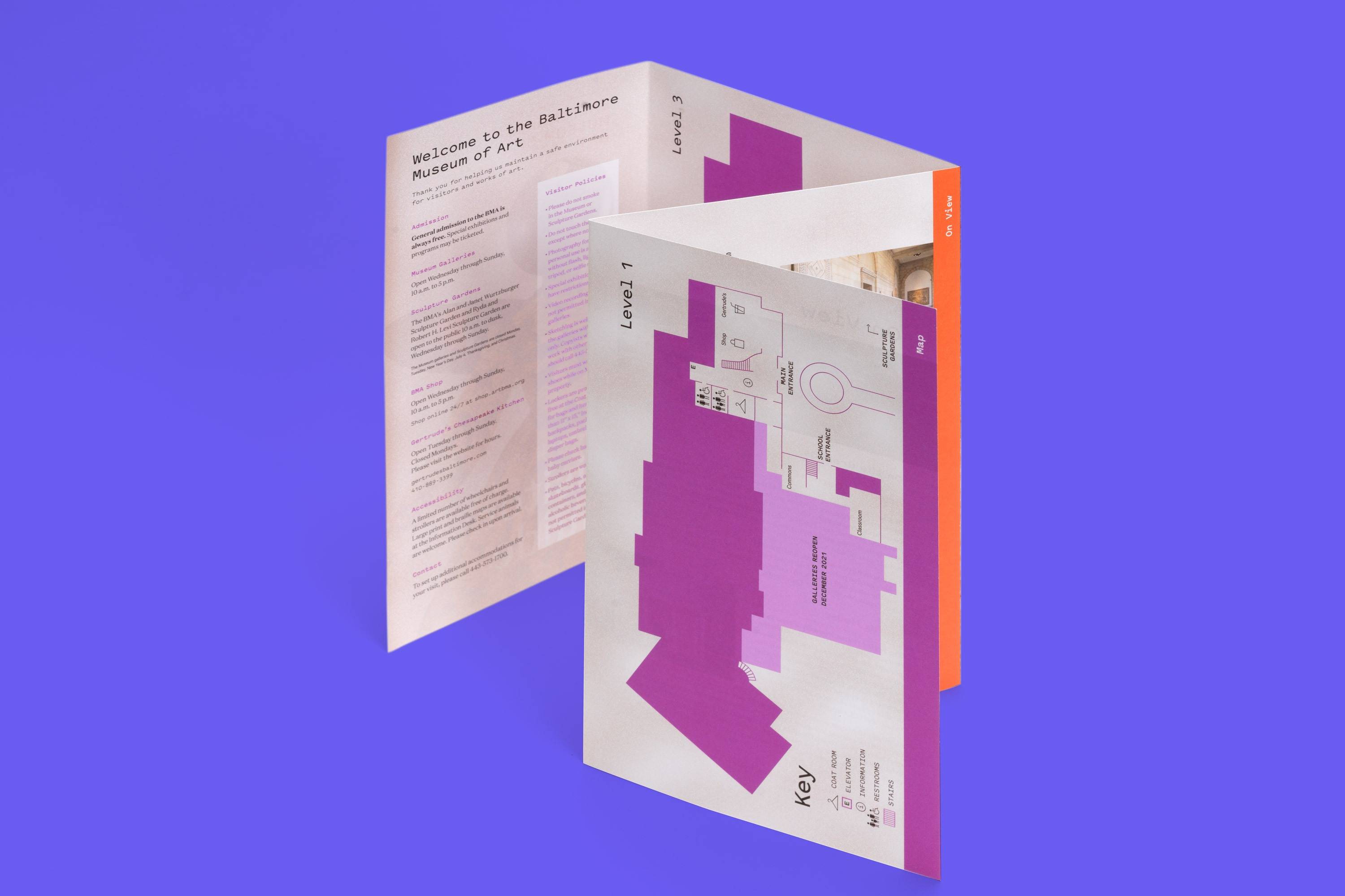
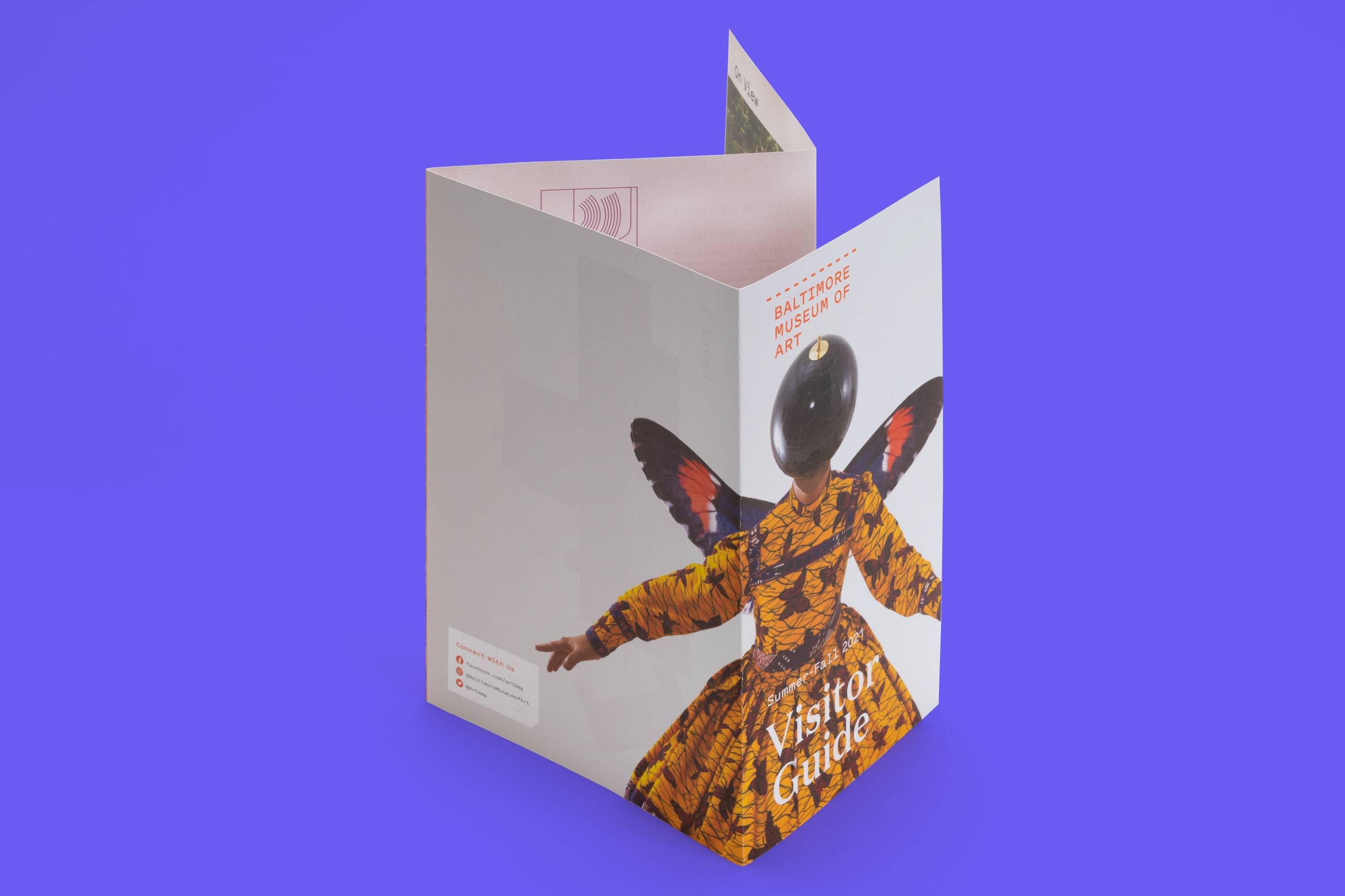
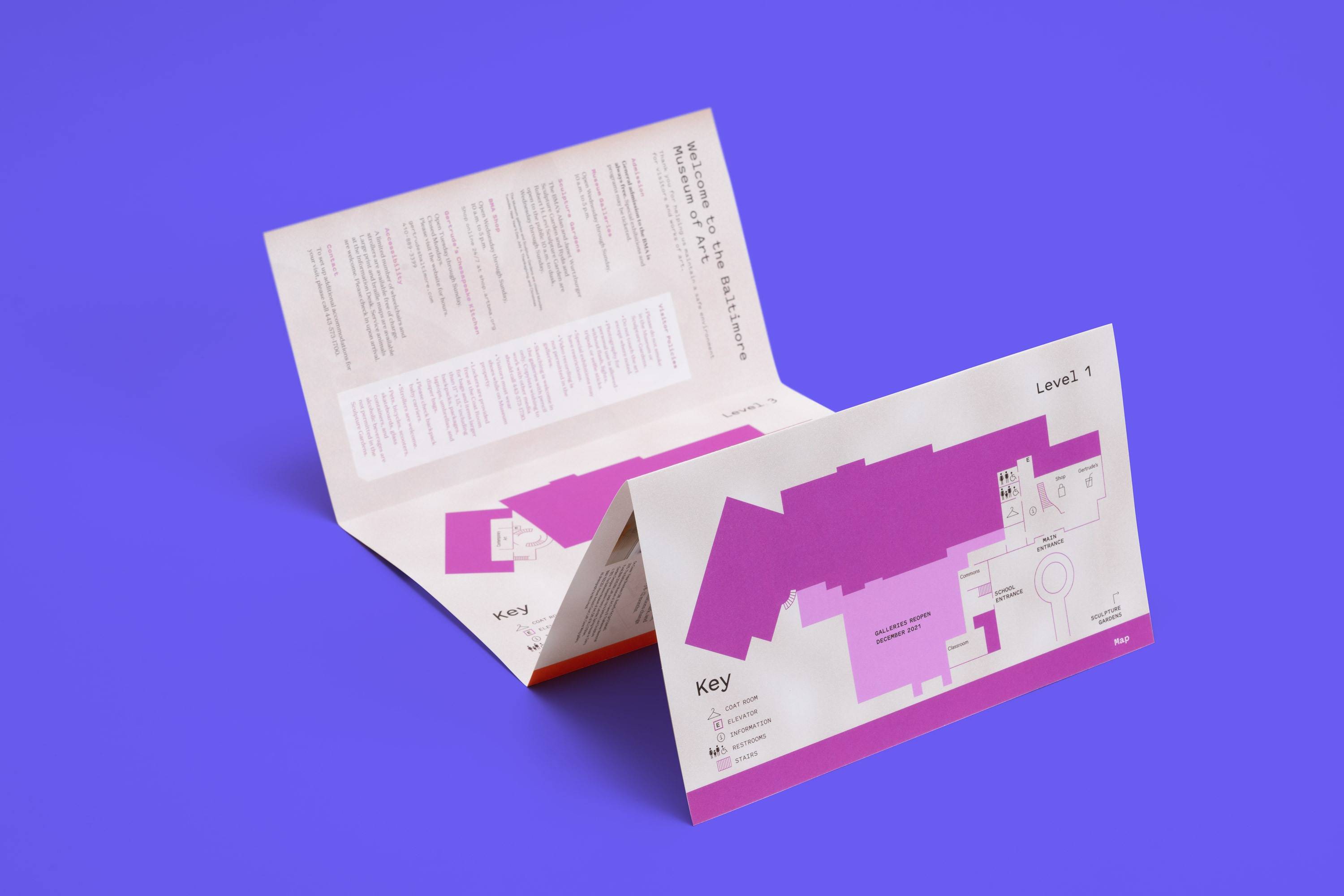
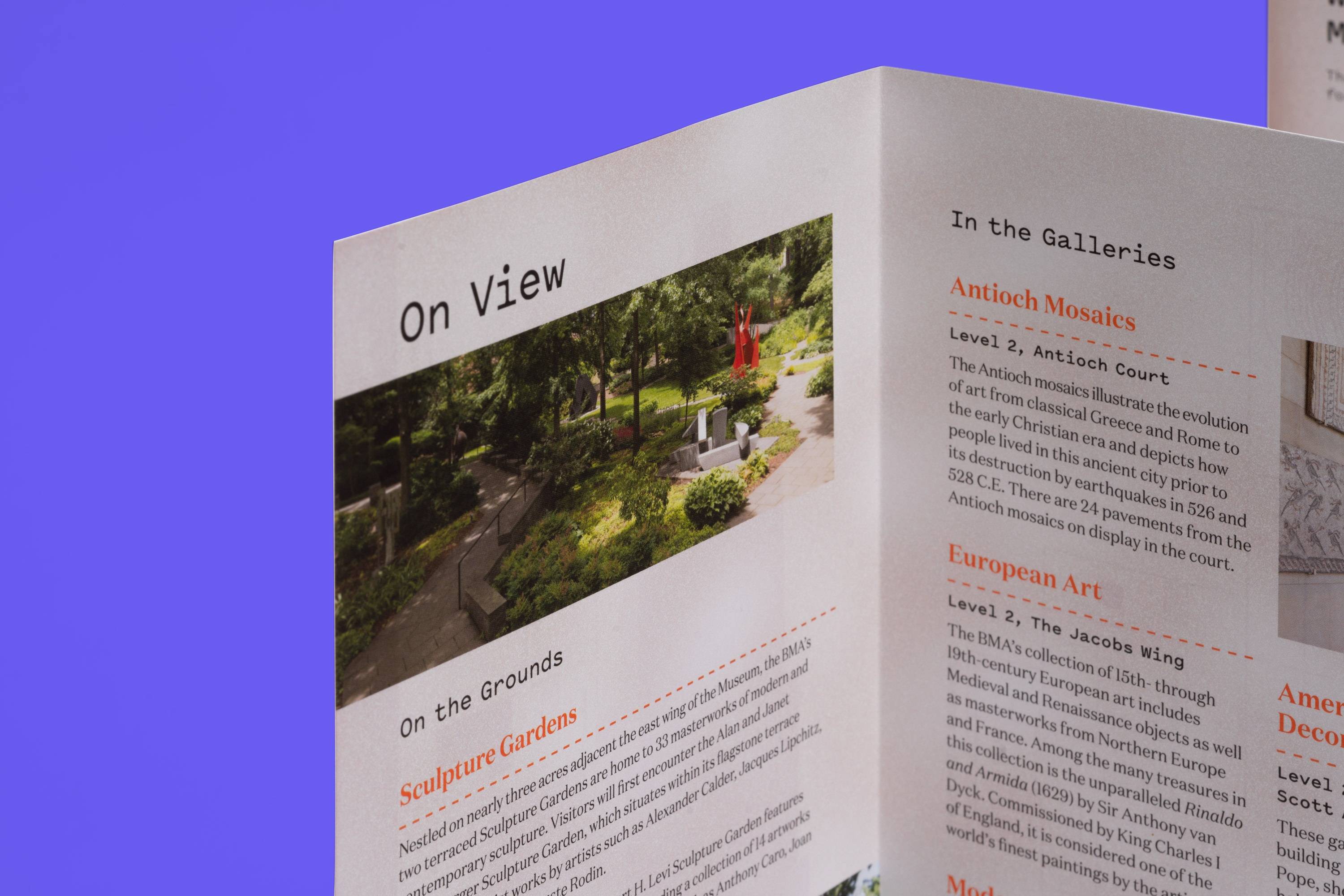
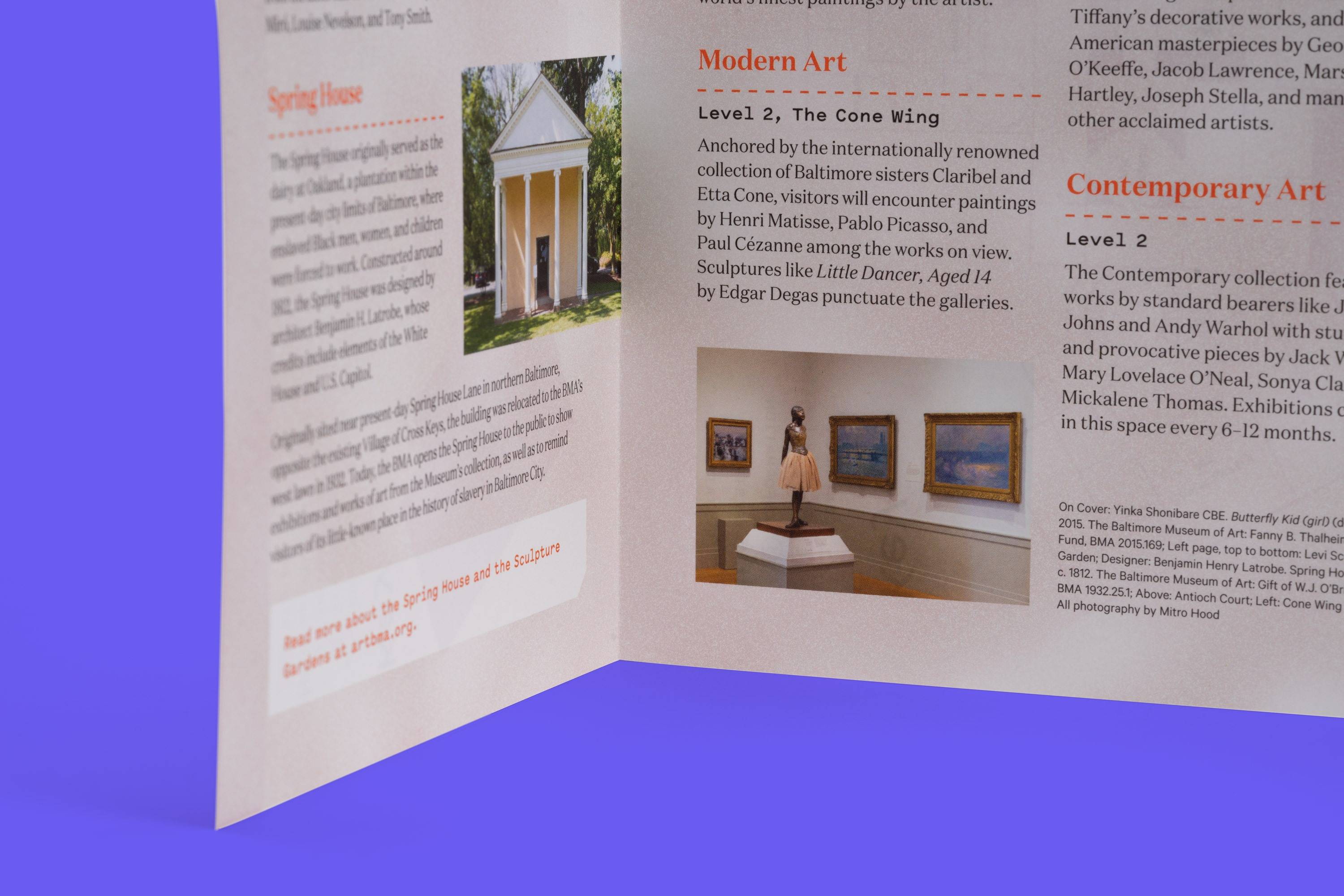
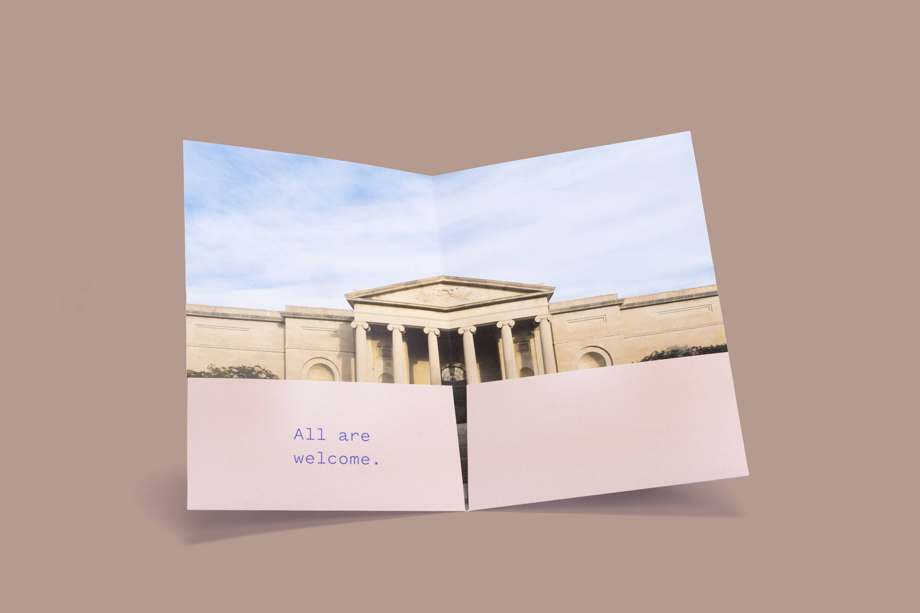
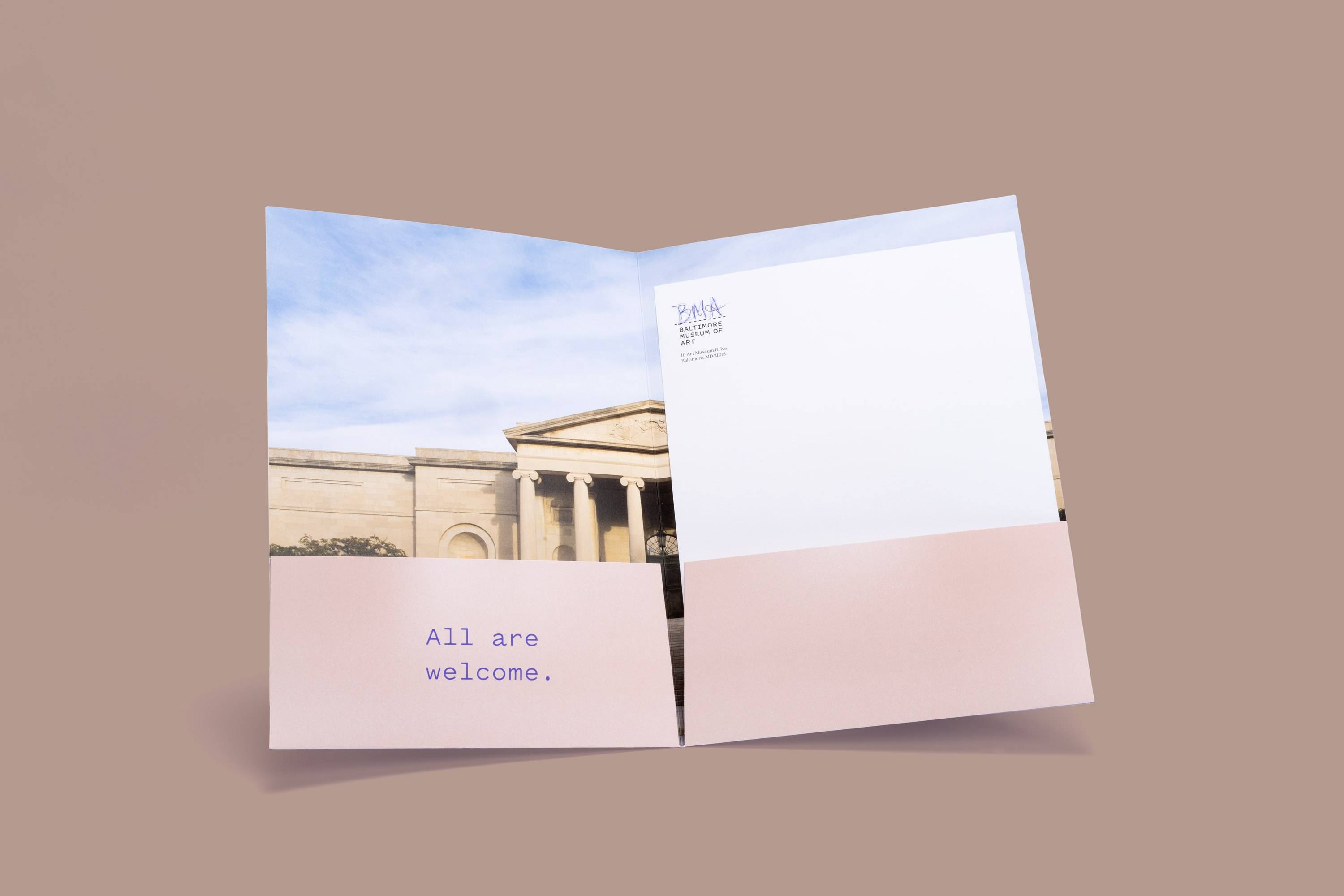
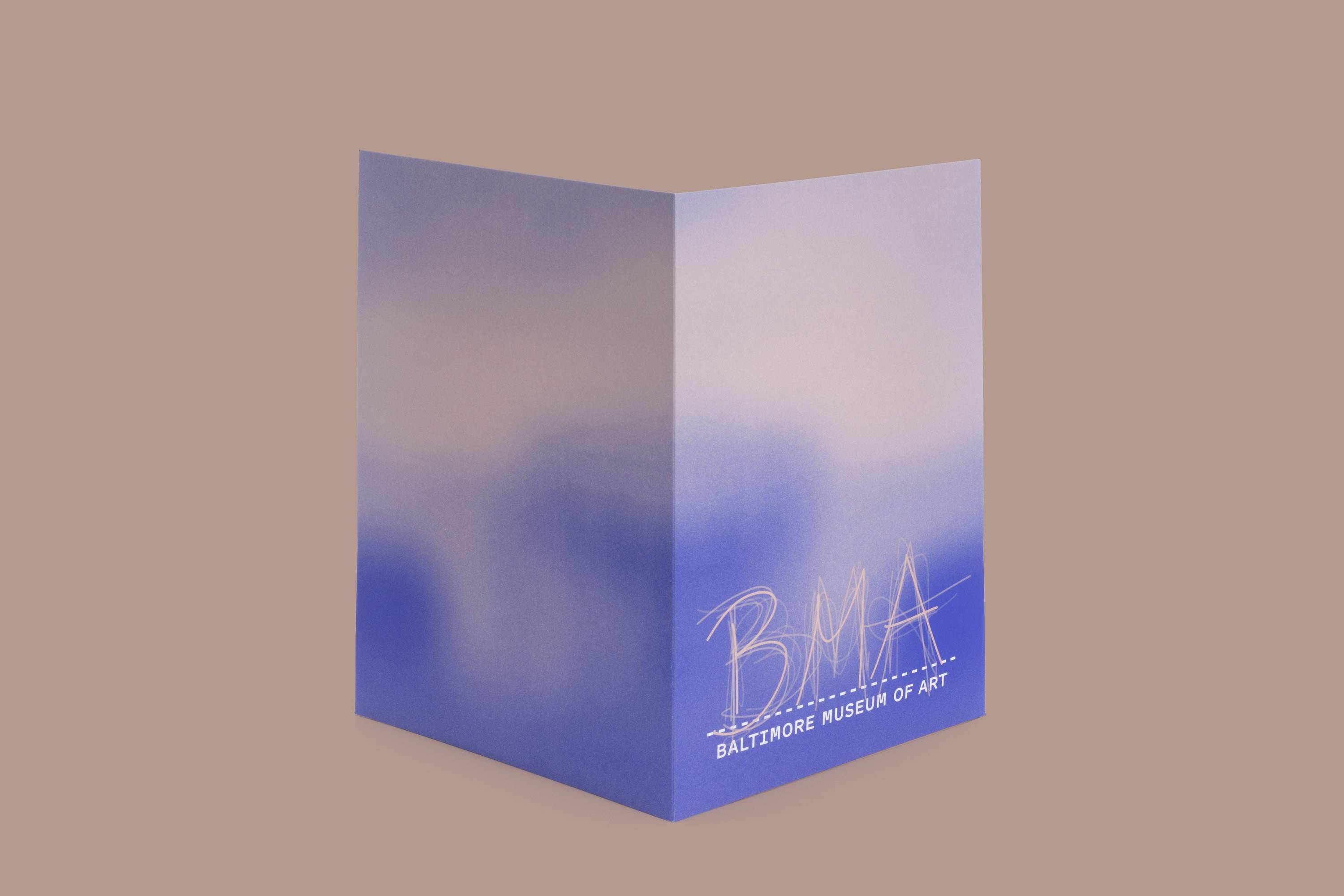
We also created a visual interpretation of the BMA’s haptic and collaborative approach to programming. “Haptic backgrounds,” serve the utilitarian purpose of providing a base for all manner of collateral, from brochures to stationery to the new website.
In Use



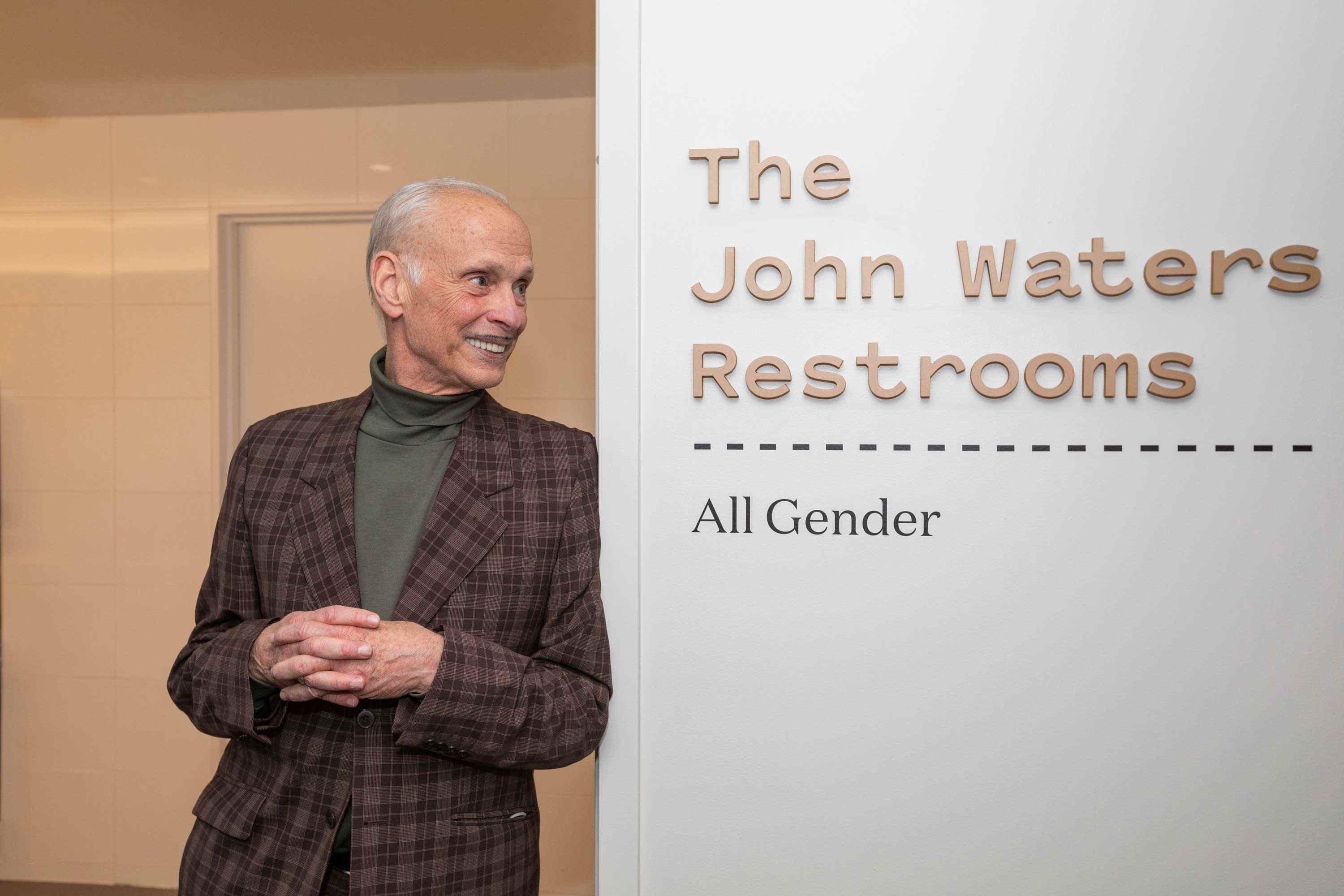
Photograph by Erika Nizborski
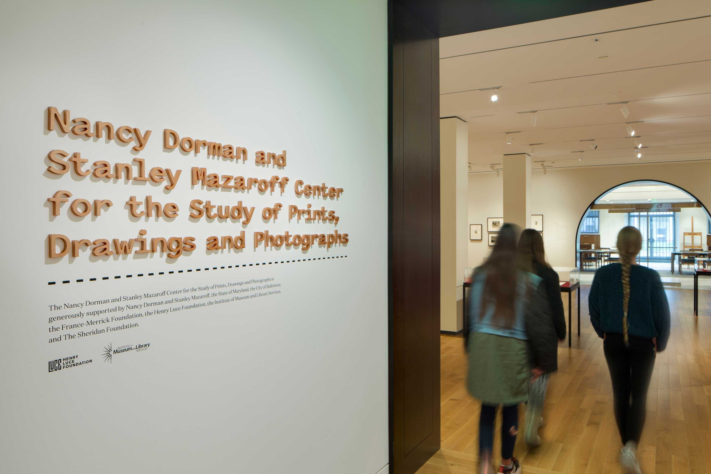
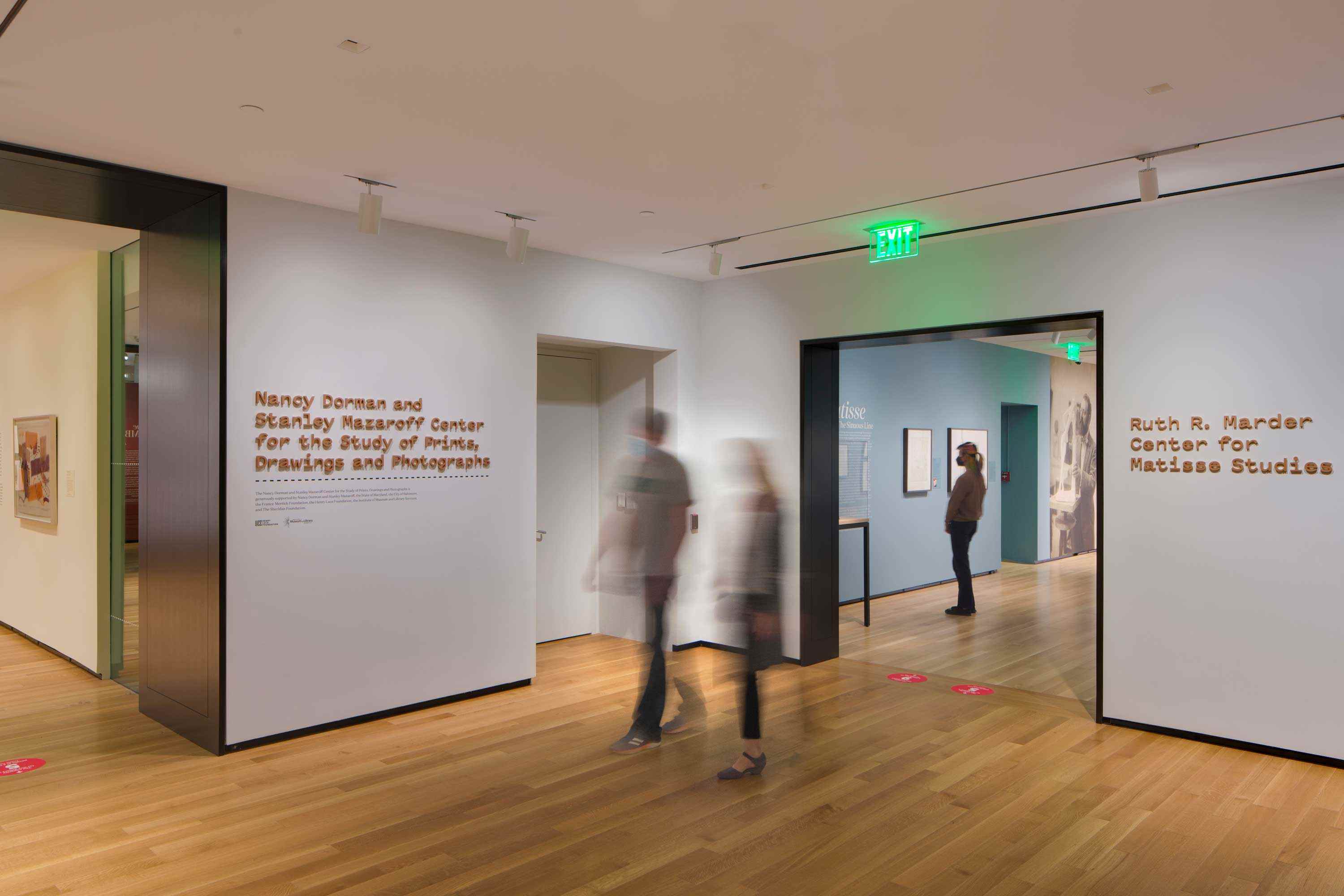
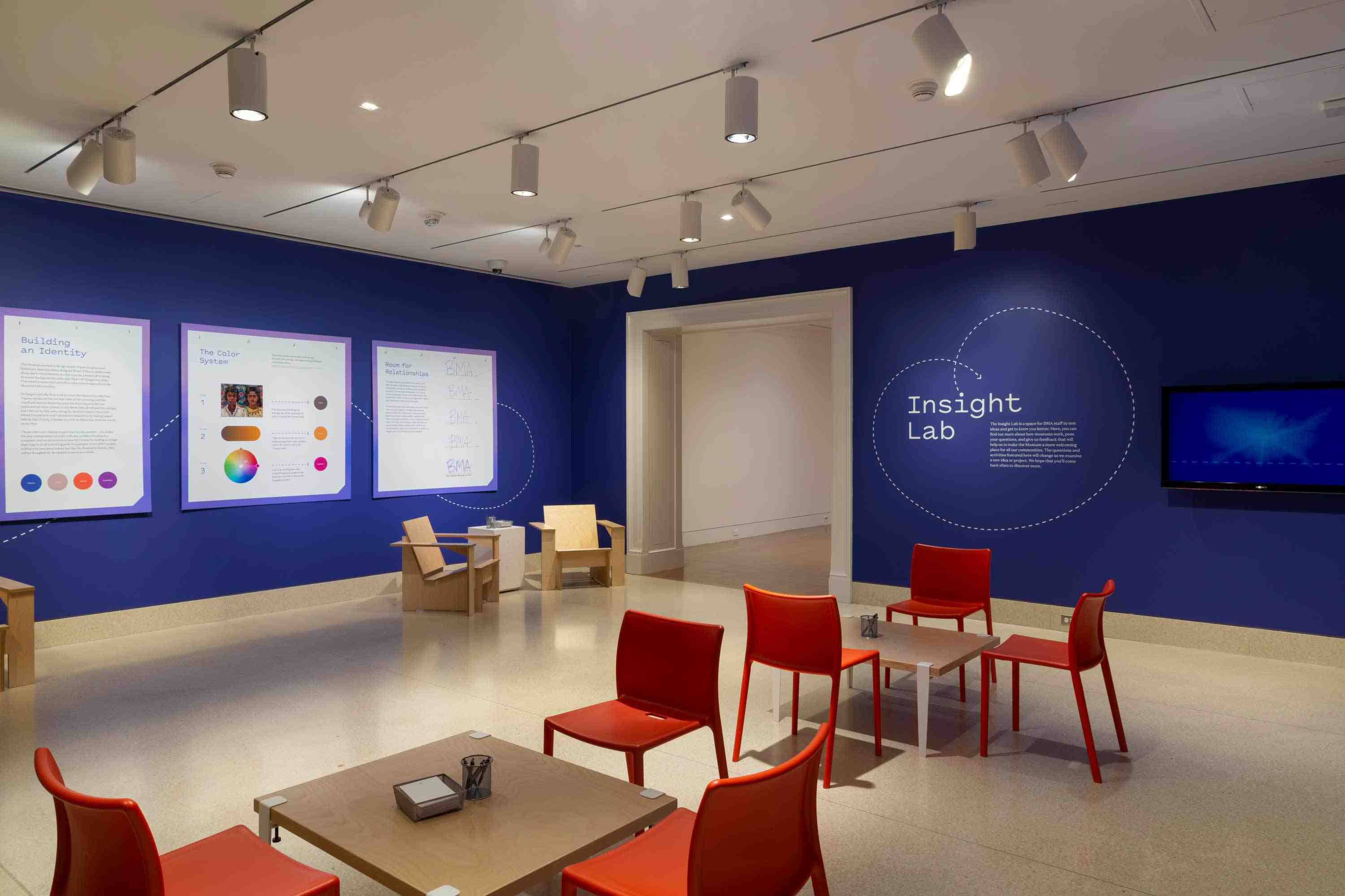
Photographs by Mitro Hood, Erika Nizborski, and Maximilian Fraz
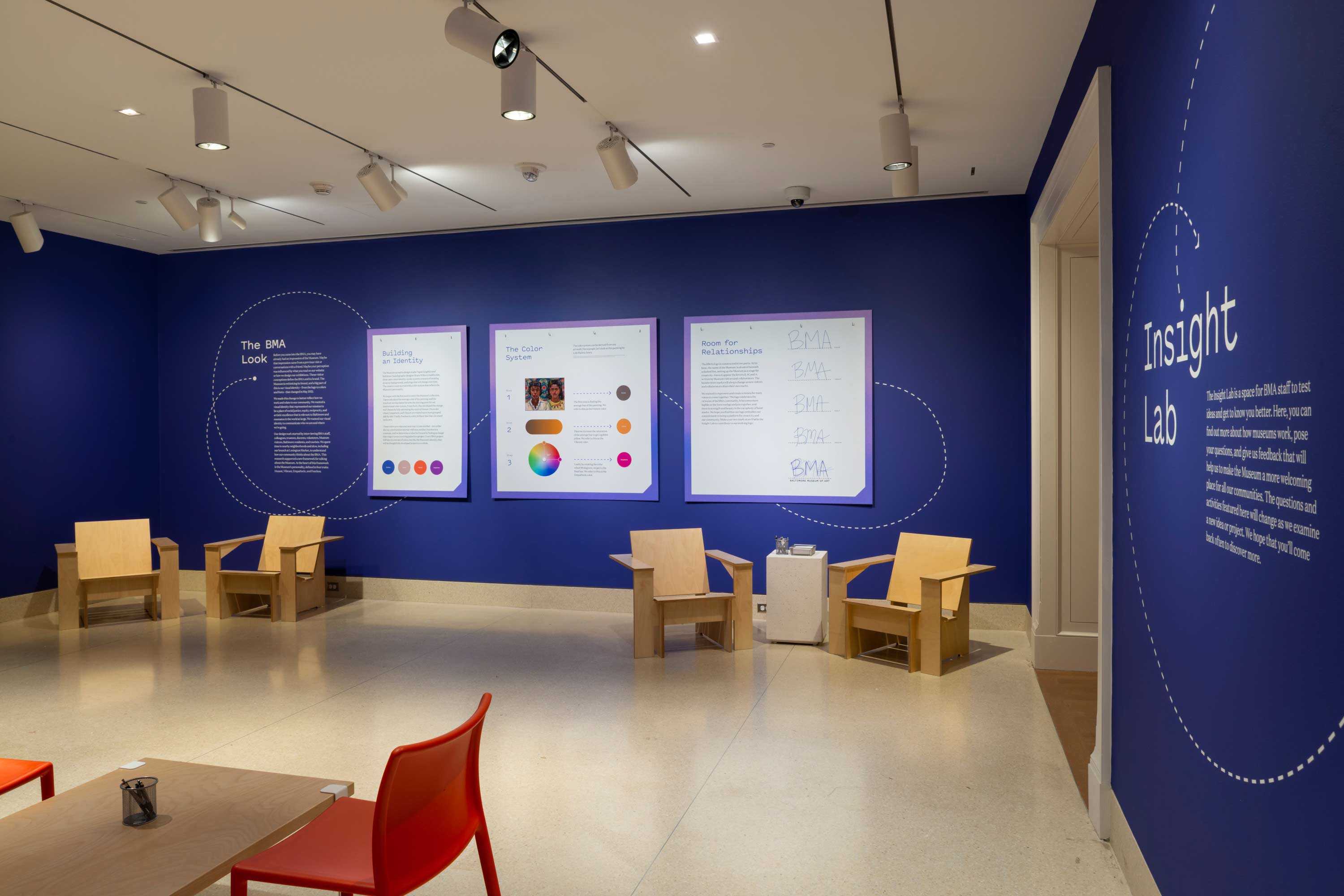
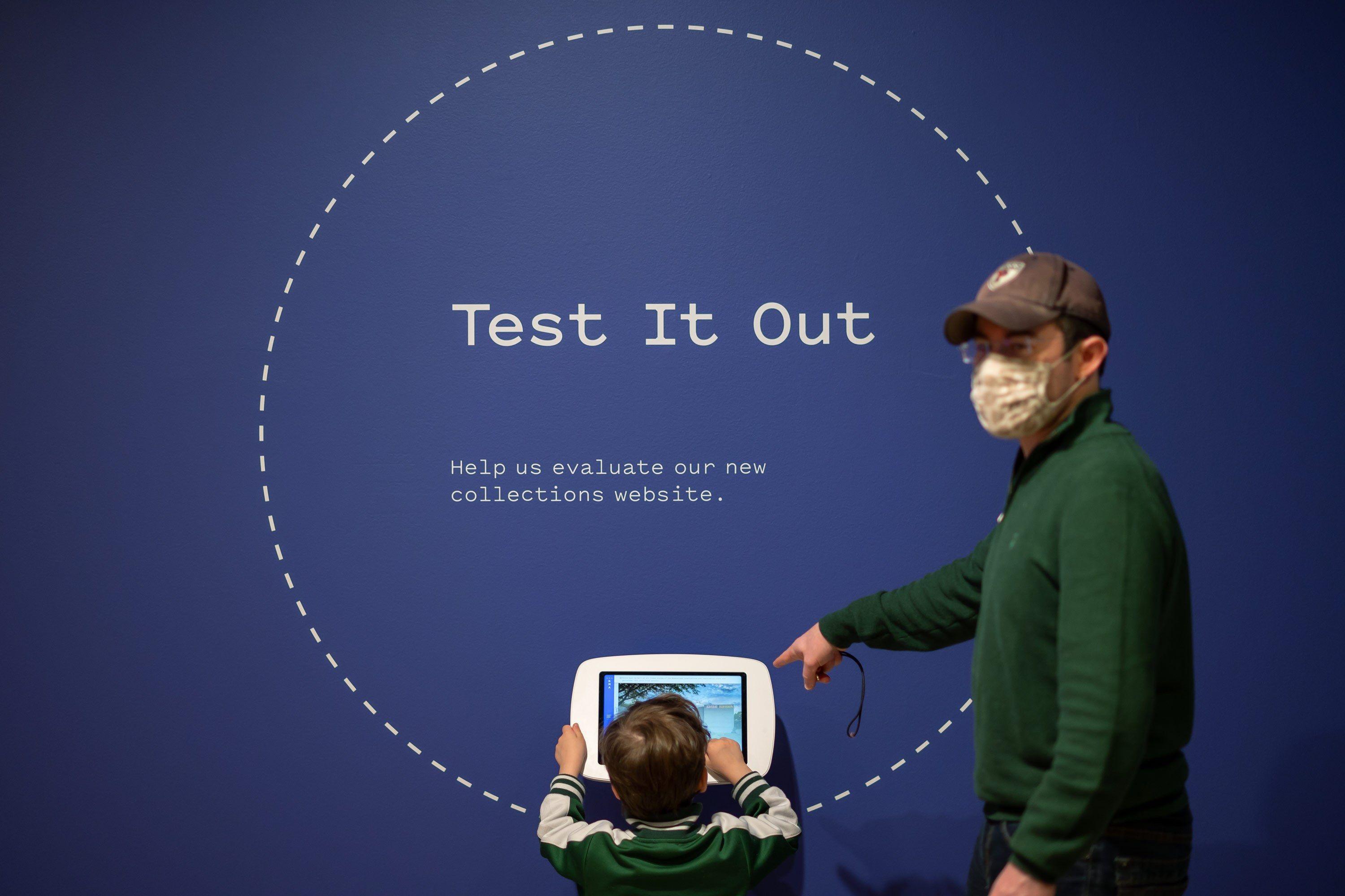
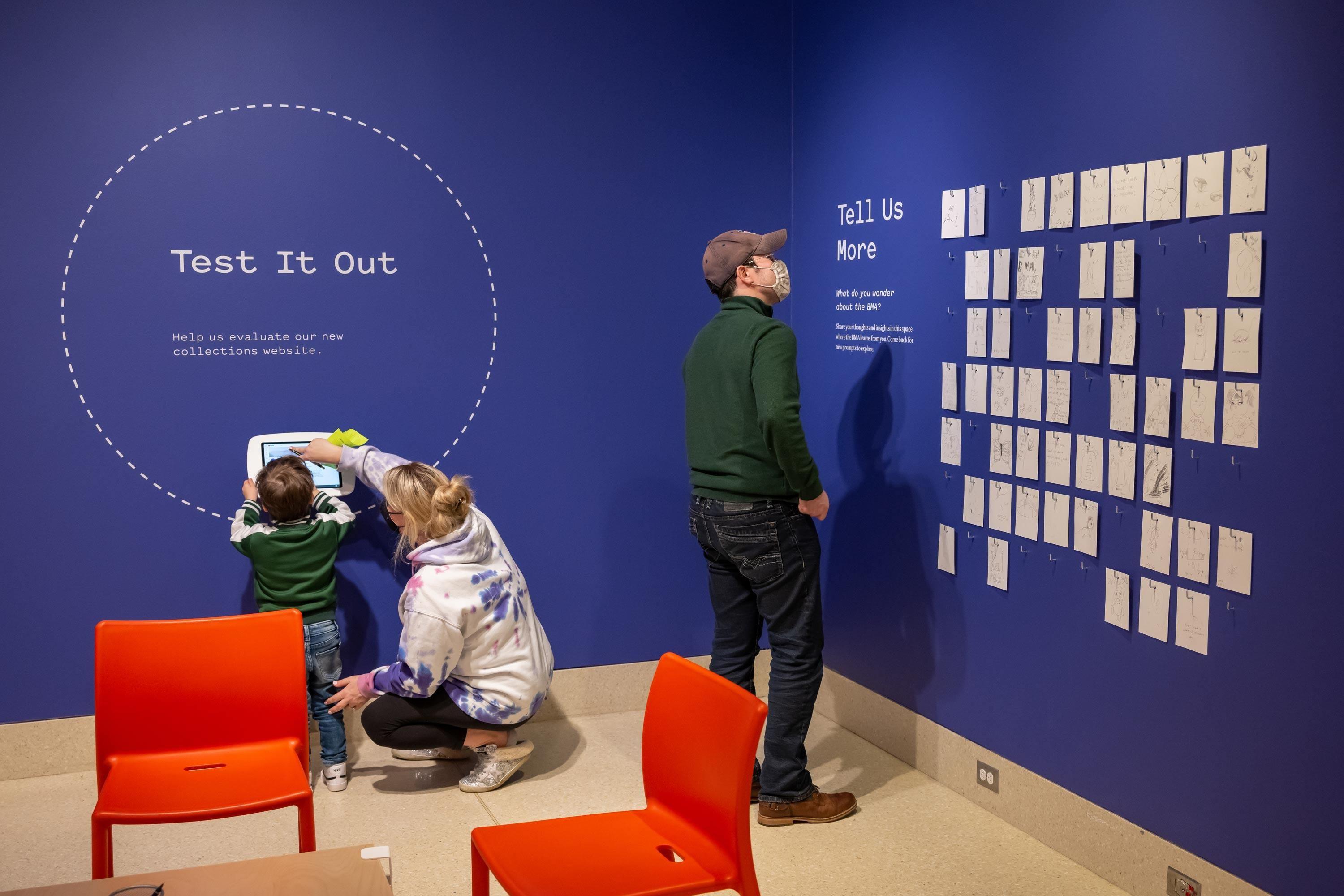
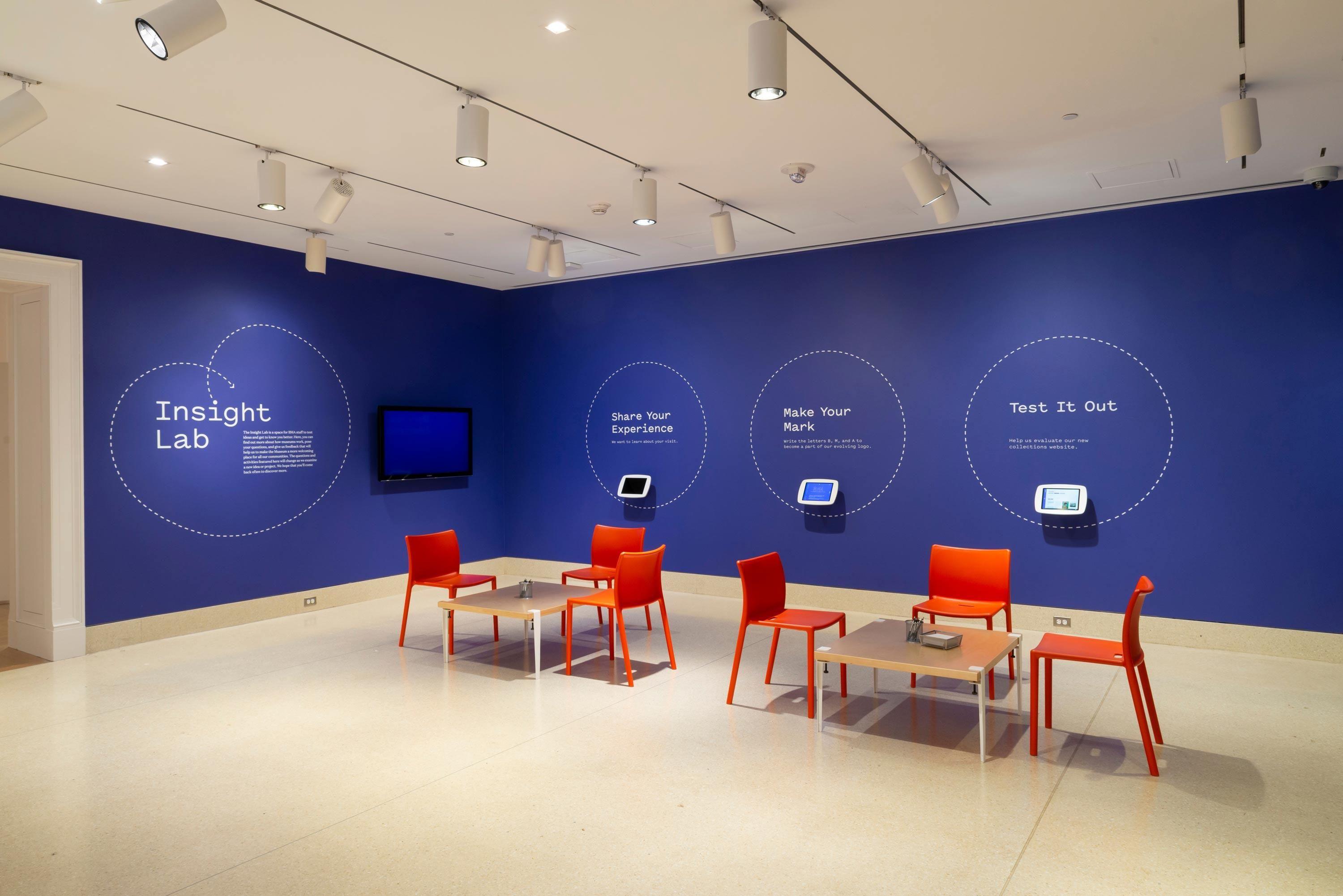
BMA’s Insight Lab is a dedicated space for the museum to engage its audience with the process of making exhibitions and offering an opportunity for participants to shape the museum’s programing and focus. It is a lab that allows the museum to learn what its audience is interested in learning more on as well as share what the museum is currently planning.
The first installation in the Insight Lab was dedicated to sharing the process and reasons behind the museum’s rebrand.
