Video Consortium
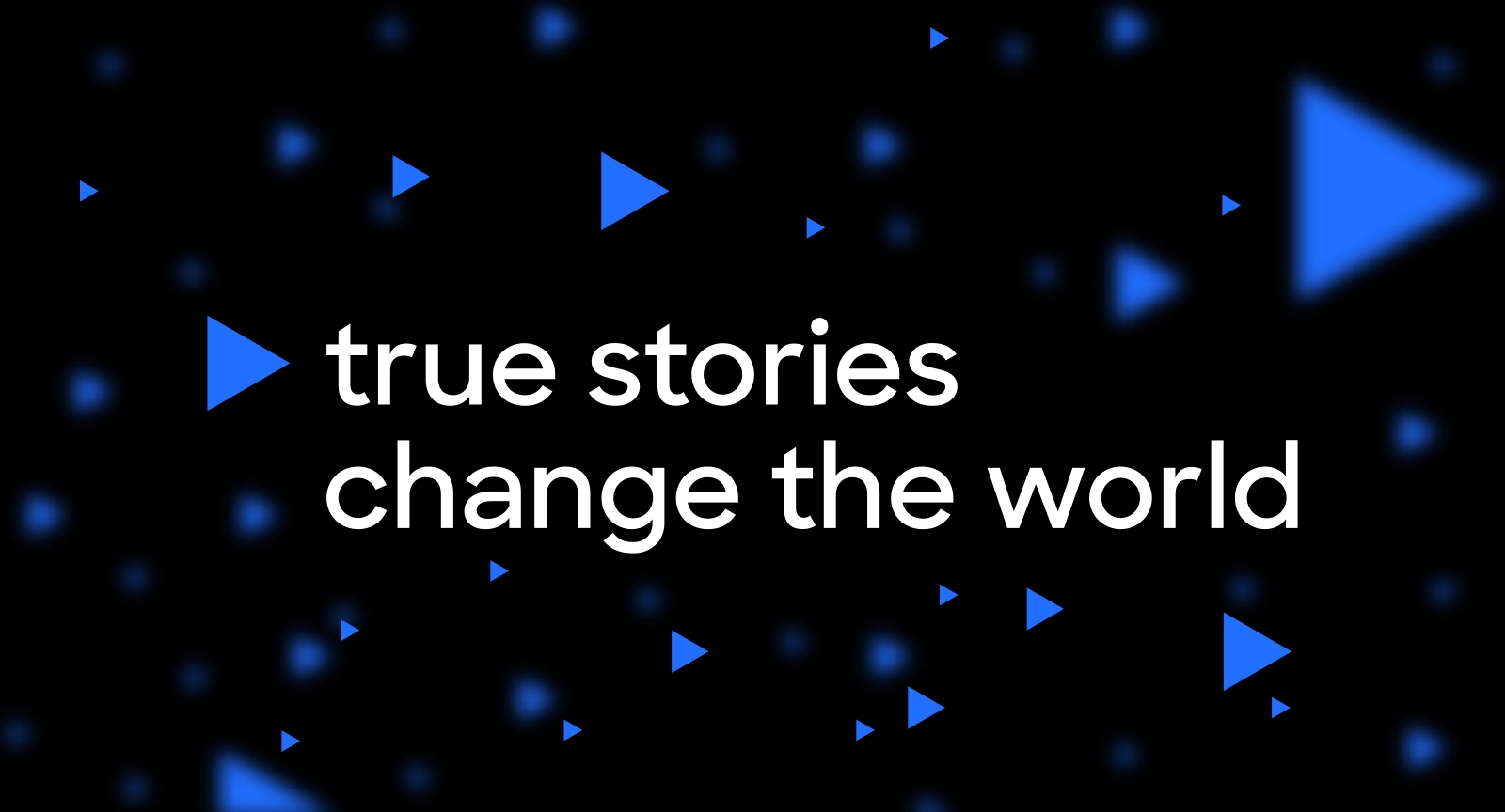
True stories change the world.
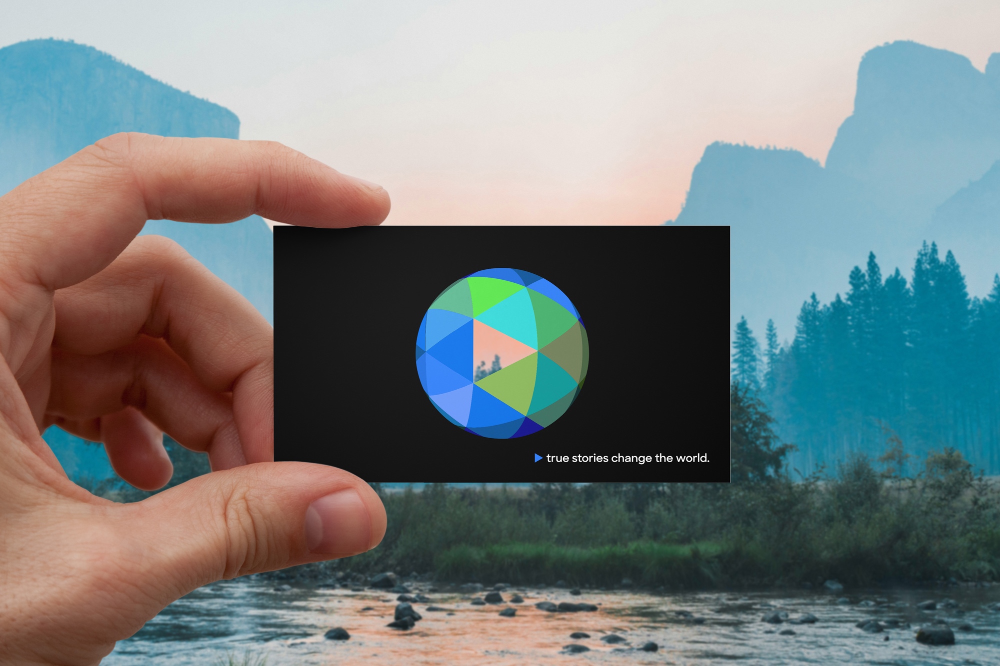
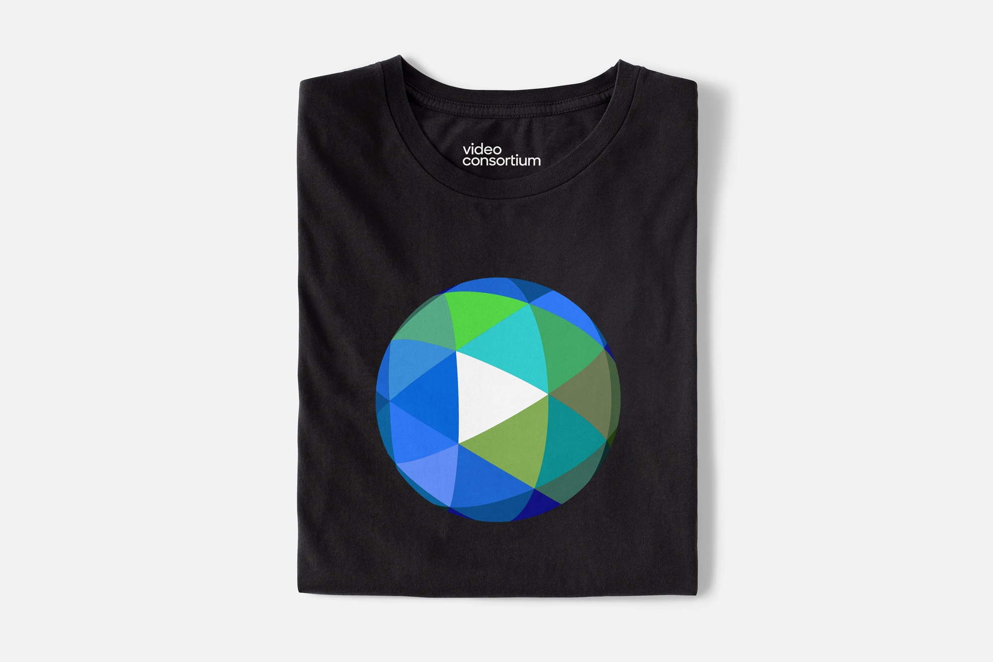
Video Consortium is a global media organization that supports a diverse worldwide community of nonfiction filmmakers, journalists, and newsrooms to catalyze change through their work. The logo is a manifestation of this interconnected mosaic of impactful stories and the thousands of people who make them.


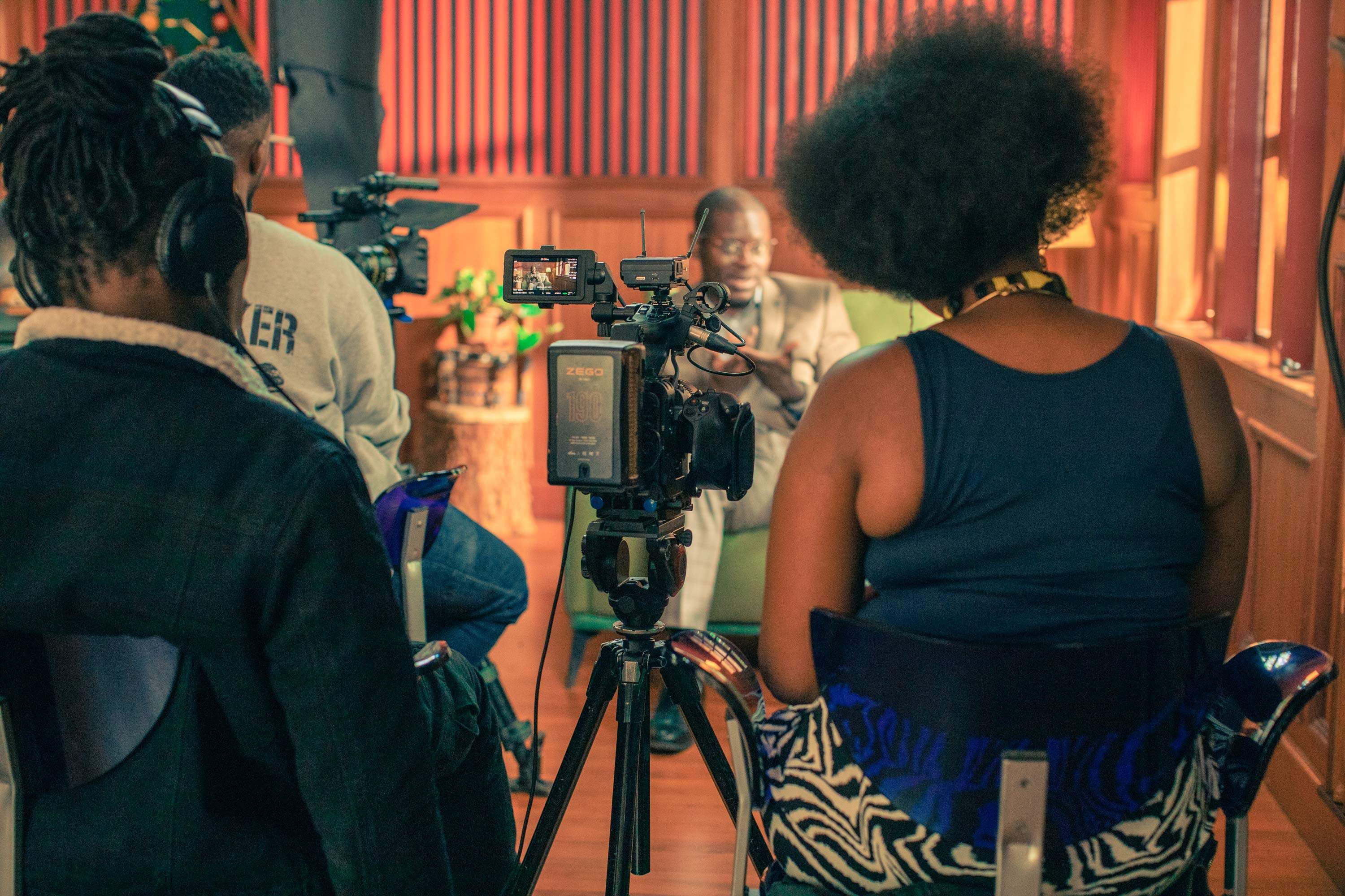

Photography by Bellyfire Productions, Oresti Tsonopoulos, Kholood Eid, Matthew Gilbert.
Context
As Video Consortium grew into a larger organization with national and international hubs and major partners, they recognized the need for a brand that could maintain consistency across applications while communicating their global reach. At the same time, they wanted to preserve the grassroots energy that defines their community gatherings.
Brand Identity Elements

The play button, a key element of the logo, symbolizes the beginning of every story. As a triangle, it also serves as an arrow and a versatile compositional device—underscoring Video Consortium’s role as a dynamic community of storytellers.


Sharp Sans was chosen as the primary typeface for its geometric design, with circular forms and diagonal cuts that echo the globe and the angular play button.
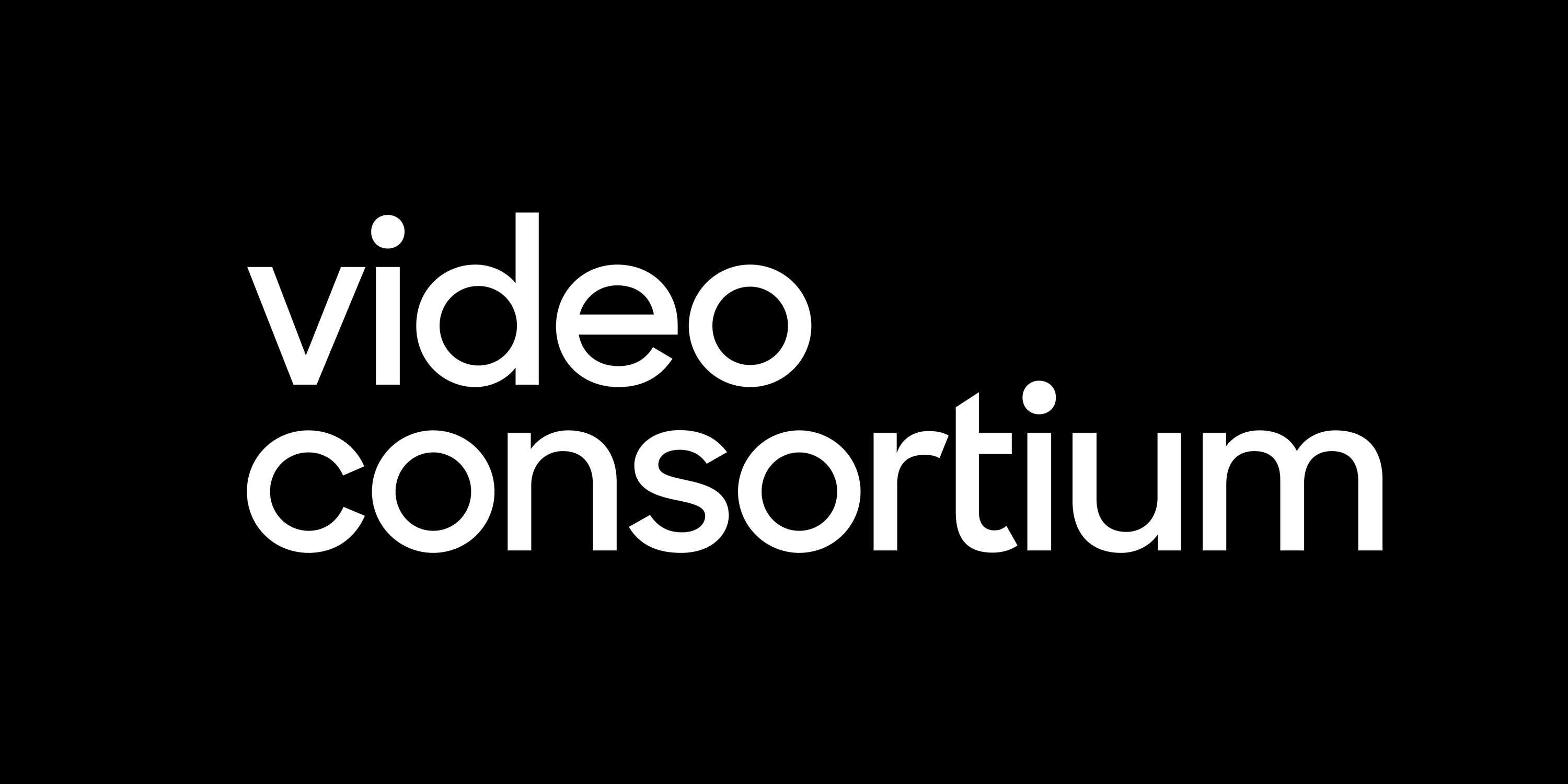
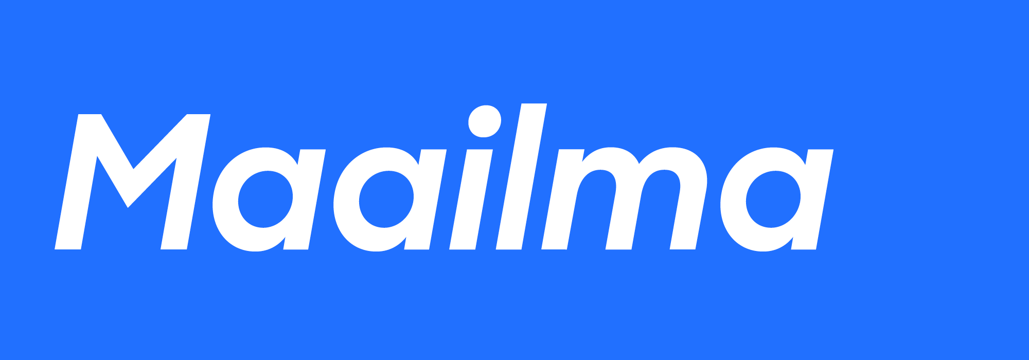
The custom logotype adjusts the lowercase ‘t’ to align with the play button’s angles, with the crossbar modified for improved spacing.


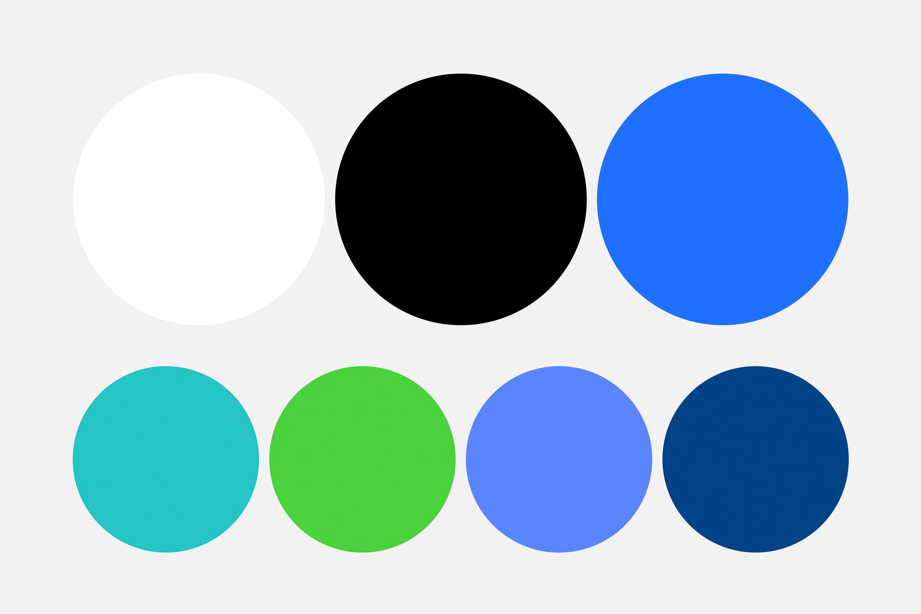
The color palette is inspired by an abstraction of the globe. Black serves as a foundation, evoking space and depth, while VC blue nods to the organization’s previous brand identity. Secondary colors expand the palette, helping to distinguish their diverse programming.
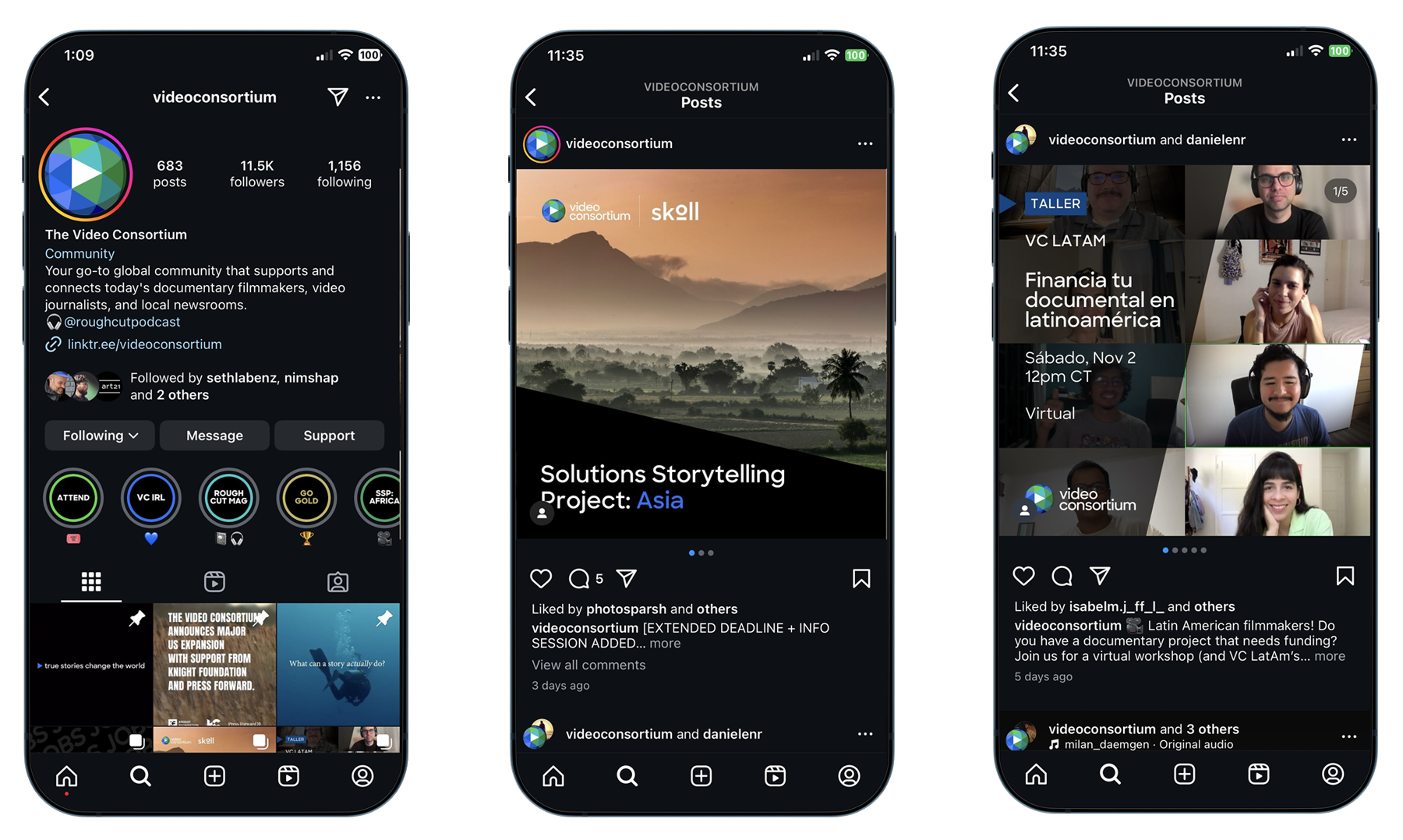
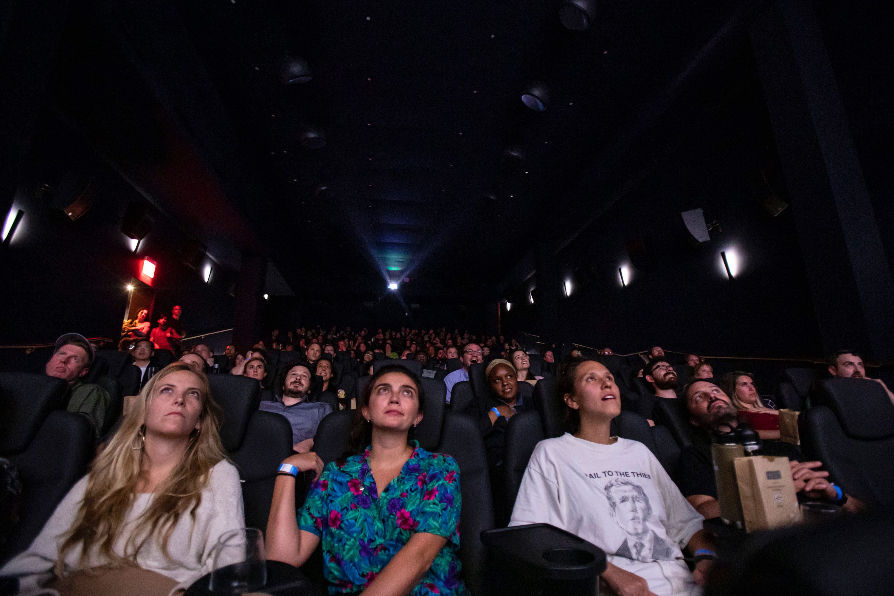
In Use