Tropic Bound
Miami’s First International Artists’ Book Fair
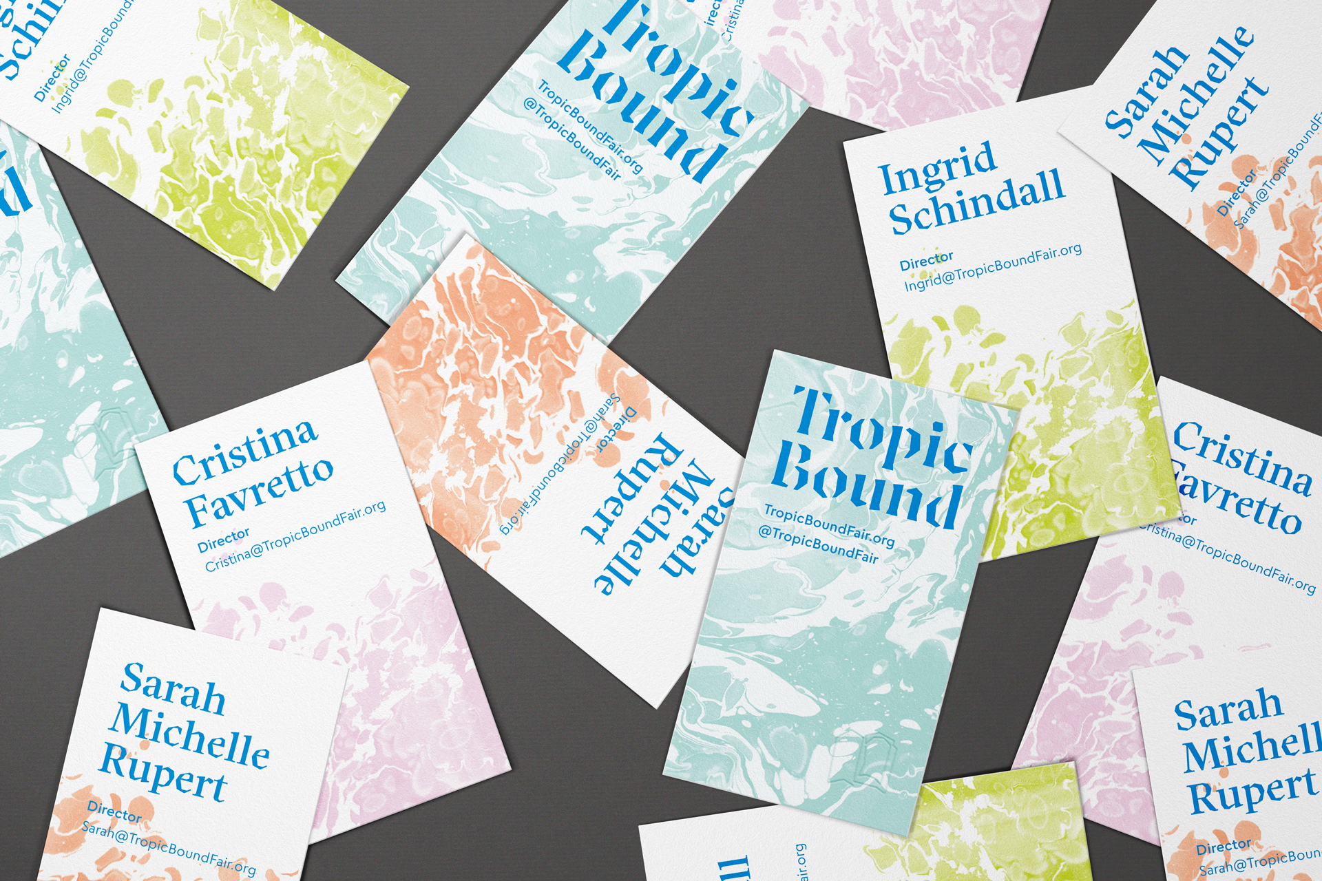
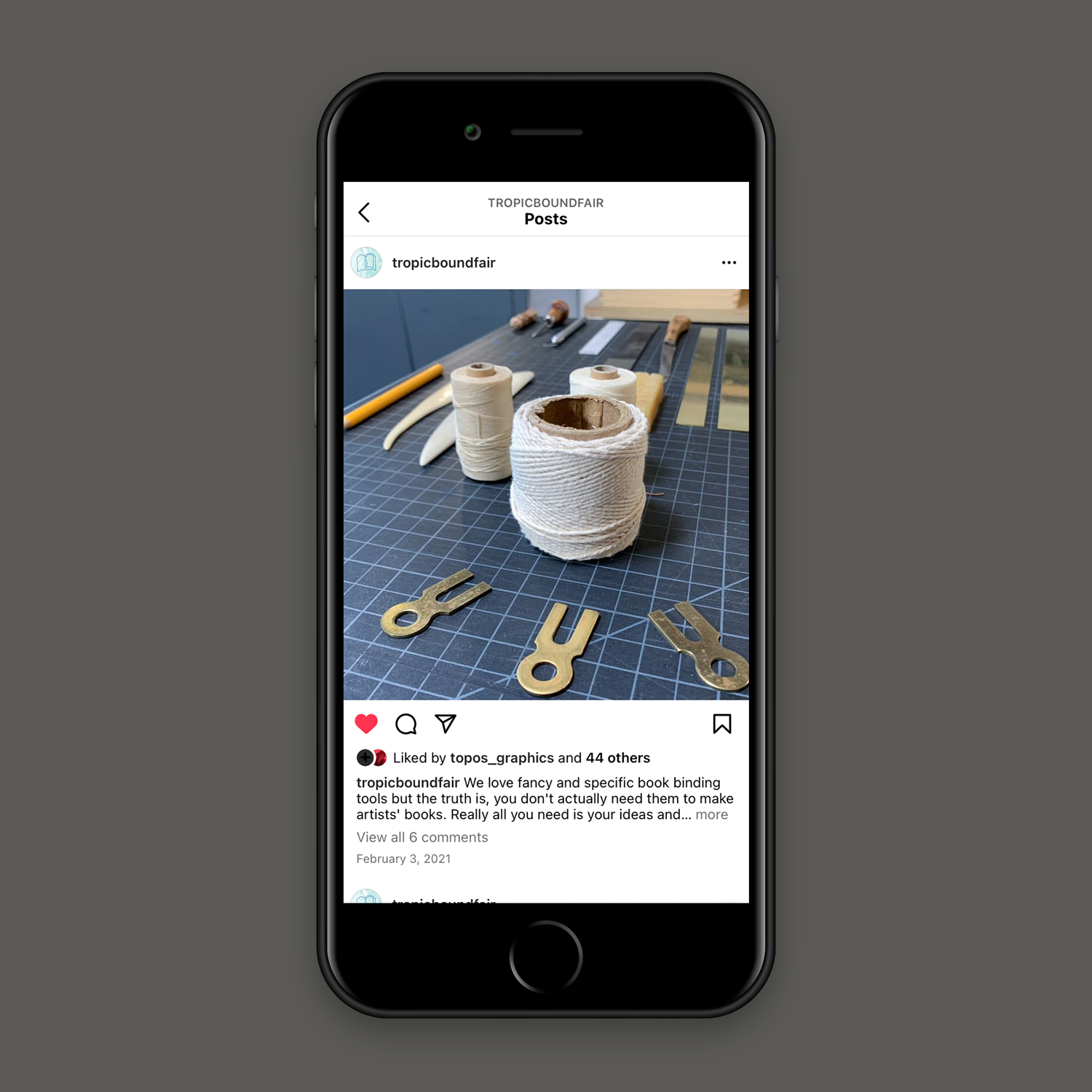
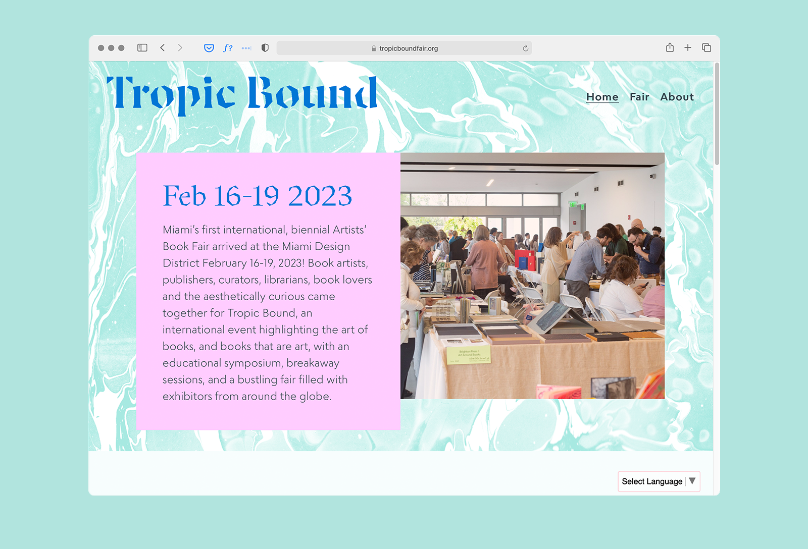
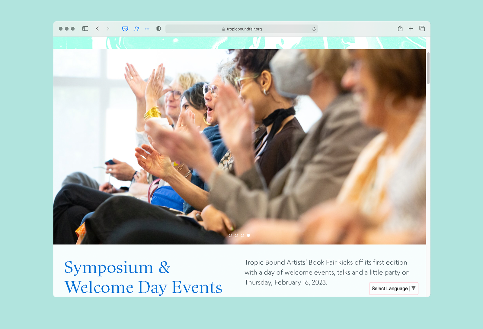
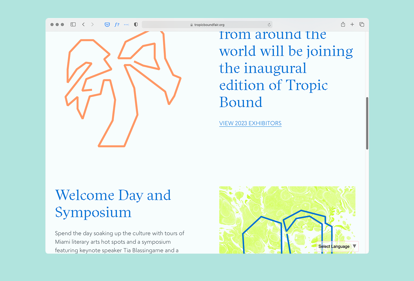
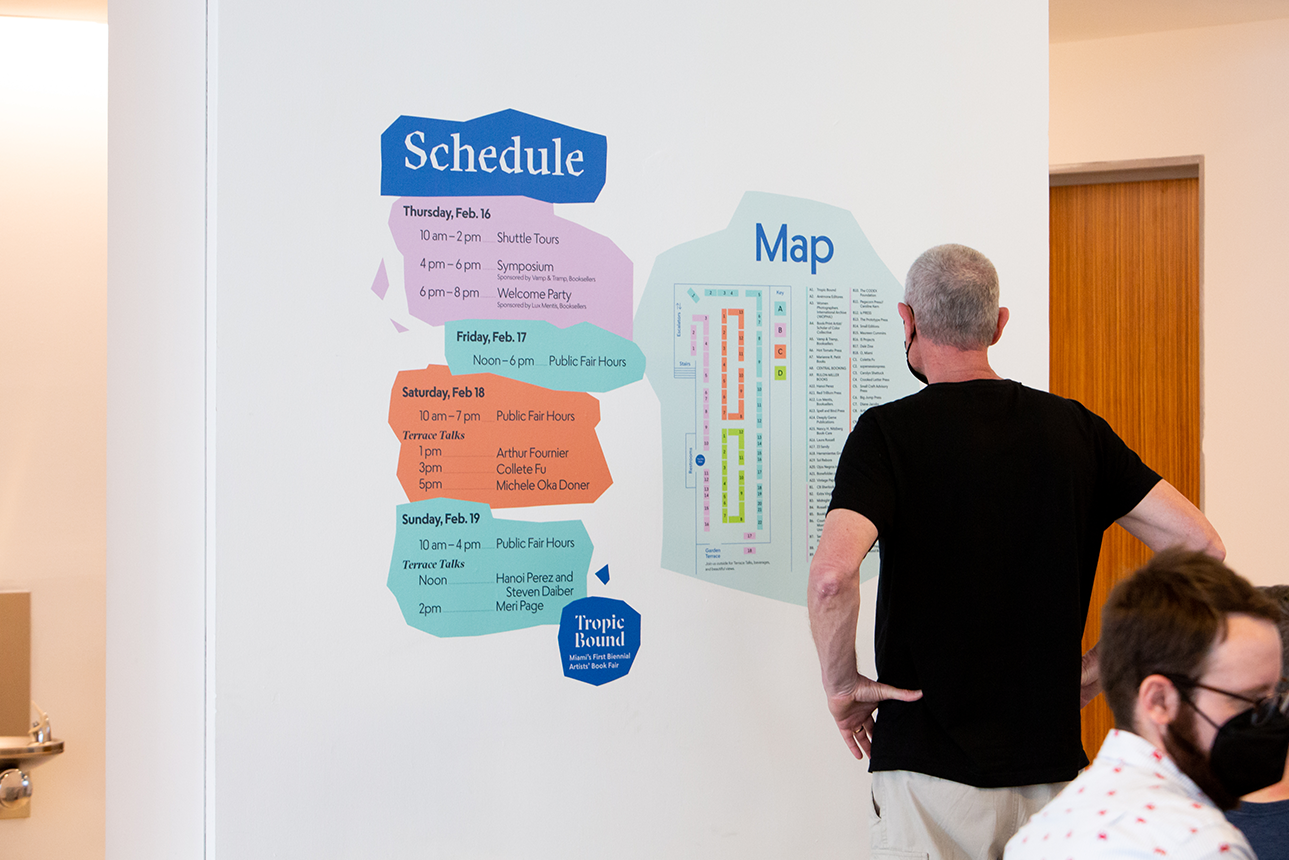
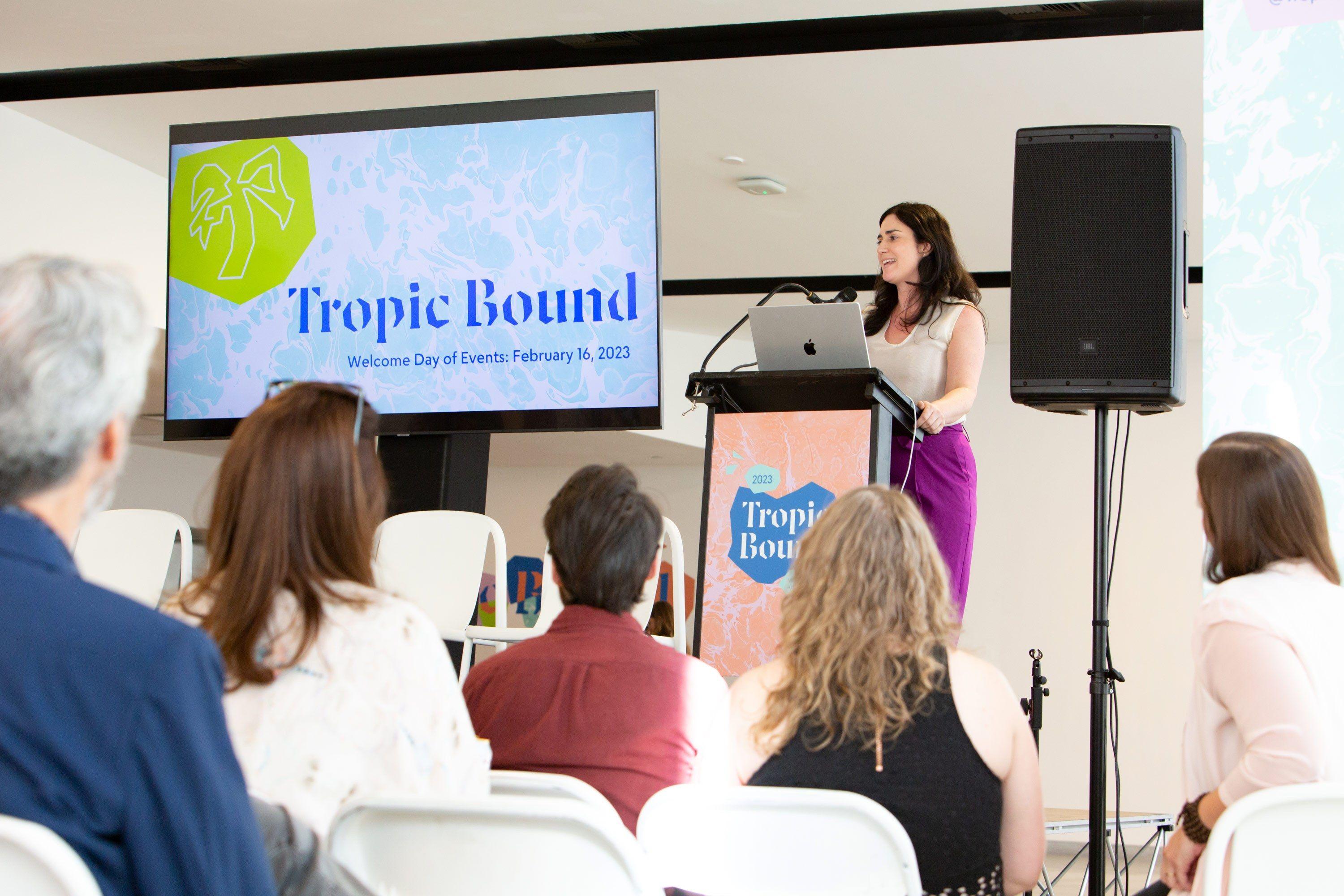
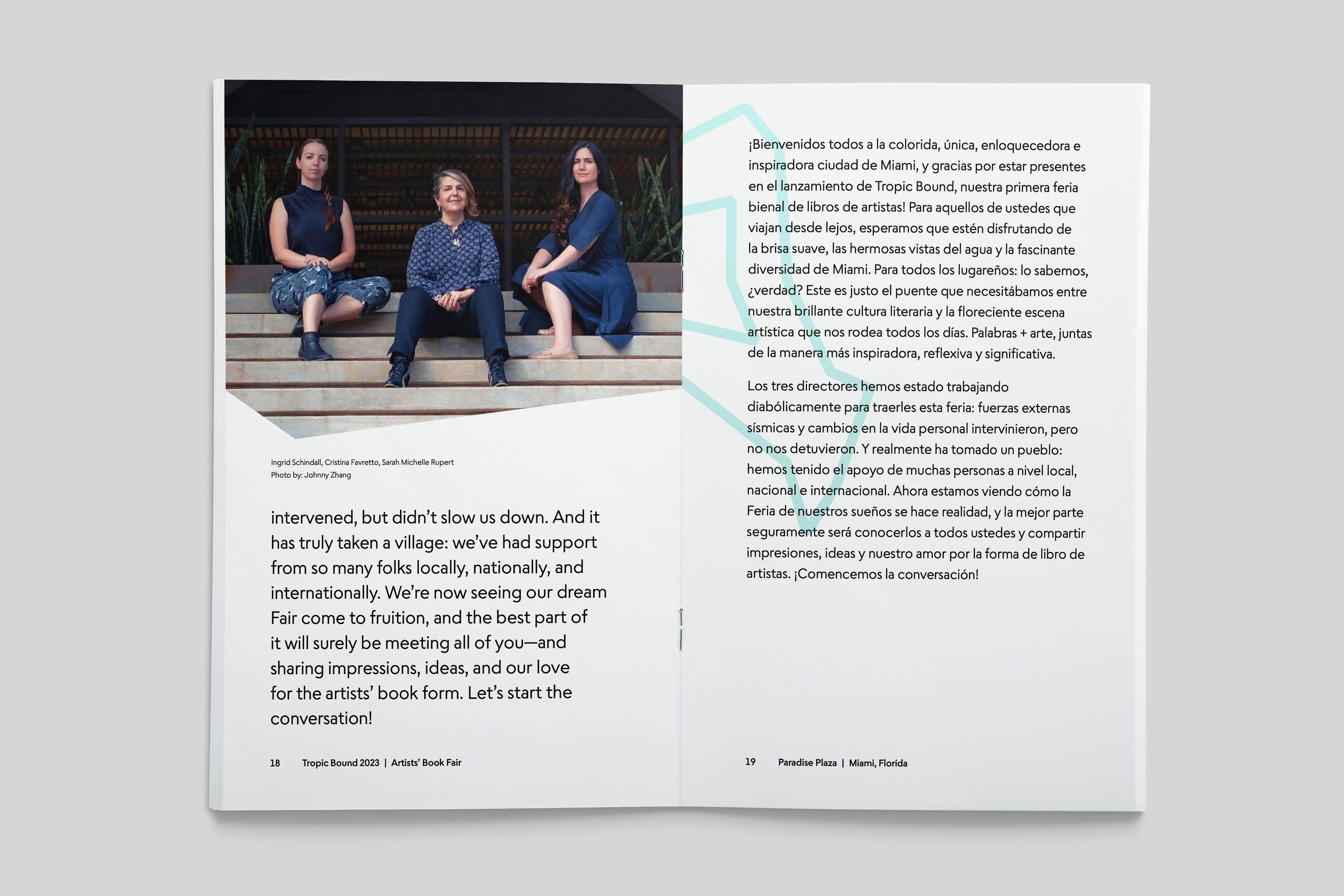
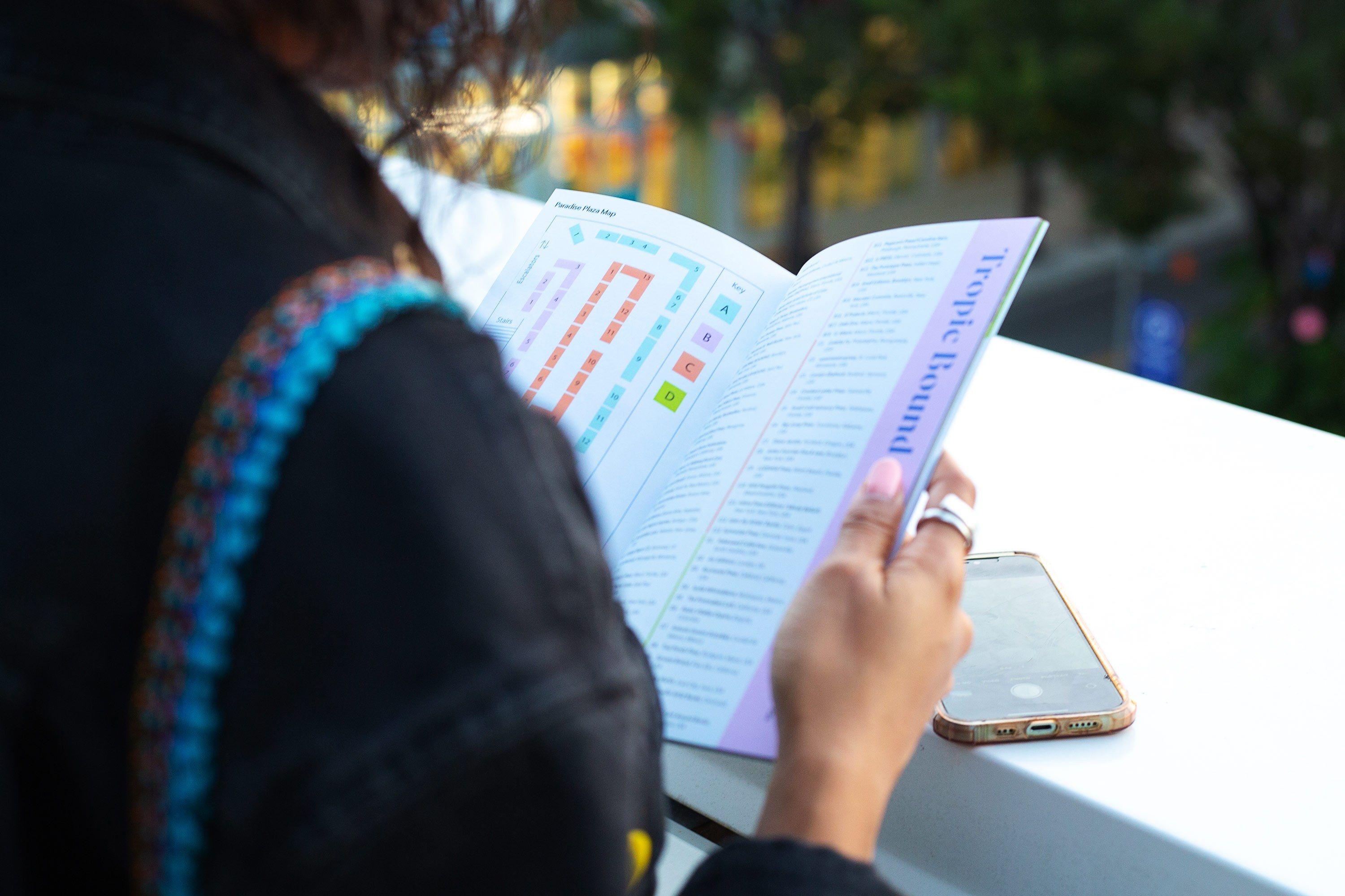
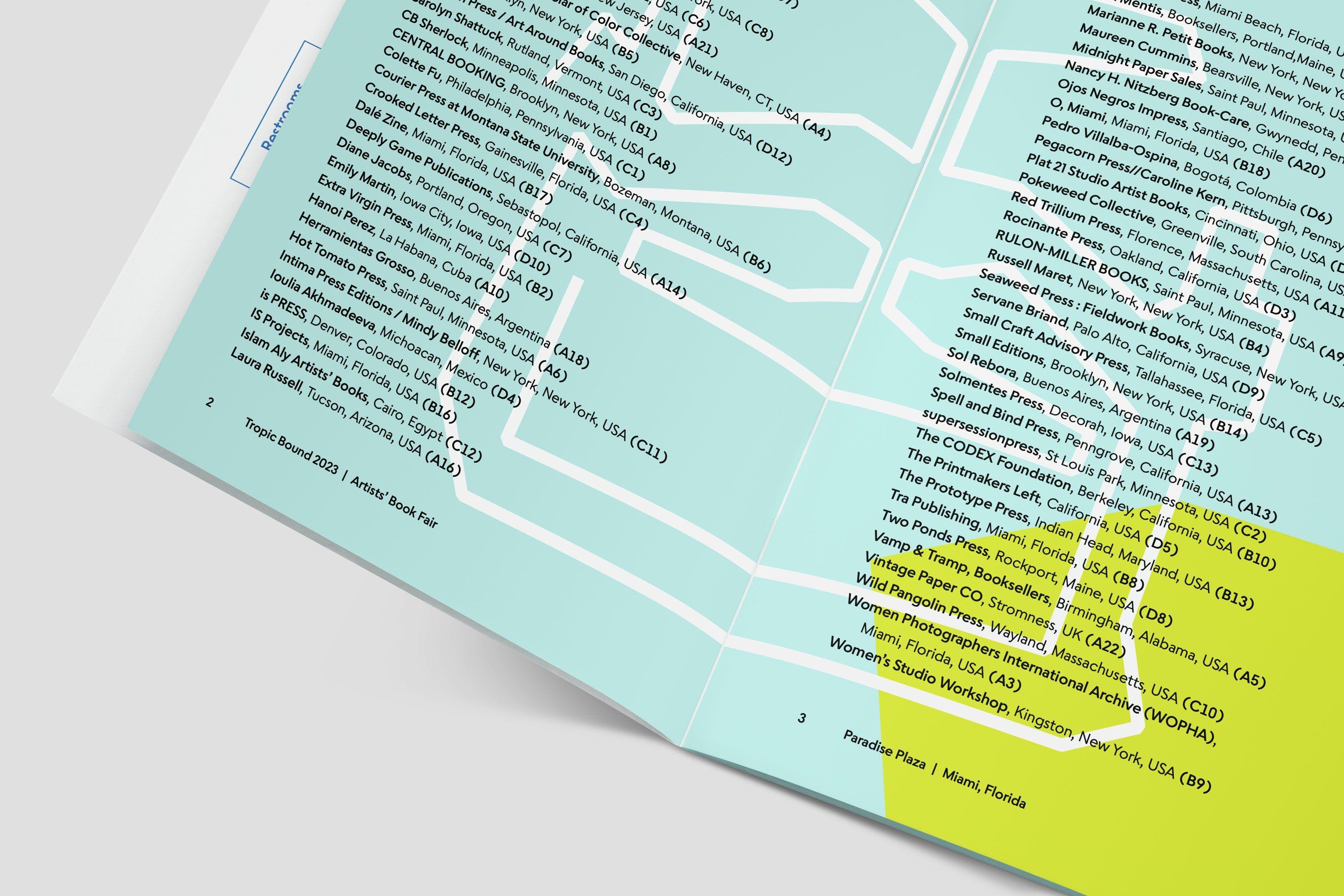
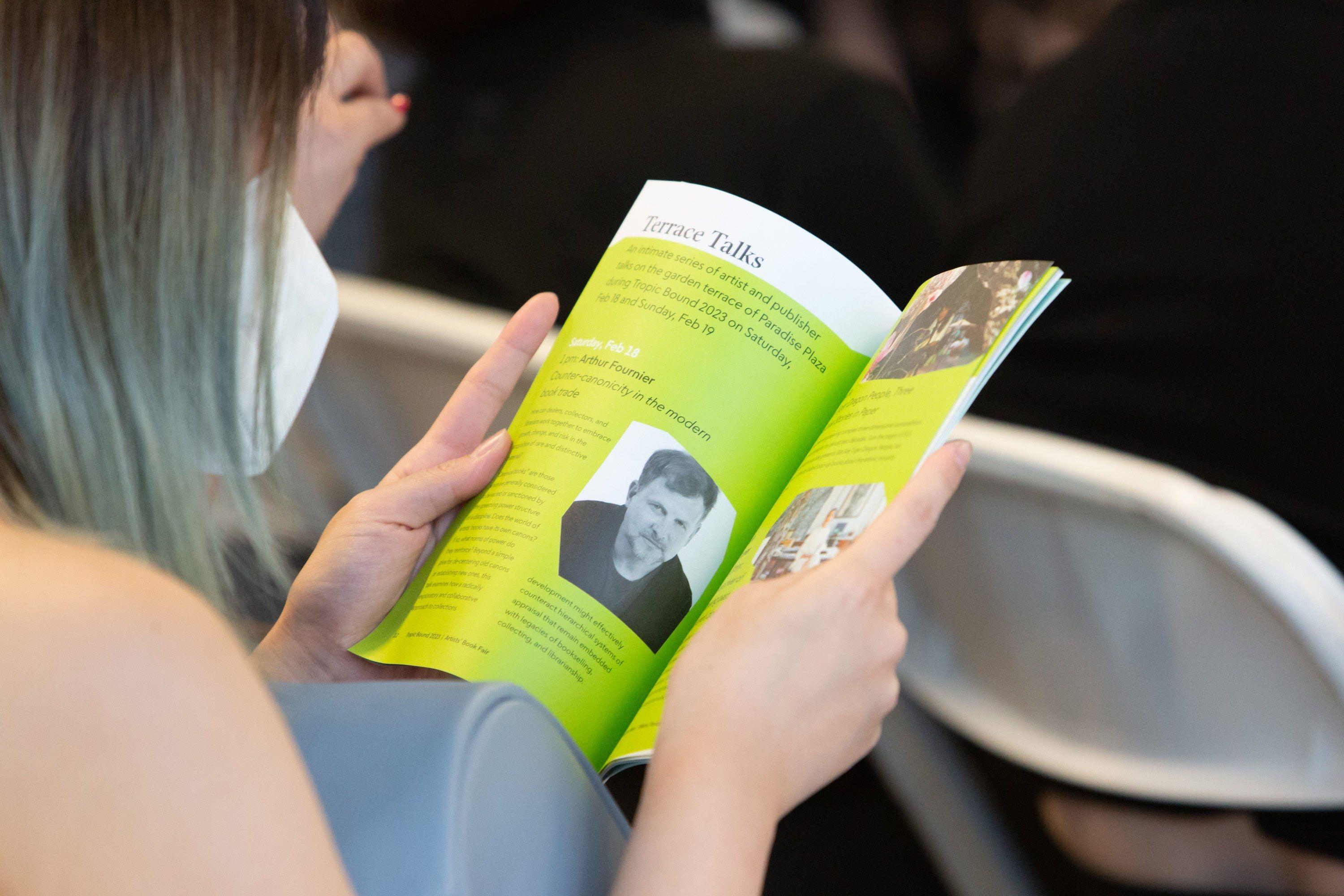
Tropic Bound is a biennial artists’ book fair led by Cristina Favretto, Sarah Michelle Rupert, and Ingrid Schindall. The inaugural 2023 fair featured book-centric tours through Miami, panel discussions, artist talks, and over 60 art book exhibitors.
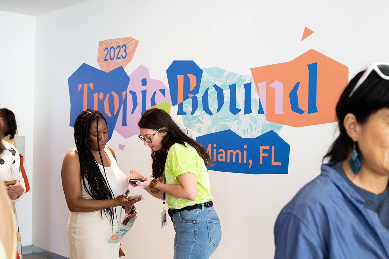
With an energetic blend of colors, type, and textures, the brand kit for Tropic Bound created a perfect background for this joyous weekend event.
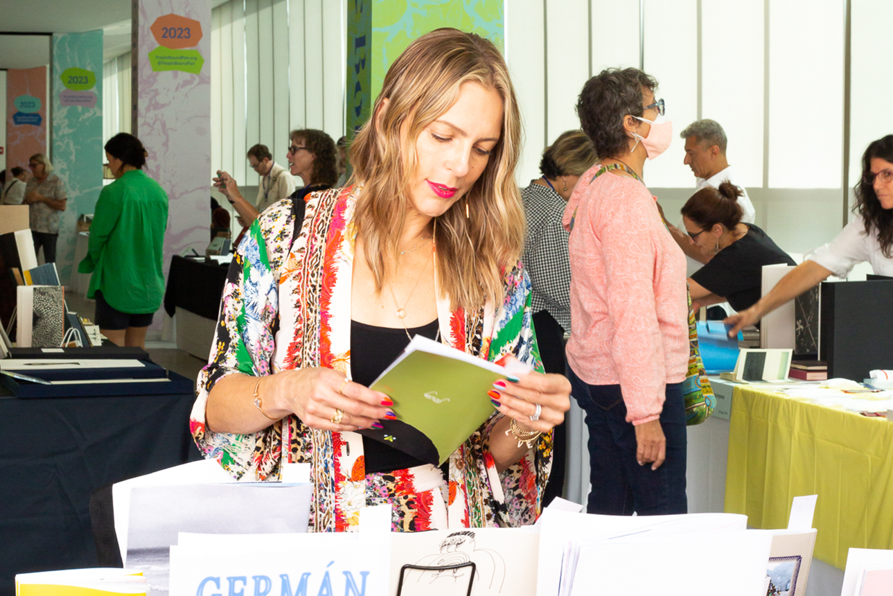
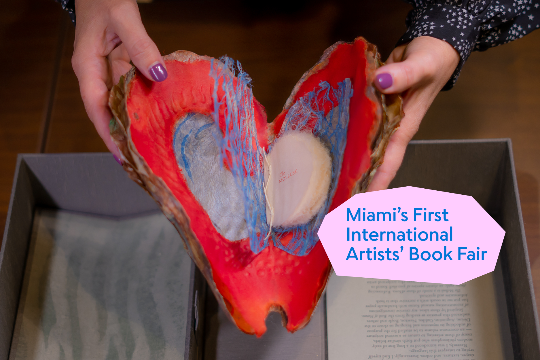
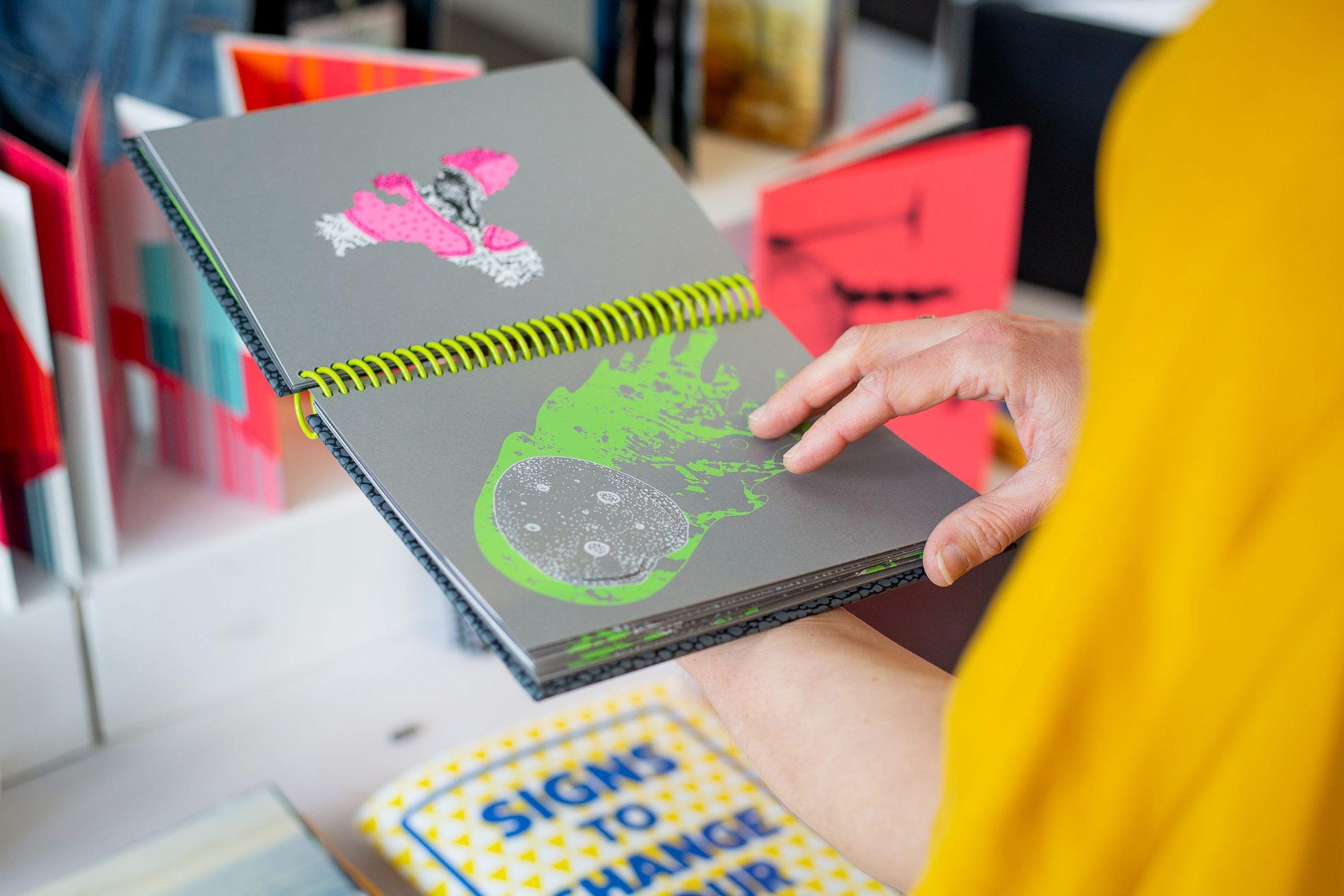
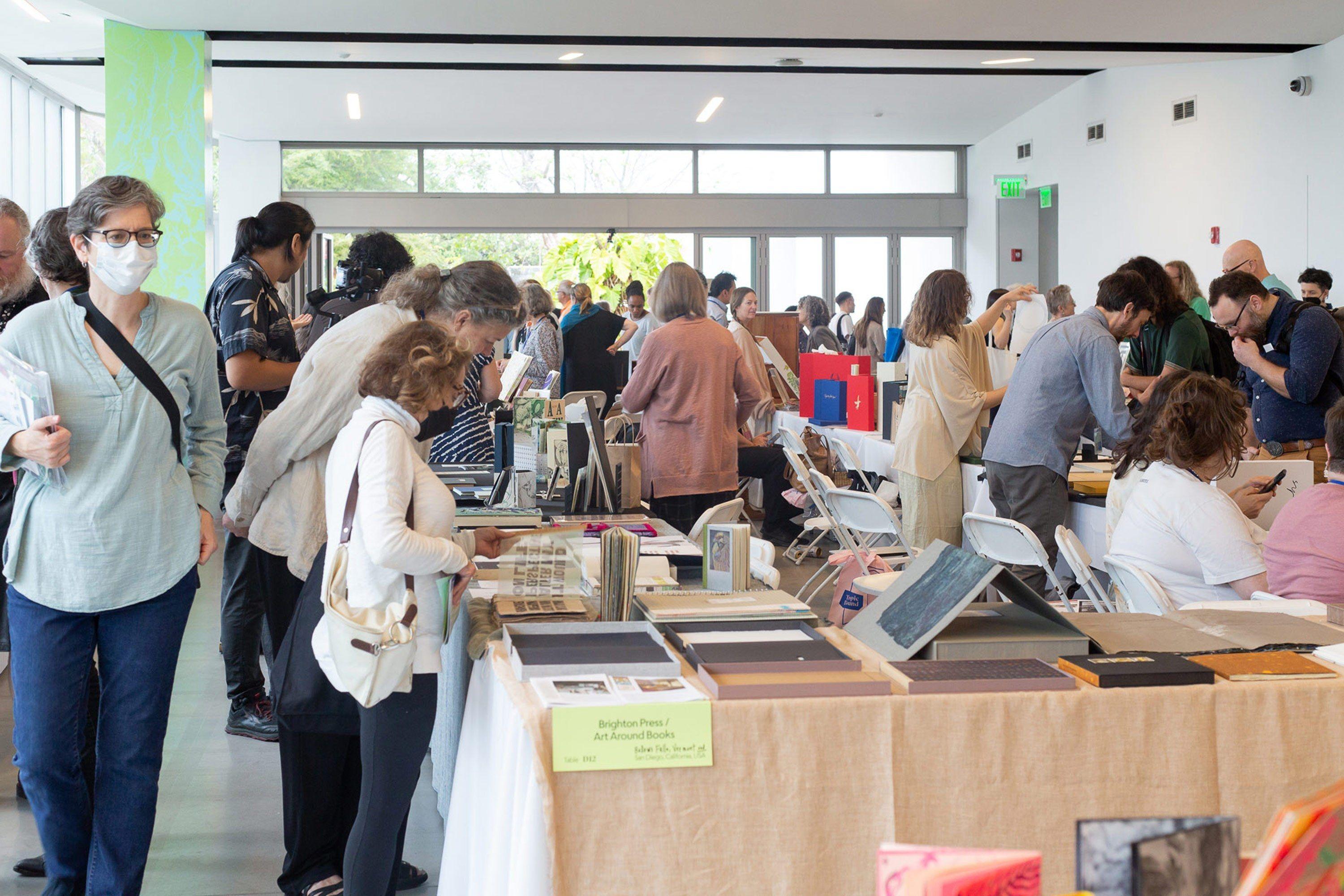
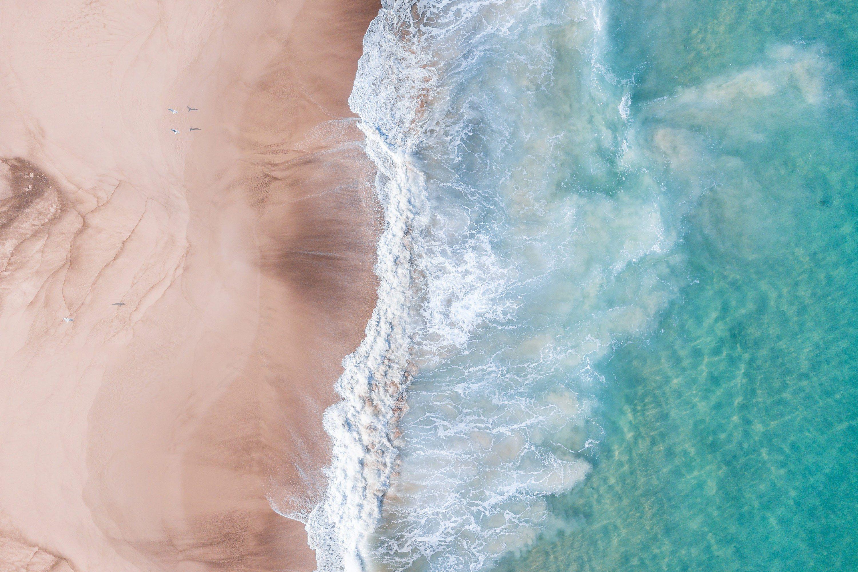
Photos by Monica McGivern, courtesy Tropic Bound
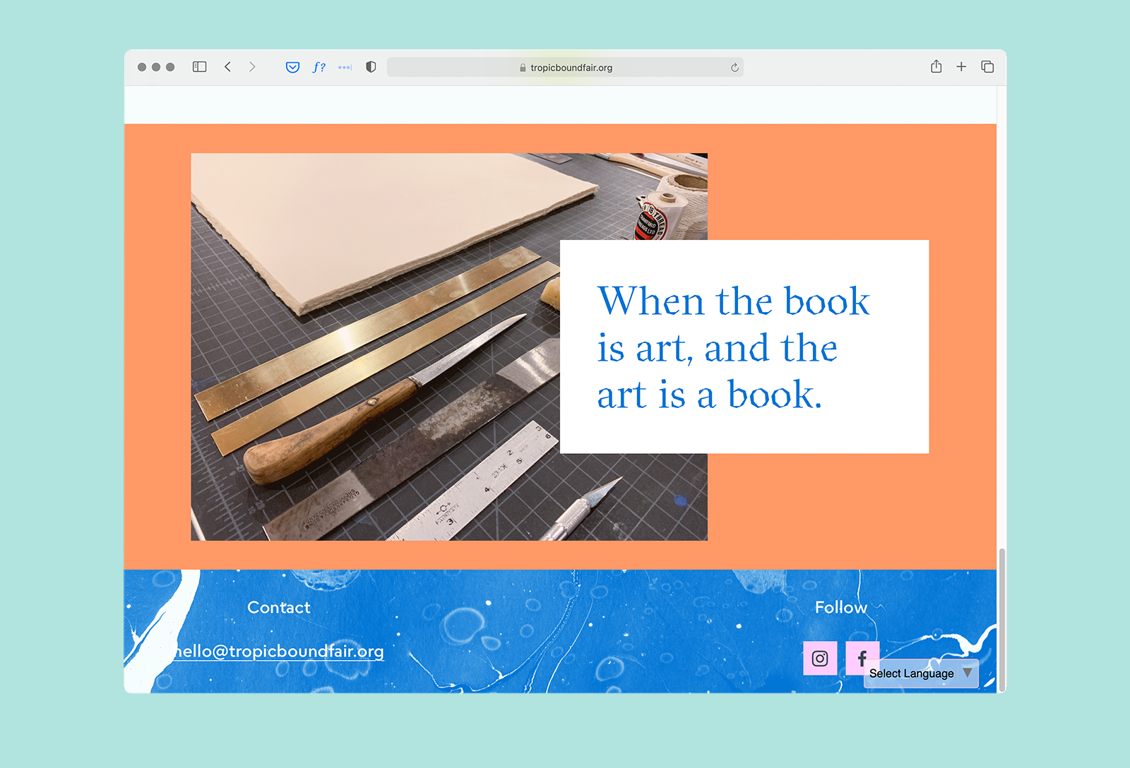
“When the book is art, and the art is a book.”
Tropic Bound
Context
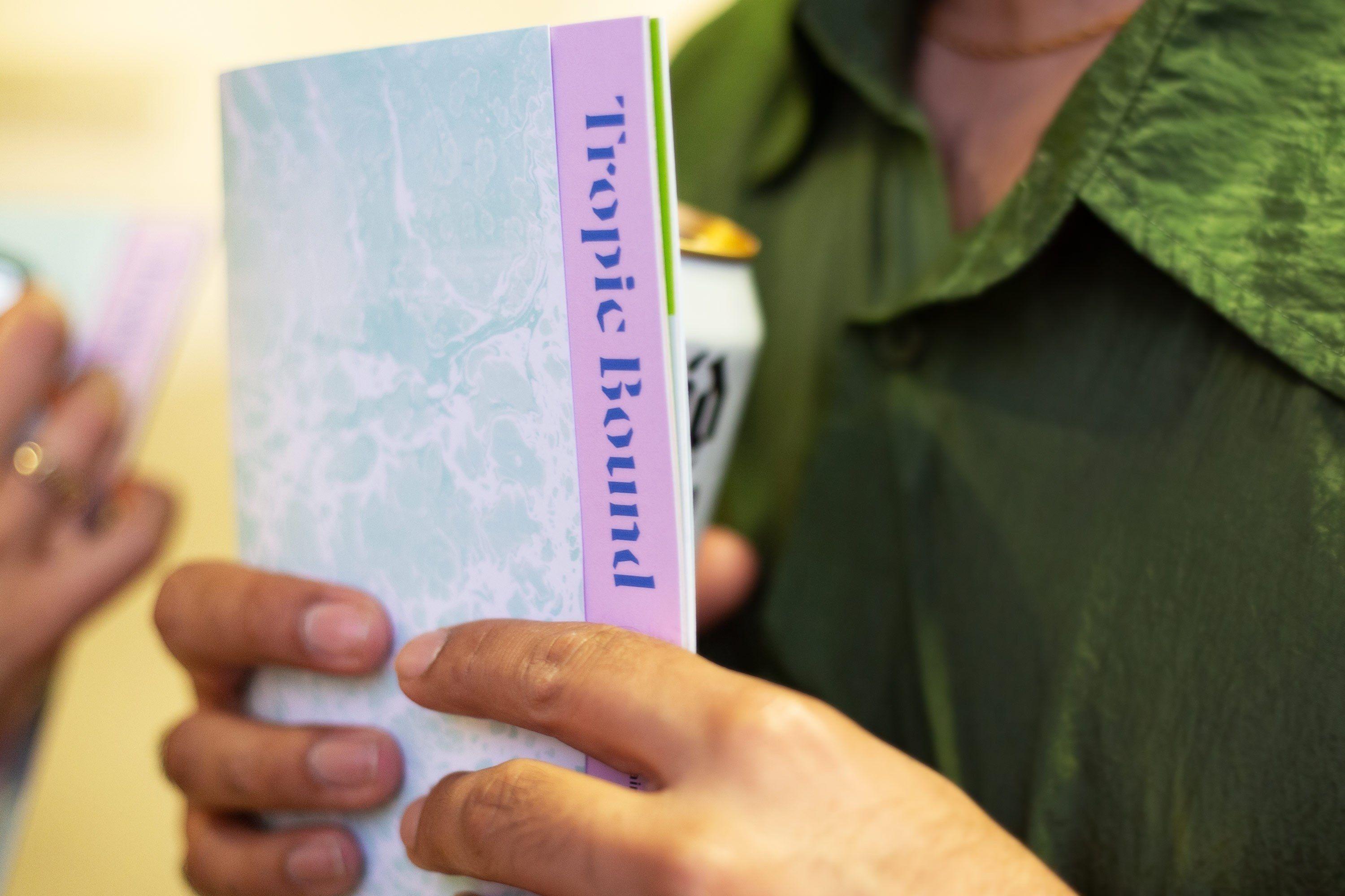
Tropic Bound’s identity represents the book arts. Their priorities are not just to showcase this artistic outcome, though. Rather, they want to illuminate it as an interactive, intimate, and provocative art experience. The brand is all about craft and materiality; its foundation is inspired by different techniques related to book arts: woodcuts, marbling, and watermarks.
The process began in 2020, and Tropic Bound’s inaugural Fair took place February 2023.
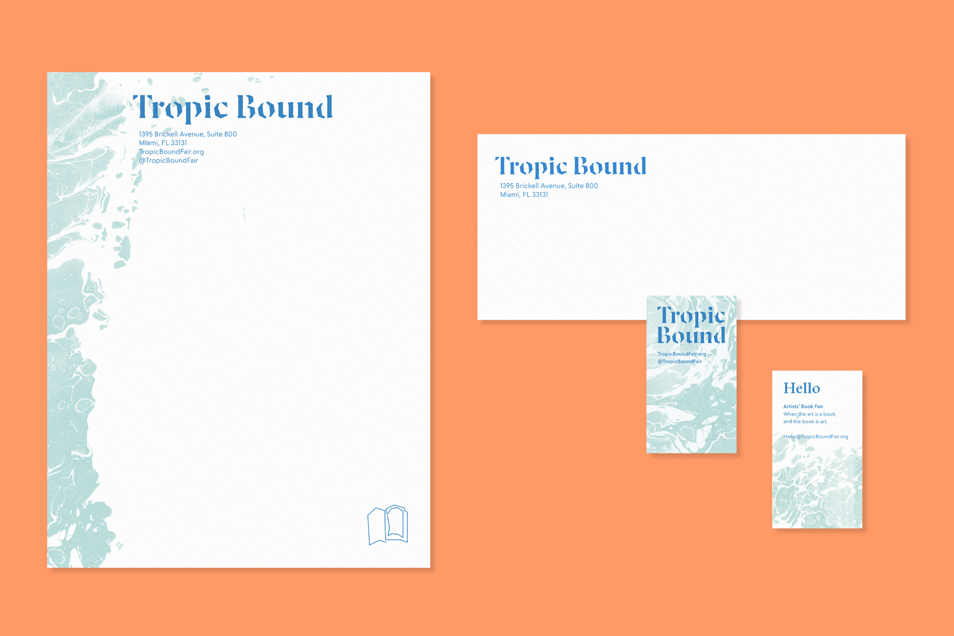
Brand Identity Elements
With the help of Jesse Ragan of XYZ Type, our logotype design utilizes angular shapes, exhibiting sharp, woodcut-like cuts.
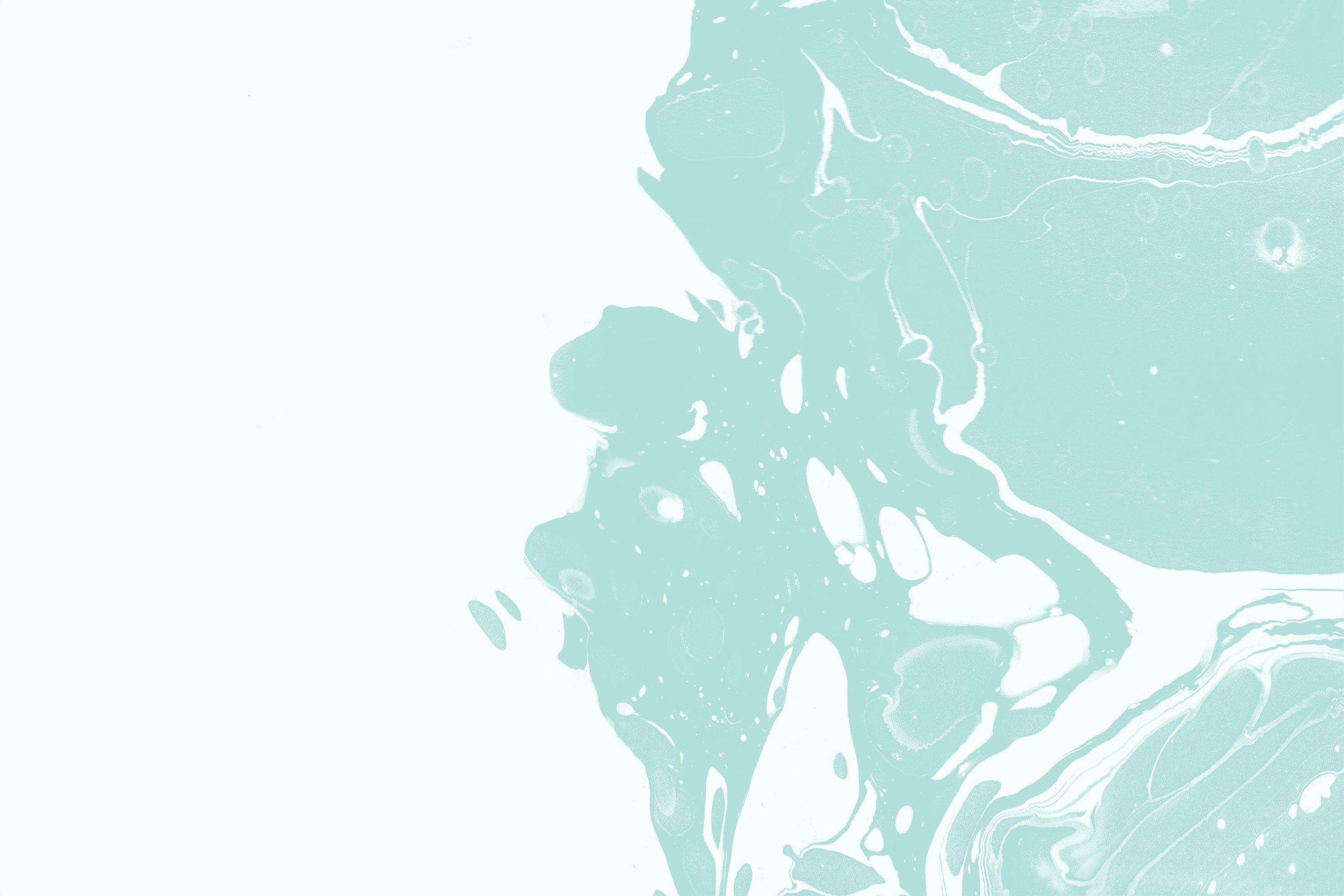
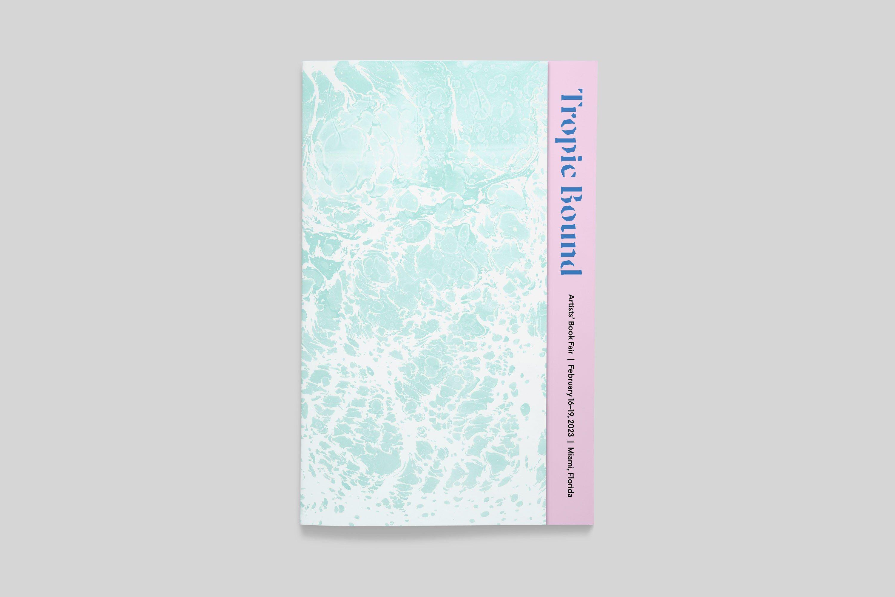
To establish a base, we wanted something that felt connected to the physical, natural, and familiar. To achieve all of that at once, we chose marbling. Marbling has historically been used for end pages and is still a part of the book crafts. It gives the appearance of movement and texture, and the fluid quality of this effect can also be interpreted as water, a relevant symbol of life in the tropics.
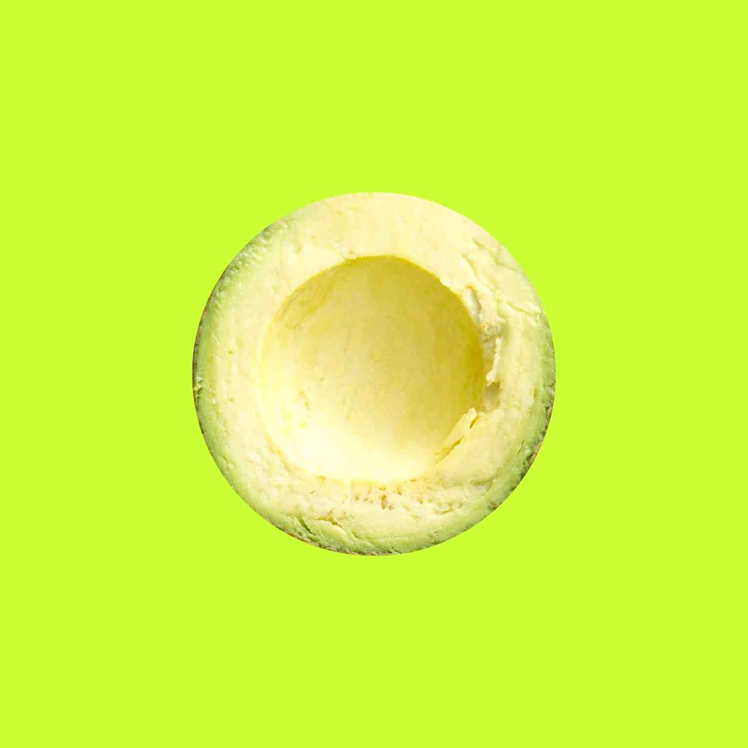
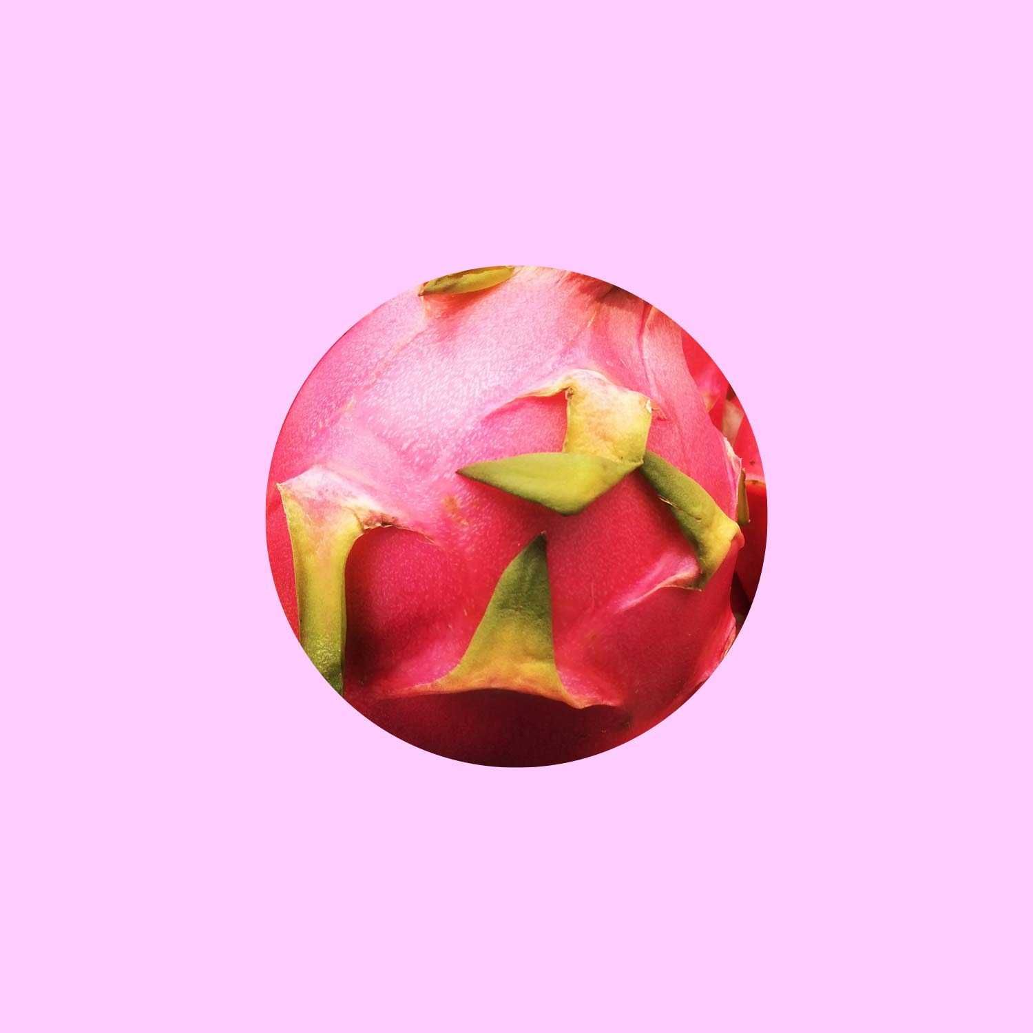
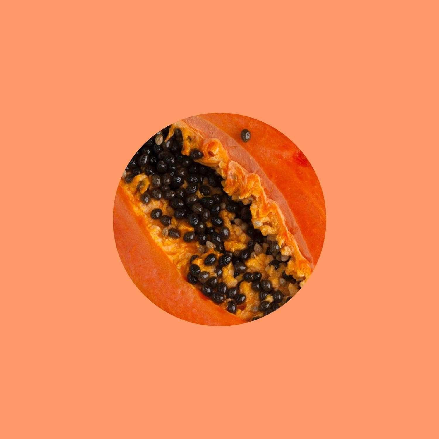
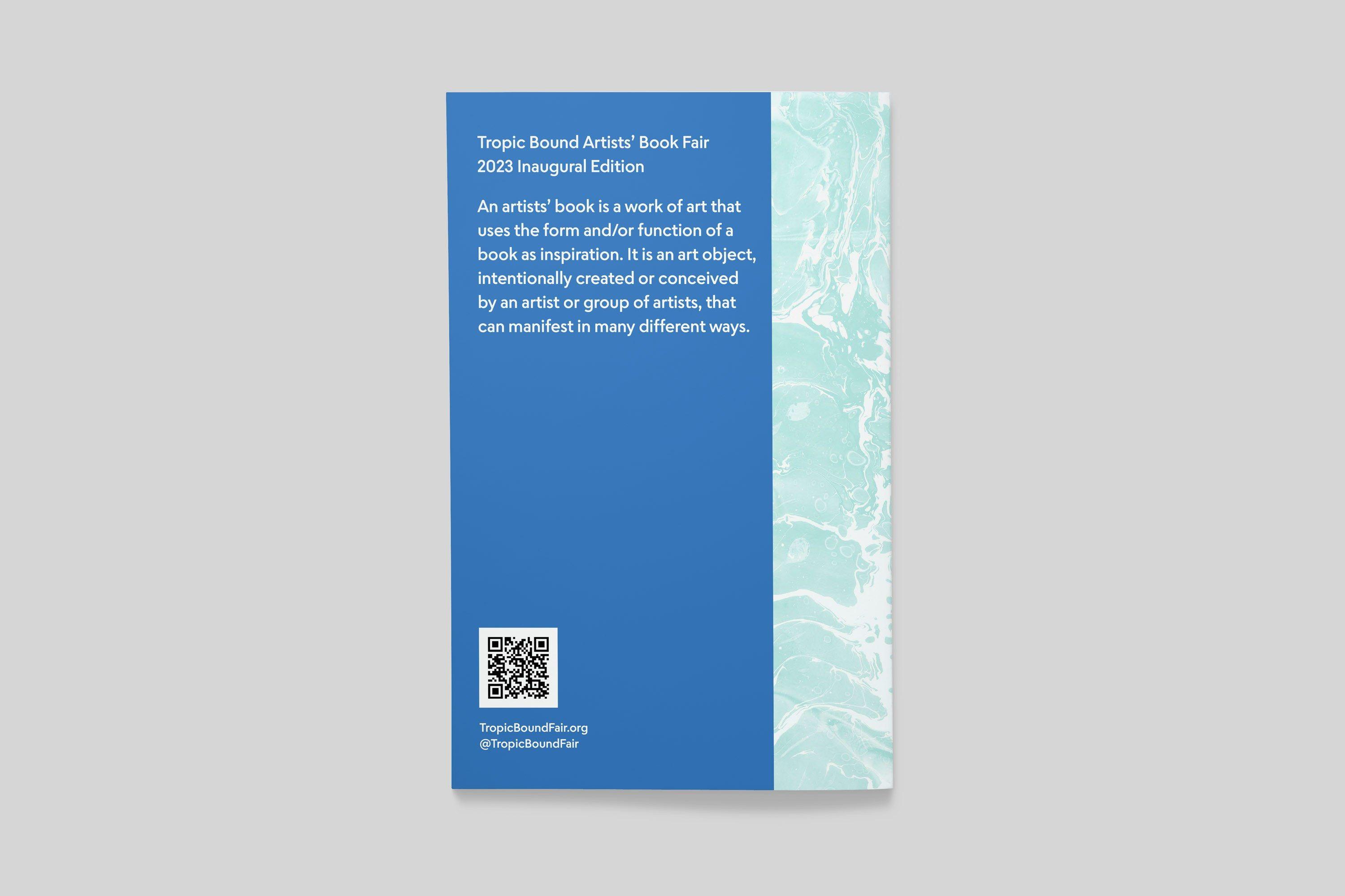
The color palette is inspired by the vibrant hues of tropical fruits, creating a connection to both the spirit and the physical location of Tropic Bound.
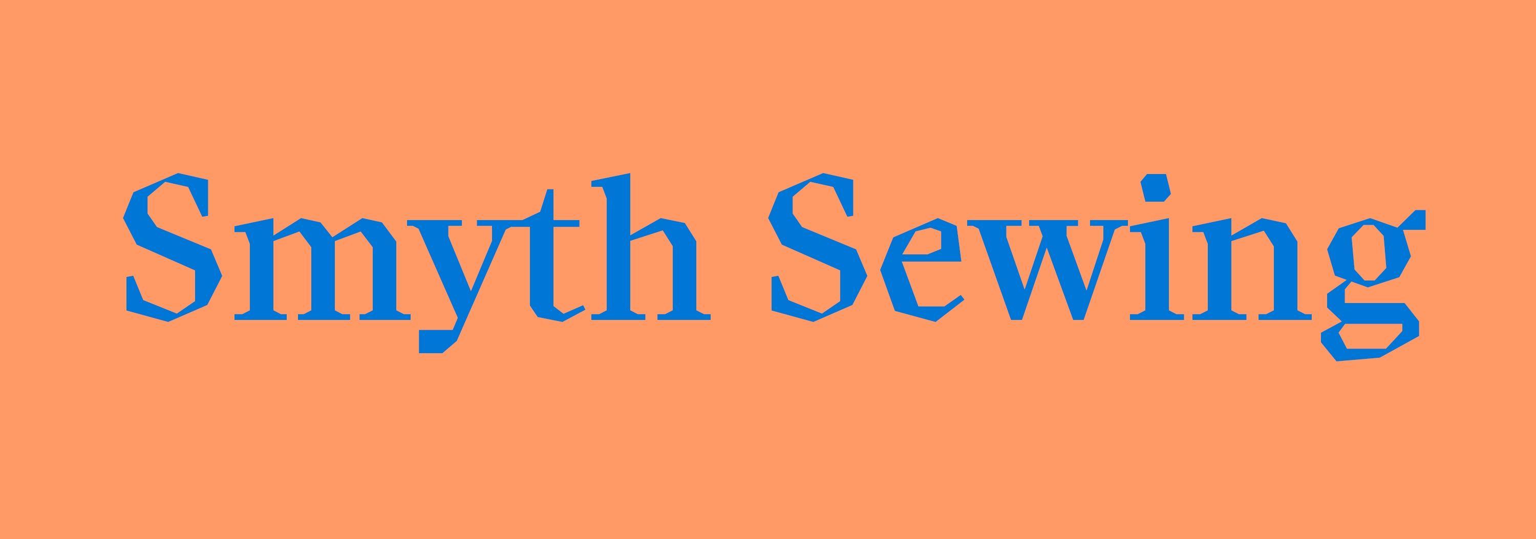
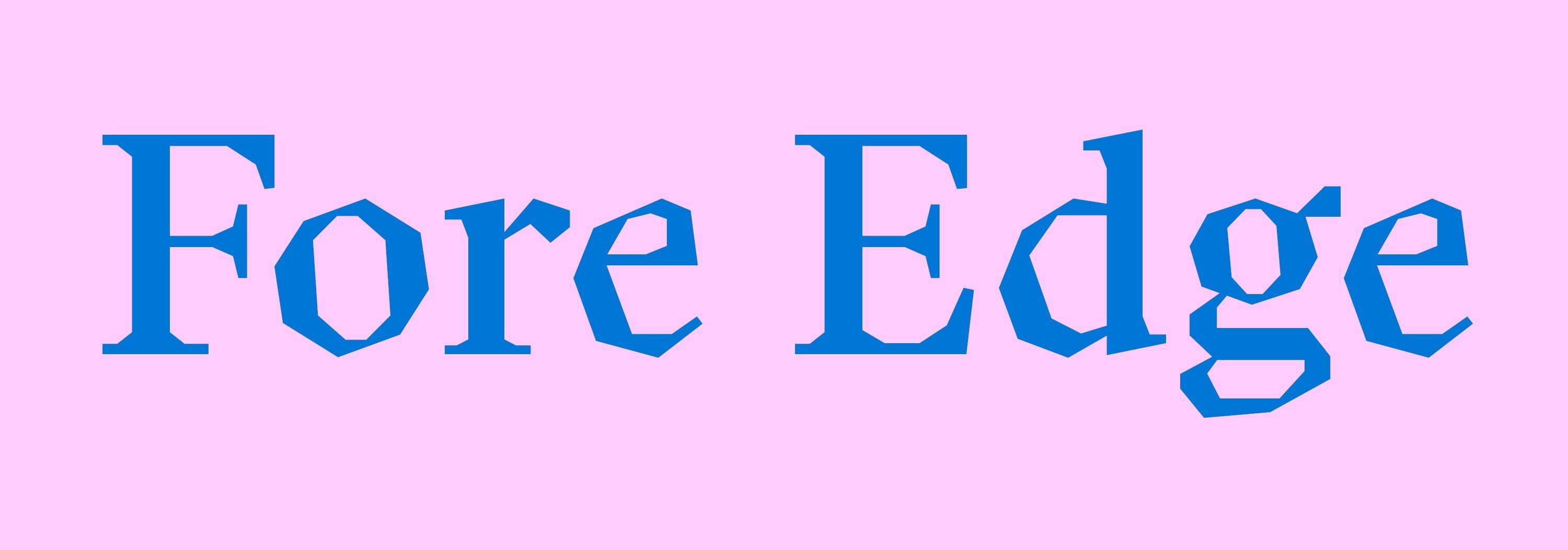


Tropic Bound’s identity uses two font families: Luzi Type’s Koper, combined with XYZ Type’s Escalator. Koper, used as an expressive display typeface, was inspired by rough woodcuts, as seen in its edges and angular features. Escalator serves as a geometric compliment—an approachable, friendly sans serif used for subheads and body copy.
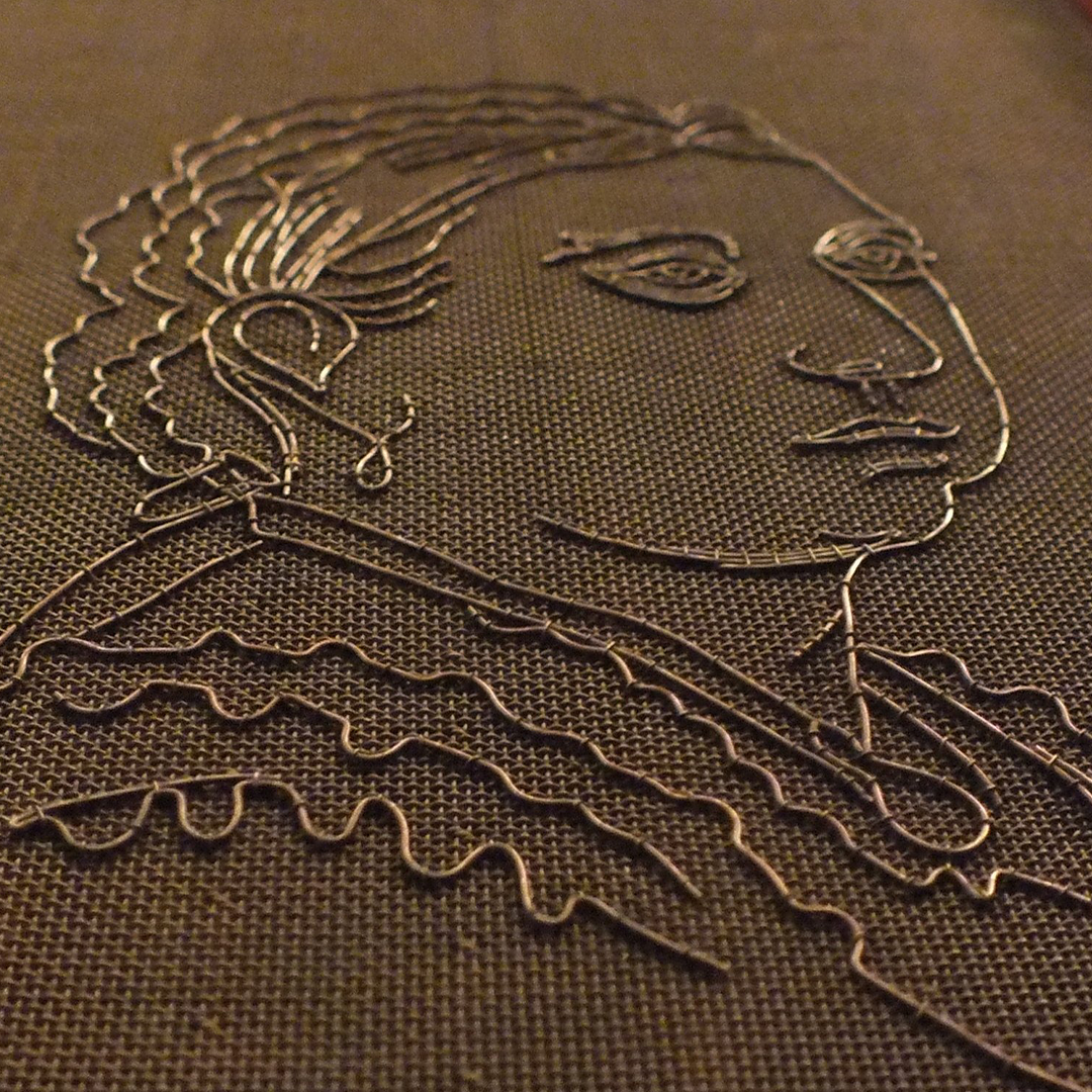
Above: Watermark from the Robert C. Williams Paper Museum in Atlanta
Custom icons like the book, scissors, and palm tree reference antique watermarks. They are drawn as if they were created with a traditional, one-piece wire.


Inspired by paper cuts and material scraps, we utilize irregular shapes as layering design elements. The shapes’ angularity also echos the identity kit’s display type, Koper.
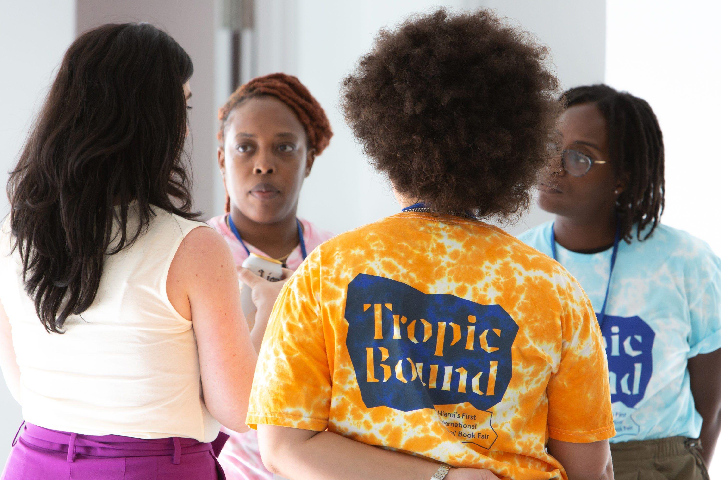
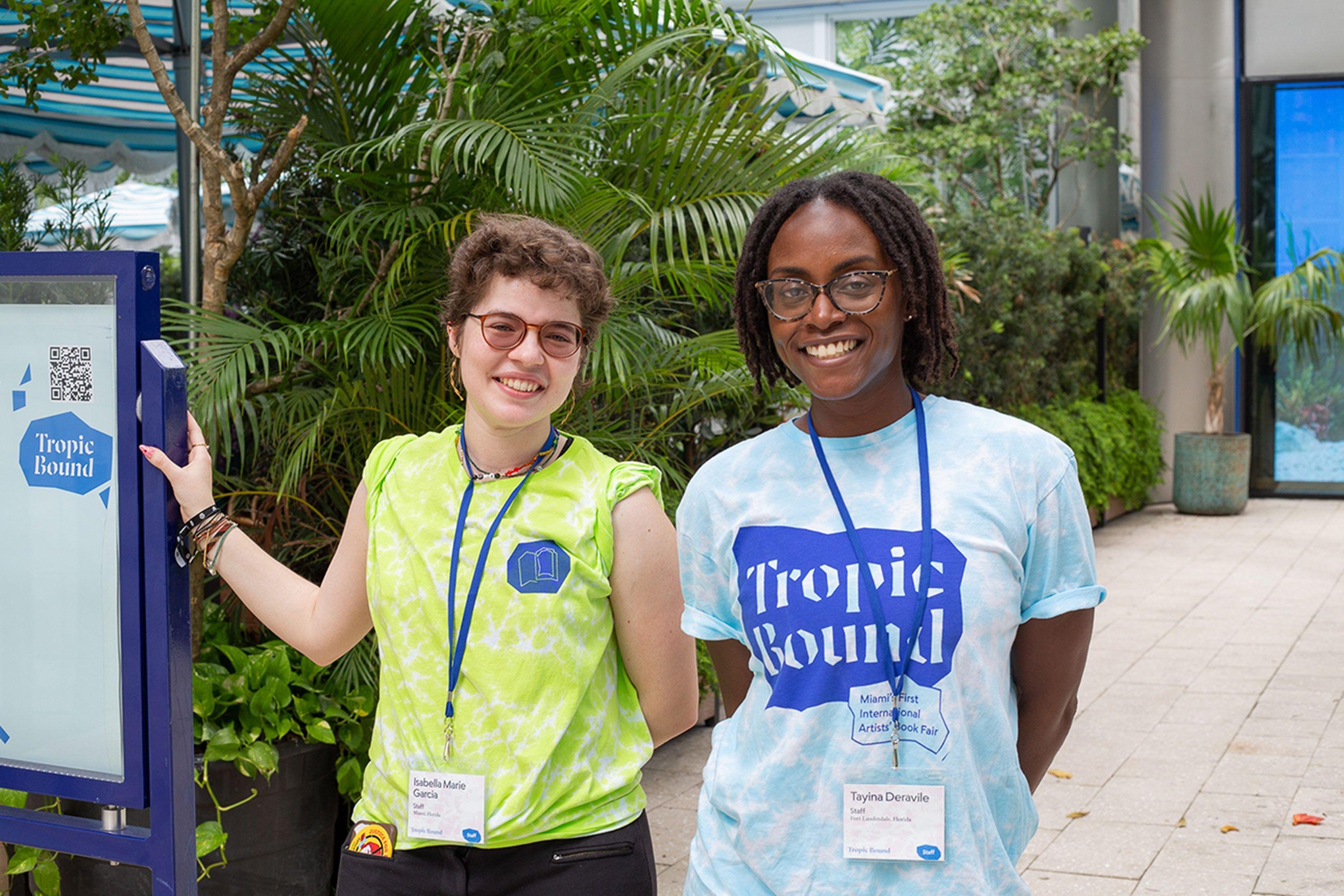
In Use
Photos by Monica McGivern, courtesy Tropic Bound